Remember the flip house? (If not, you can read about it here.) We bought it during the summer of 2016 and affectionately (that’s probably not the right word) referred to it as The Pee House. Because that’s what it smelled like. I had every intention of documenting the renovation in real time but you already know that didn’t happen. However, I did take a bunch of “after” photos and thought I’d share them with you while hitting the highlights. You’ll have to overlook the inconsistencies in lighting as Steve and I were rushing around prepping for the open house. The house faces south and you’ll notice that the south-facing rooms have a warmer tint to them while the north-facing rooms along the back of the house have a cooler, greenish tint to them. This tour loosely follows the before tour so if you want to toggle back-and-forth between posts to see the differences it’s kind of fun to do!
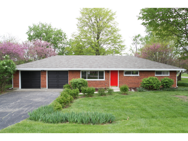
The major changes we made to the exterior were new windows, new garage doors, new gutters and new light fixtures. Luckily, the roof was in excellent condition. However, the eaves were rotted and there were no gutters or downspouts. Steve had to cut the eaves back to allow for gutter and downspout installation. (Originally, there was no vertical surface for a gutter to tie into. Hence, the gutter-less situation we inherited.) Then he installed new fascia and vinyl soffits. Cutting back the deep eaves also allowed more natural light to reach the interior of the house. Bonus!
We cleaned up the yard with some pruning, weeding, mowing and mulching. It was probably my favorite part of the entire renovation. It’s amazing what tidying up a bunch of overgrown bushes can do for curb appeal. I so wish those peony bushes would have been in bloom when I took these photos! I have a comical memory of all five of us (yes, kids too!) spreading mulch in the dark the night before the open house. We had our car headlights on and directed toward the front entrance so we could kind of see what we were doing. We came back the next day to find a freshly mulched sidewalk. Ha!
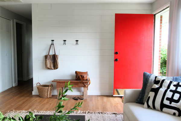
Other than weeding and general cleanup, we didn’t touch the driveway. It was one of the “it’d be nice but not profitable” projects that, inevitably, didn’t make the cut. So was the front door. Instead of replacing it, I painted it a cheery red.
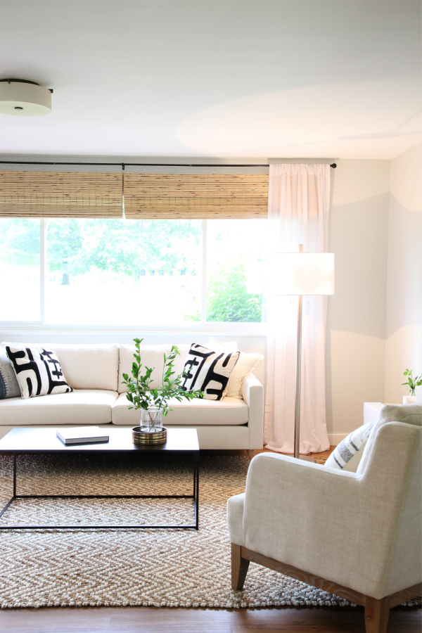
No more pistachio walls! The wall color throughout is Fog by Olympic in eggshell. It’s one of those chameleon colors that looks different – but great! – in each room. It’s light and airy but hides scuff marks. We decided to keep the wall color consistent throughout to make things feel as spacious and cohesive as possible. Ceiling and trim are off-the-shelf white because…profit.
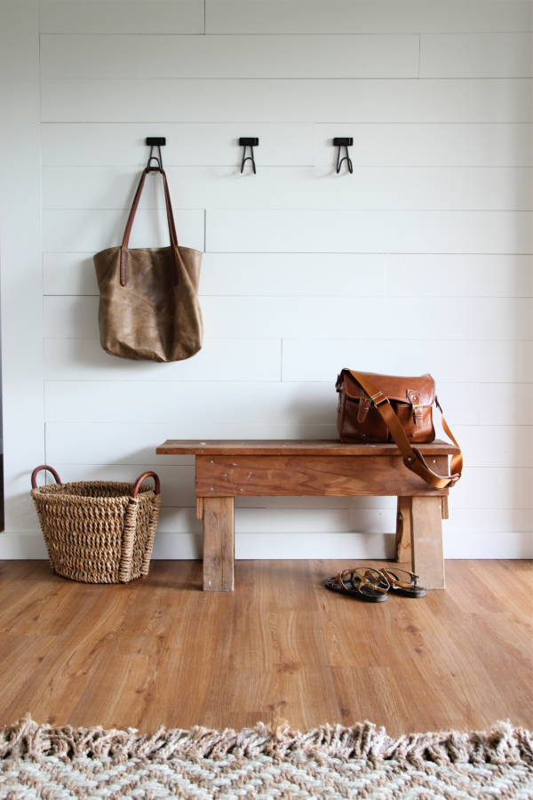
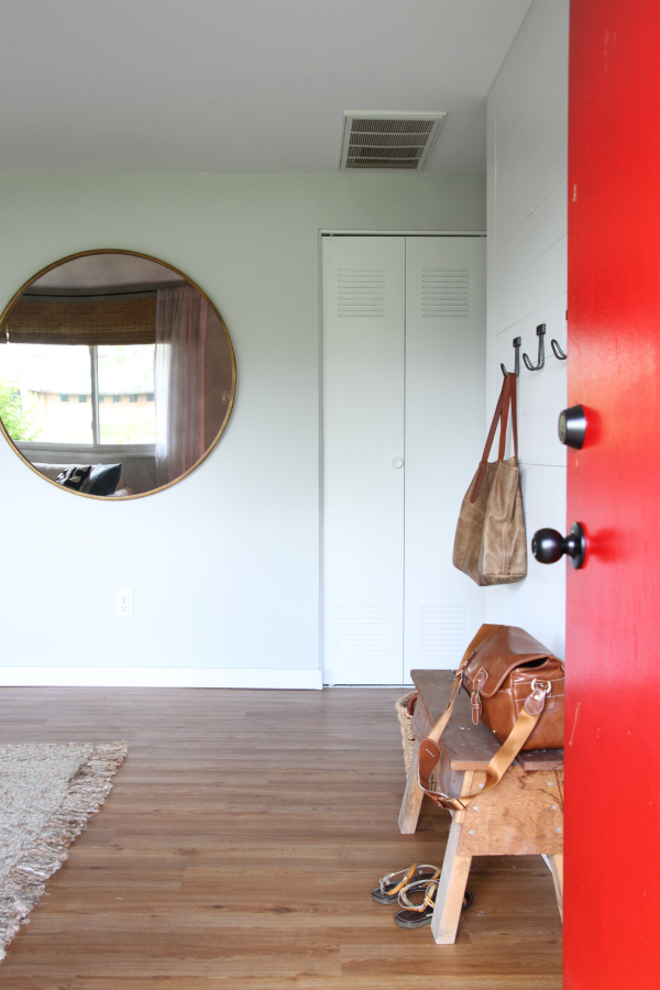
To add the teensiest bit of interest, we planked the entry wall and painted it the same as the trim. The bench came with the house. It was left in the garage. Free props = the best props. A trio of hooks from Target adds function and contrast.
We didn’t have the original flooring tested, but it’s likely it was asbestos. There are two ways to deal with asbestos tile: 1) abatement ($$$) or 2) encapsulation (less $). We assumed the tile was asbestos and went with encapsulation which essentially involved covering it up with new flooring to prevent fibers from releasing into the air. The new flooring is SMARTCORE luxury vinyl in putnam oak. I really, REALLY like this flooring. The color is warm with a matte finish and the pattern varies enough so that it doesn’t look like a sticker repeat. Installation was straight-forward. No subfloor prep required! A separate underlayment is optional but we opted out since the planks come with an attached pad. However, if we were to install this flooring in our own home, we’d opt for underlayment just to make it a bit more insulating underfoot.
FYI – We did notate that the tile under the vinyl flooring may be asbestos on the home disclosure form just in case the buyer ever wanted to pull up the flooring.
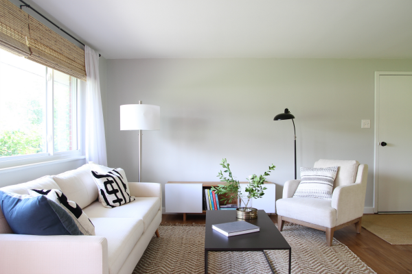
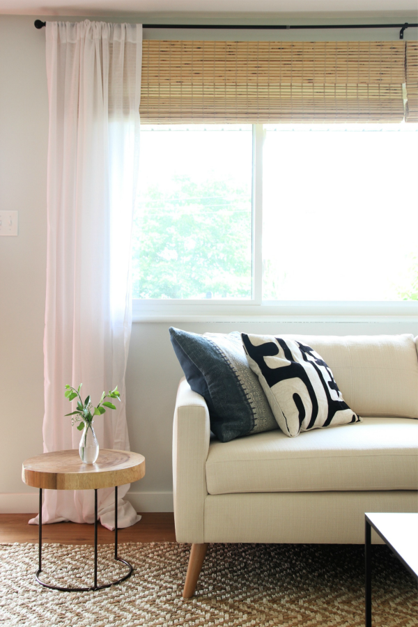
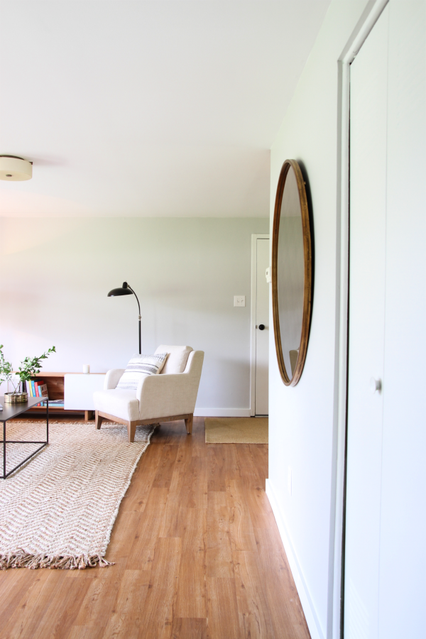
The goal in the living room was to lighten things up so we replaced the heavy curtains with airy white ones layered over woven shades, added a ceiling light and painted. The only feasible spot for a TV was on the wall perpendicular to the window so we staged the room with that in mind. I hung a mirror opposite the window to bounce light around and give the illusion of a larger space.
All of the lighting, furnishings and decor hail from Lowe’s, Menards, Target or our personal stash. This was back when Lowe’s had an online furnishing store called ATG Stores and I was blogging more regularly. They offered up some items for staging but by the time The Pee House sold, they had rebranded to The Mine and changed up inventory before ultimately folding. I feel really crappy about that :( I’ll try to link to what I can still find.
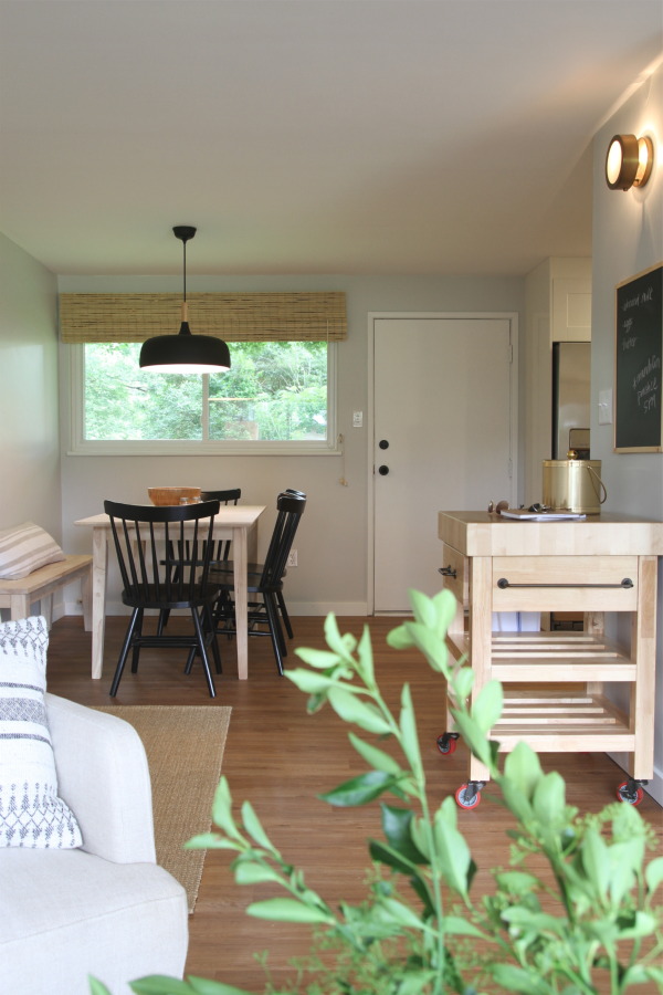
This is the view from the couch looking towards the back of the house. Other than switching out the pendant for something more modern, staging the dining space and painting, we didn’t do much. I soooooo wanted to replace the door to the backyard with a windowed Dutch door, but it just wasn’t necessary. BUT WOULDN’T IT HAVE BEEN AMAZING?!
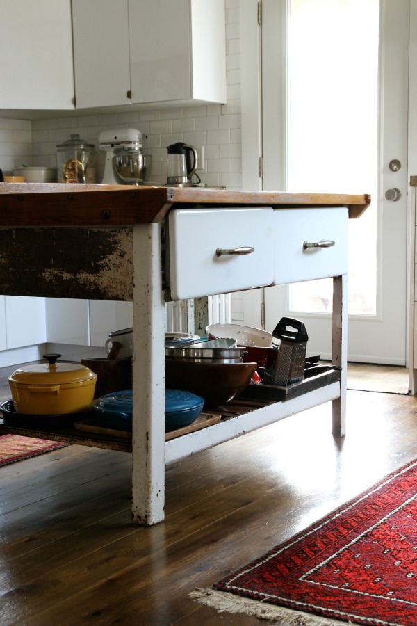
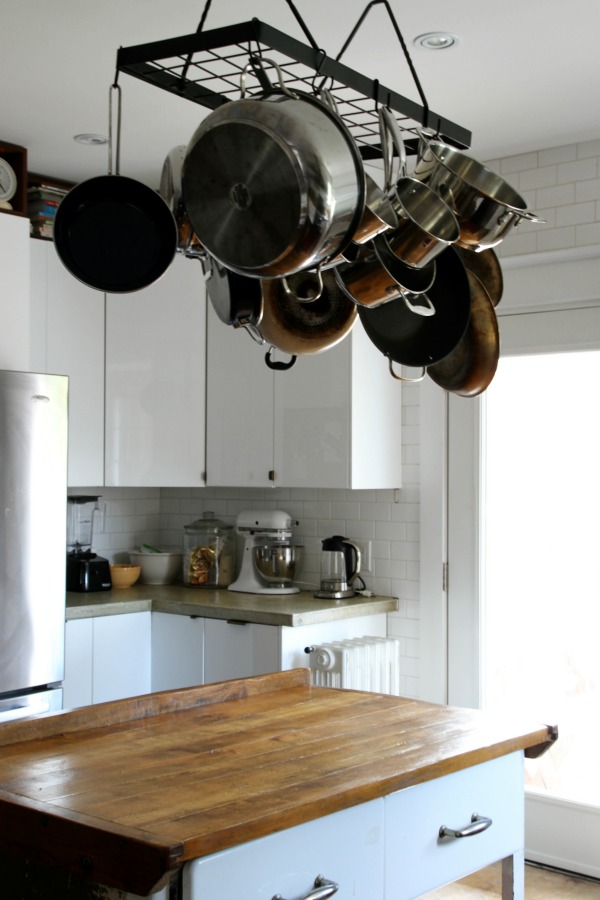
The rolling butcher block cart was my attempt to show how the space could multitask. Leave it in place as a drop zone for mail and keys coming in from the garage or for serving beverages when entertaining. Move it to the kitchen for extra prep space or for folding laundry. The porthole wall sconce is a perfect fit for the sliver of wall between the kitchen and living space. It’s like a minimal, classic piece of jewelry and puts off the prettiest ambient light.
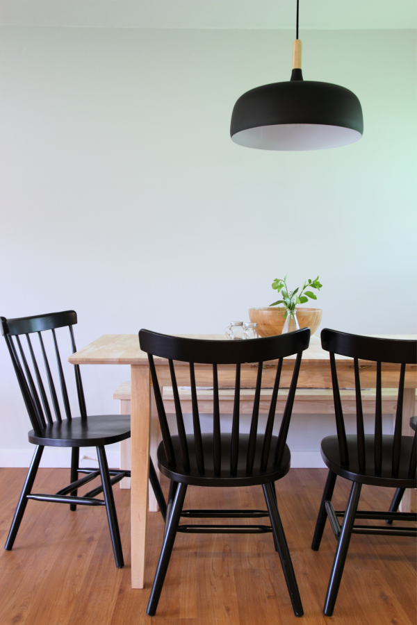
The dining area was pretty tight so I opted for a bench against the wall instead of chairs all the way around the table. We tossed around the idea of something built in but chose to keep things flexible for potential buyers. Can’t you just picture built-in seating and a fun little gallery wall? It’s crazy to look back at this now because the breakfast nook in our current home has an eerily similar setup.
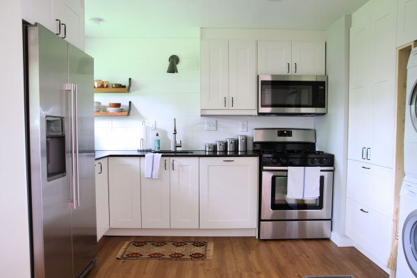
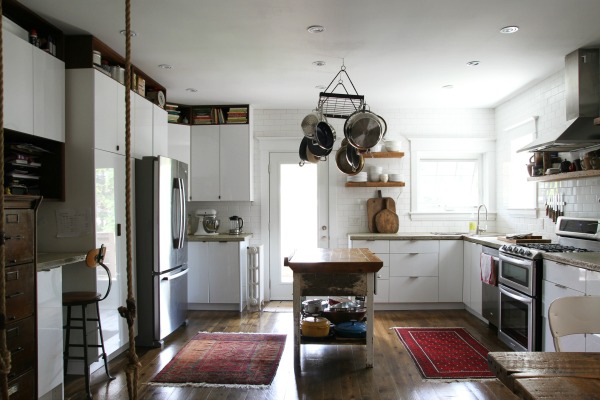
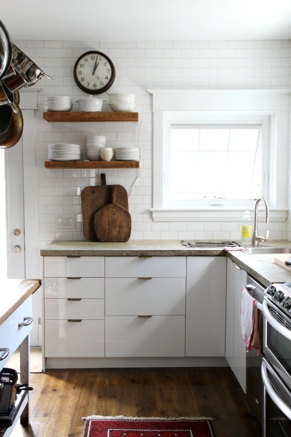
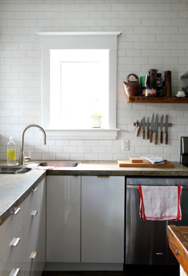
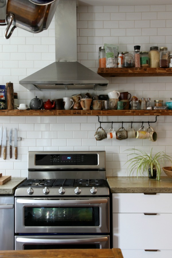
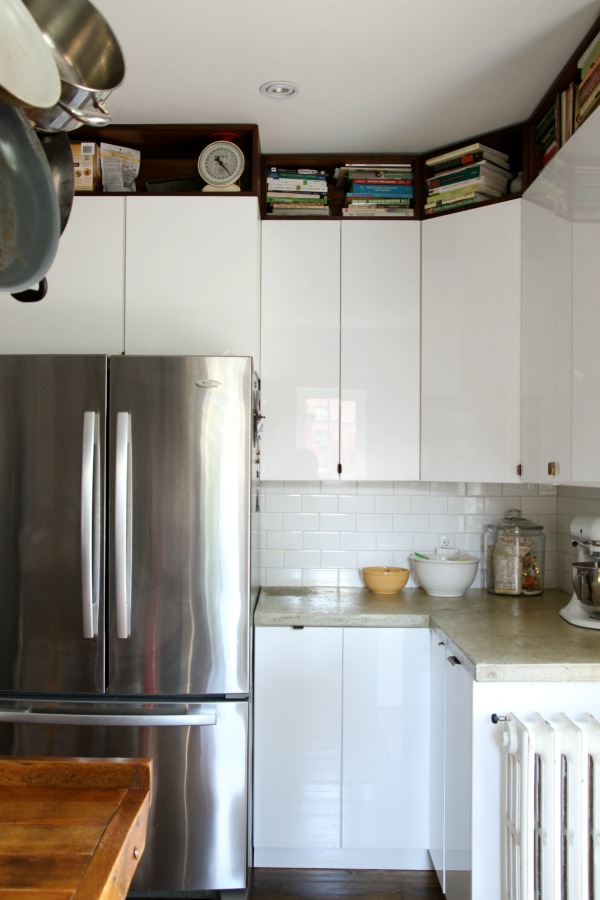
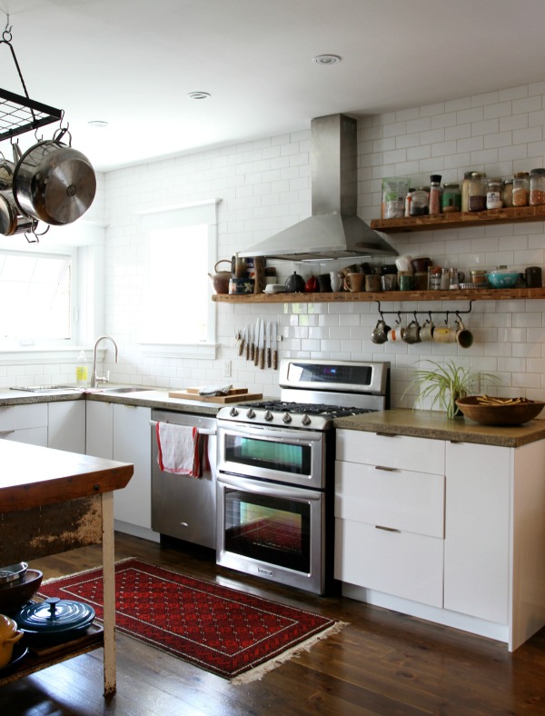
Of all the rooms, the kitchen makeover is the most dramatic. We removed an awkwardly placed closet, sold the metal Republic cabinets, closed up the wall fan, relocated the electrical panel to the garage and reworked the layout to include IKEA GRIMSLOV cabinets (R.I.P. GRIMSLOV) and a stackable washer and dryer. We considered putting the washer and dryer hookup in the garage but, when we thought about it more, it seemed better to have it in a temperature-regulated room. Who wants to do laundry in a cold garage?
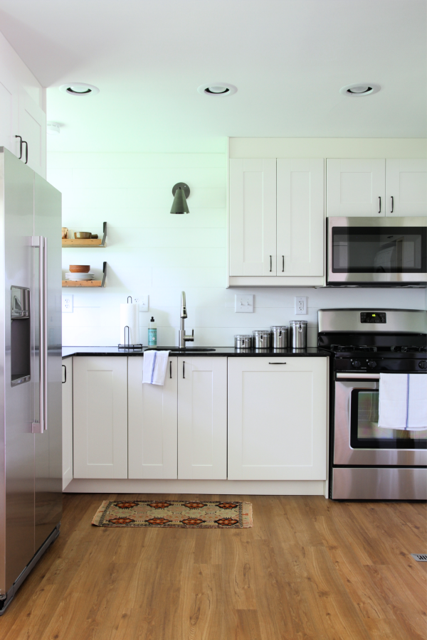
Centering the pot lights from wall-to-wall (as opposed to cabinet-to-cabinet) is the biggest rookie mistake we made. Still irks me! Other than removing the closet, we worked with the original kitchen space. To save money, we left the perimeter walls in place and kept the sink and window placement the same. With some creative space-planning, we were able to include a gas range, microwave, refrigerator, built-in pantry AND add a dishwasher. The dishwasher panel (to the right of the sink) was a splurge but worth it to keep appliances from overwhelming the small space. I trolled the internet for weeks searching “no kitchen sink window” for inspiration and finally decided to keep it simple and do a single sconce above the sink. The vintage rug was a birthday gift I had bought for my sister but hadn’t given to her yet. Penny-pinching tricks! (Don’t worry, the rug eventually made it to my sister and happily lives in her kitchen to this day.)
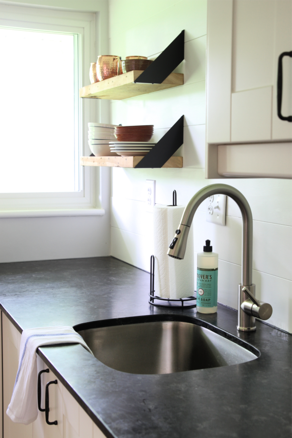
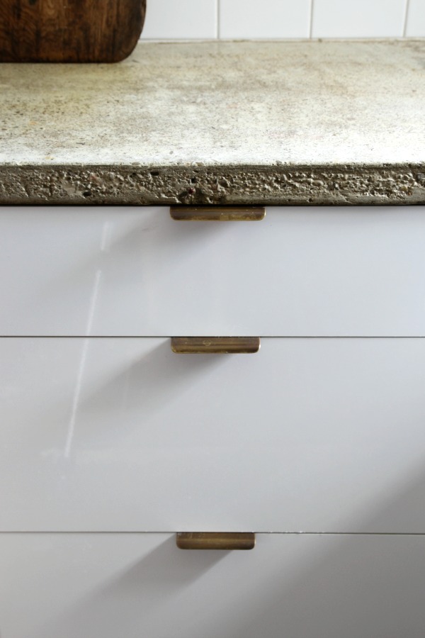
The countertop is Saint Henry Black granite in a honed finished. It’s 2cm thick and thinner than standard because I wanted to avoid anything chunky in the small space. I ordered it from Polycor (super easy to work with!) and had it fabricated and installed by a local fabricator that we’d used in the past. I was going for the look of soapstone with the ease of granite and it turned out better than I had anticipated. We installed and painted the planked sink wall in lieu of a backsplash to save money and tie in to the planked entry wall.
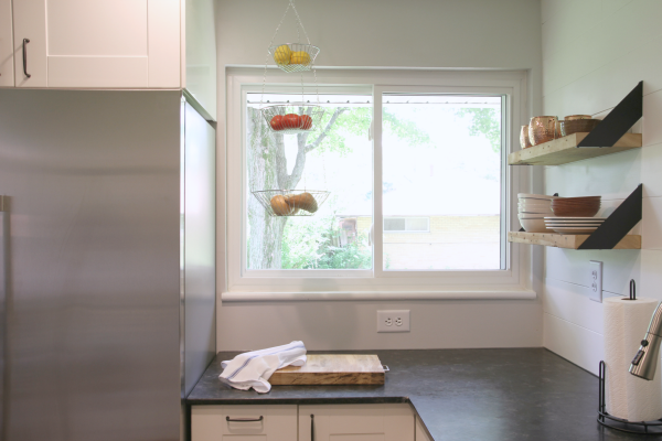
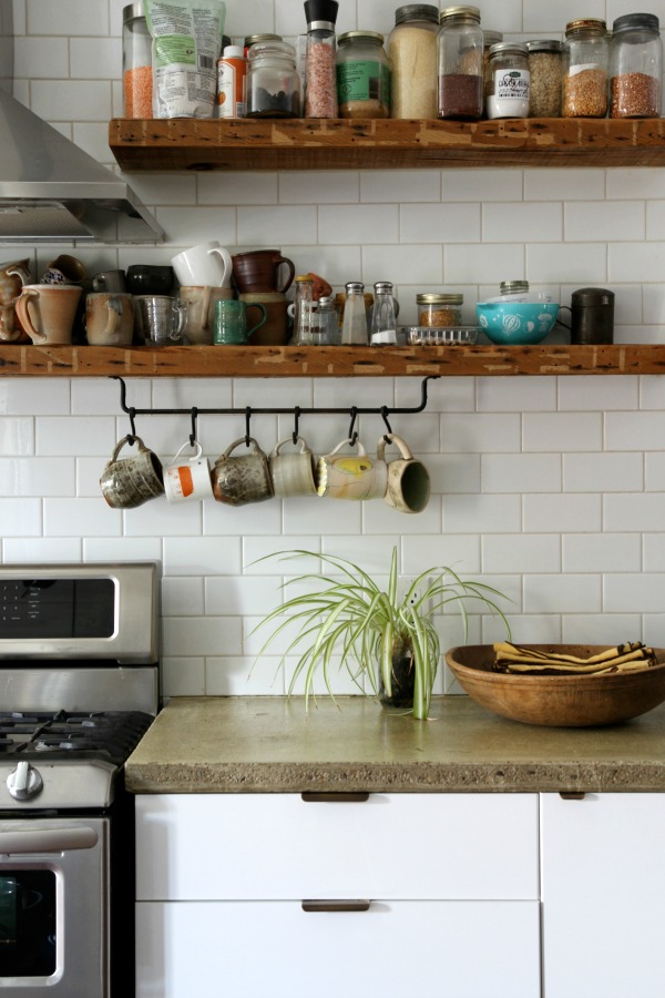
We included a few inexpensive flourishes in this corner to make it feel special. The hanging fruit basket is conveniently located above a trash pull-out next to the fridge.
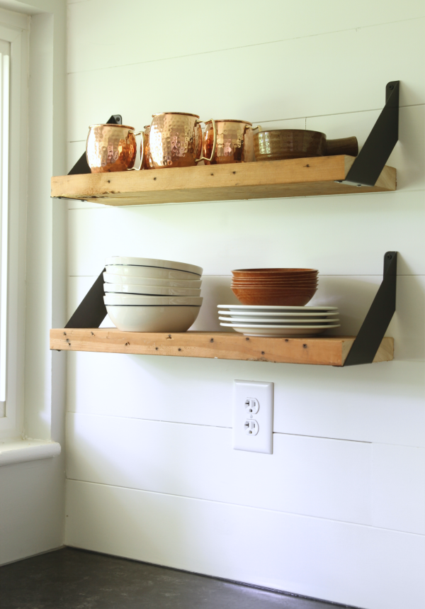
The shelves were DIY’d using four over-under shelf brackets and leftover lumber for $8 total!!
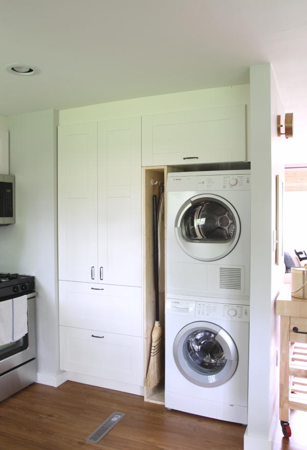
I’ve been dreaming of that floor-to-ceiling cabinet since we installed it three years ago. So. Much. Storage. We found the like-new stackable Bosch washer and dryer on Craigslist for a steal and it reinforced our decision to keep the laundry out of the garage. An upper cabinet and plywood cubby provide easy (on the eye) access to practical things like detergent, cleaning supplies, a broom and ironing board.
We didn’t touch the existing floor vent. It’s a bit of an eyesore but moving it would have involved messing with the concrete slab which we weren’t willing to do.
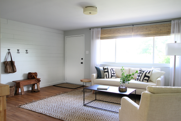
This is the view from the dining area looking to the living room and front door. Notice the two woven shades placed side-by-side to span the width of the large window. All the tricks!
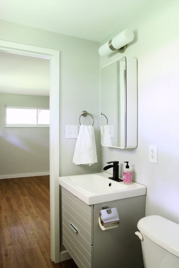
The hallway on the left leads back to the bedrooms and bathrooms.
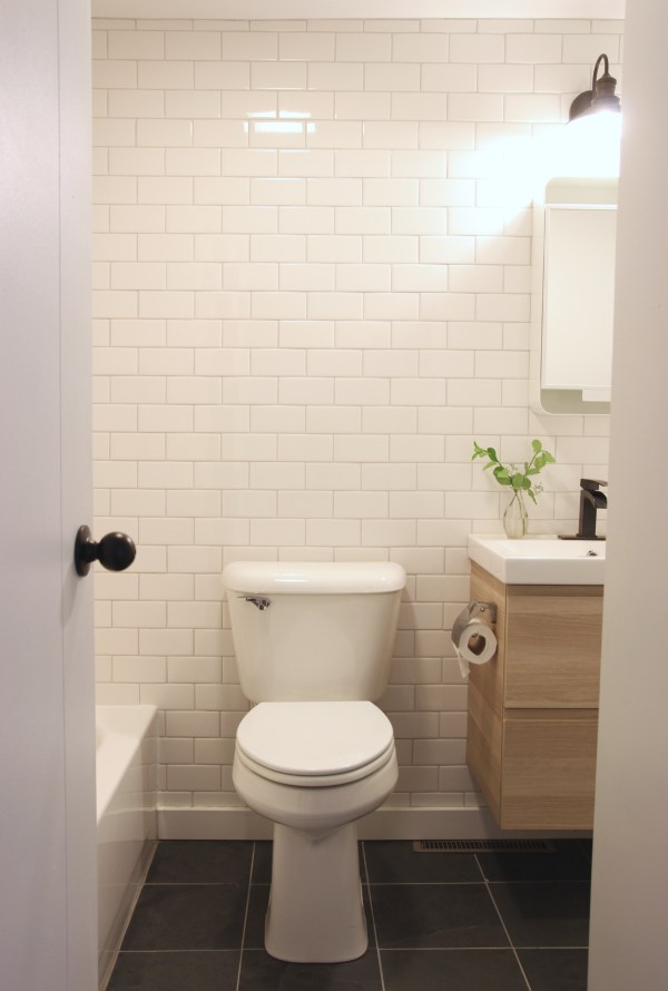
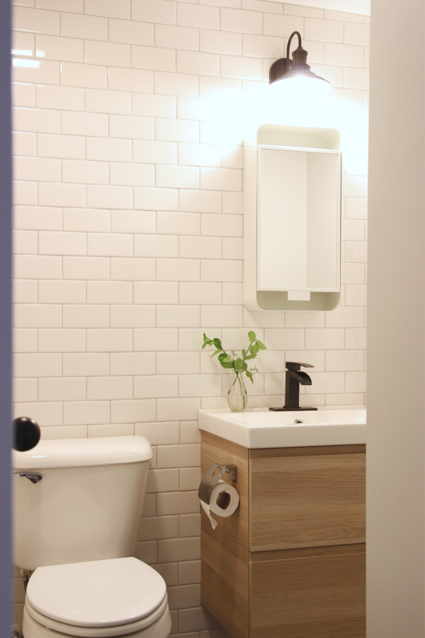
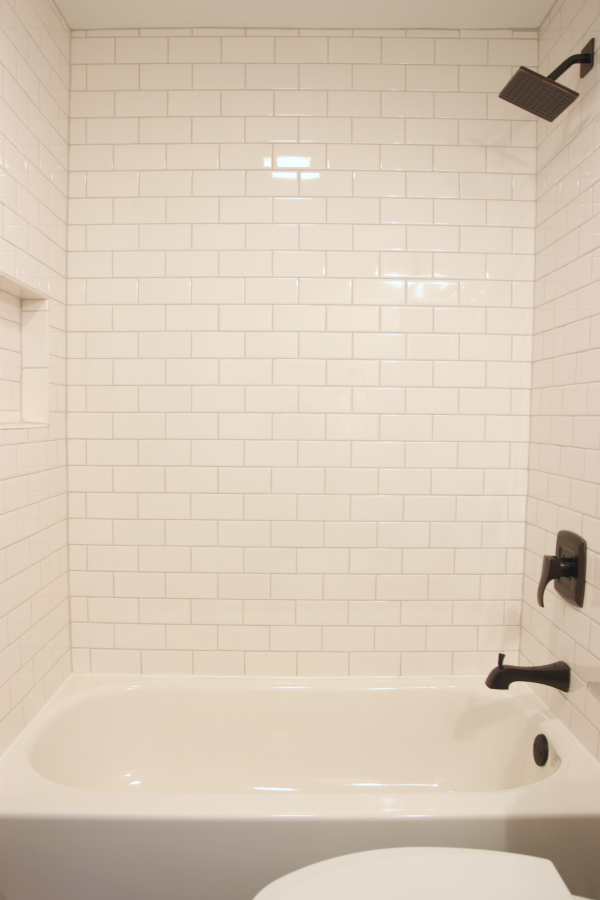
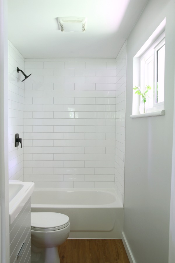
The windowless hallway bathroom was dark and dated. The wall tile was literally falling off so removing it wasn’t even a decision we made…it had to happen. It was already happening! We worked with the original layout to keep costs down. I chose off-the-shelf white subway tile and light gray grout to brighten things up. We took it floor to ceiling on the sink wall. A floating IKEA vanity is another attempt at giving the illusion of more space, plus it’s a cinch to clean underneath. The medicine cabinet is IKEA but, sadly, no longer available. We switched up the flooring in here since the wood lookalike vinyl flooring + wood lookalike vanity would have been too much…wood lookalike. We installed black porcelain tile that resembles limestone but at a fraction of the cost. A new toilet, tub, shower surround (featuring a cute and practical niche), exhaust fan and fixtures complete the room.
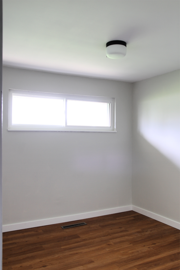
Each of the three bedrooms received new flooring, lighting and paint. You may recall that the smallest bedroom (pictured here) was the source of the infamous pee odor. Initially, we thought the moisture damage under the window was due to a window leak but later concluded (with help from our inspector) that it was only urine damage. Ew. No mold or mildew but, still, ewwwww. I did a bunch of research into getting rid of the odor. We were prepared to pay a professional if my attempts didn’t work but, luckily, they did. First, I sprayed the afflicted area (floor and wall) with distilled white vinegar, let it sit for 20 minutes then wiped it up. I did this approximately a half-dozen times. After that, I did several rounds (three?) of Pet Stain & Odor Miracle enzyme solution over a few days. I bought a gallon of the spring mint scent and used it all. I cannot express how amazing this stuff is!! Not a tinge of urine odor remained after using it, and I have an extra sensitive sniffer! Miracle stuff, I tell you. I did this early on in the renovation and followed up with Kilz2 multi-purpose primer then paint on the wall. Worked like a charm.
We chose not to stage the bedrooms because they’re on the small side and we wanted potential buyers to envision using them as they saw fit without furniture cluttering things.
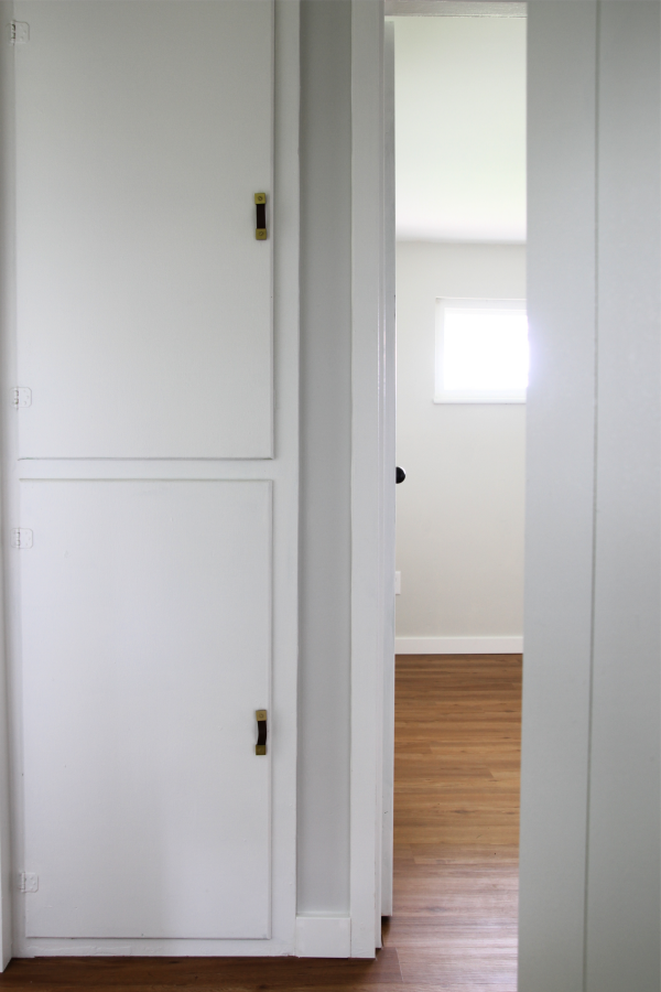
A built-in linen closet between the first and second bedrooms is my favorite original feature of the house. I cleaned it out, gave it a fresh coat of paint (okay, more like three coats) and added faux leather pulls from Target. It turned out super cute and created a happy lil’ moment in the hallway.
Notice anything missing from the master bedroom? Yep, the window air conditioning unit was put out of its misery. We had central air added to the existing forced-air heating system. We kept all the original interior doors (surprise, they’re metal!) but updated them with paint and new doorknobs.
I hesitate to call this a master bathroom but it’s attached to the master bedroom so…”master” it is. Once again, we worked with the original layout focusing on cosmetic changes to minimize costs. We used a slightly larger off-the-shelf subway tile for the shower surround. The vanity and medicine cabinet are IKEA but appear to be unavailable now although this gray option is pretty darn close.
And that’s it! You may be wondering what work we hired out and what we did ourselves so here’s the breakdown:
HIRED OUT
- electrical (panel relocation & upgrade)
- central A/C installation
- window installation
- gutter installation
- garage door installation
- plumbing (gas range, tub, washer/dryer hookup)
- water heater installation
- drywall finishing (kitchen/laundry)
- kitchen countertop installation
DIY
- demo & reframing
- exterior fascia & soffit installation
- minor exterior masonry work
- flooring installation
- kitchen design, build & installation
- fixture installation (lighting, faucets, shower heads, toilets, hardware)
- tile installation
- trimwork & paint
- landscaping
- general cleanup & styling
- listing & selling
We listed and sold the house by owner. We held an open house late in the spring of 2017 after a nine-month-long renovation. Roughly twenty different potential buyers (or just curious folks) attended. The house was under contract within a week. We closed two months later, a year and a day after purchasing the house as an estate sale. The timing was deliberate. In our area, there are tax benefits to owning a property for at least a year and we fully capitalized on that. After all was said and done, we pocketed $20K. People who aren’t house people always ask, “So what does that work out to in terms of dollars per hour?” We just laugh. We’ve never done the math. My guess is it would be negligible.
Going into all this, we knew it wouldn’t be your standard 4-6 week flip. We fully expected it to take as long as it did with both of us working regular day jobs and wanting to do some of the work ourselves with three kids in tow. We’re happy with how the house turned out overall (no carpet, no builder beige – just a tidied up, lightened up version of the original) and we were stoked to get it on the market in spring when the demand is highest. Obviously, depositing $20K felt pretty good especially considering it was our first flip and we earned it doing something we enjoy. As a family, we made some fun memories, too. The kids still refer to it as The Pee House and always point it out on our way to the local library. They reminisce about climbing trees and picnicking in the backyard. In fact, while writing this they’ve each peeked over my shoulder and said, “Hey, that’s The Pee House!”
Are there things we wish we could have done differently? For sure! (That dreamy Dutch door being one of them.) But they would have cut into our profit and priced the house out of the range we were hoping to stay in after reviewing comps in the area. For me, the absolute hardest part of the entire process wasn’t figuring out what to do, it was figuring out what NOT to do. Would we flip again? Absolutely. Will we be quitting our jobs and starting a real estate investment company anytime soon? Um, that’s a hard no. We like the idea of keeping it a profitable side gig.
Peace out, house people.
BONUS: How many times can you spot the small vase of honeysuckle in this post? Haha!
images: Dana Miller for House*Tweaking


budget decor, DIY, IKEA kitchens, renovation