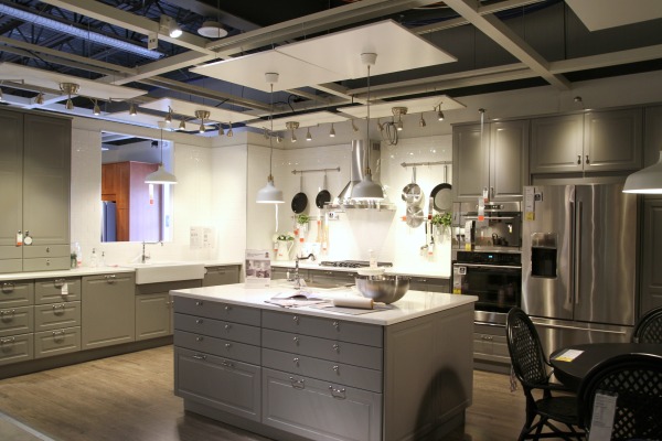
Ikea debuted their new kitchen system, SEKTION, earlier this week. Mabrey and I took a field trip to check it out. I brought along my camera to document the things that caught my attention and I thought I would share them with you. There’s one caveat: the pictures aren’t the best quality. I was in a time crunch and chasing a toddler so…yeah…my focus and white balance are all over the place. But, whatever. I have pictures!
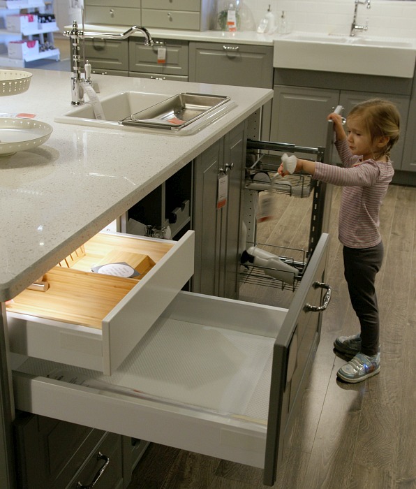
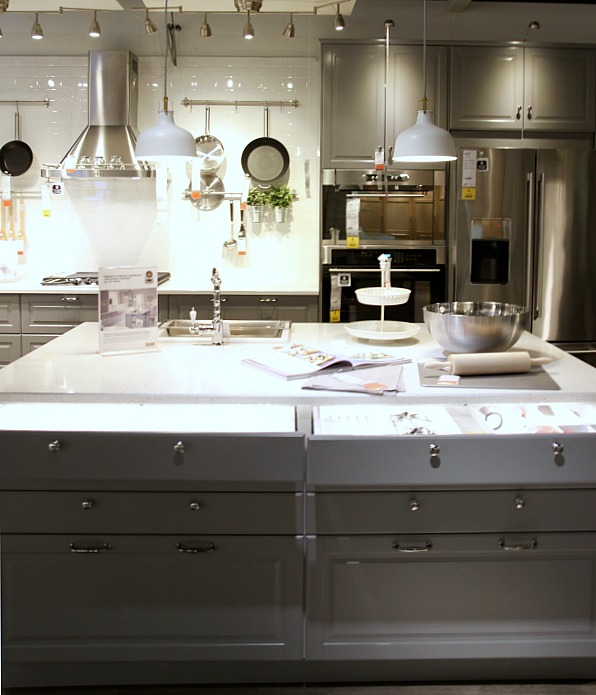
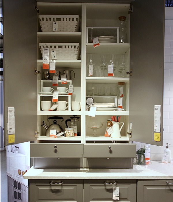
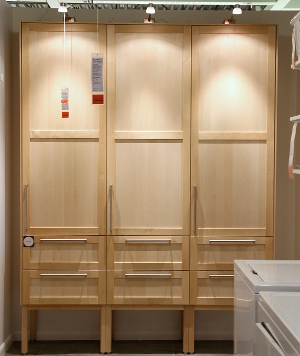
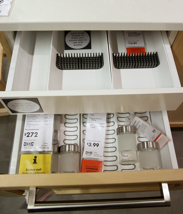
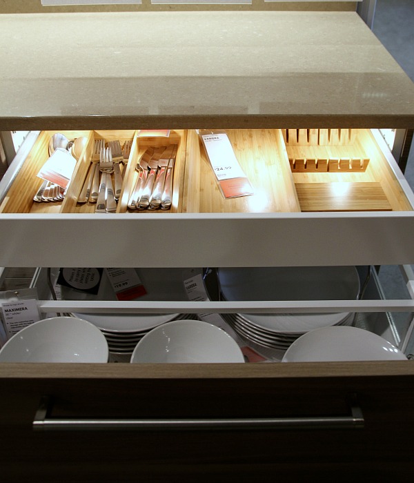
The first thing I noticed right off the bat were the drawers – specifically the drawers inside drawers. I like this option because the outside appearance doesn’t dictate the storage inside. You can have several drawers behind one drawer front for a uniform look. And you have the option of drawers that pull out all the way or only ¾ of the way if they’re layered over another pullout. The drawers themselves are available in several widths and depths that weren’t offered in the previous AKURUM line. I saw the widest, most shallow drawers I’ve ever witnessed in a kitchen in that island above. They would be perfect for flatware and servingware. Fortunately, the soft-closing hardware is still available with the SEKTION line.
Drawer lights (seen above) that turn on when the drawer is opened were an oooh-ahhh feature but from what I could tell they only lit the top drawers. I’m not sure how practical they would be for our household. Don’t people usually turn lights on anyway? I hear the new SEKTION line also features USB outlets, electrical outlets and remote-controlled dimming / power but I didn’t see this on display.
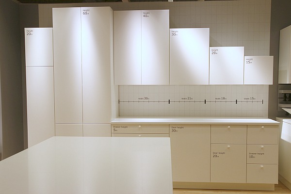
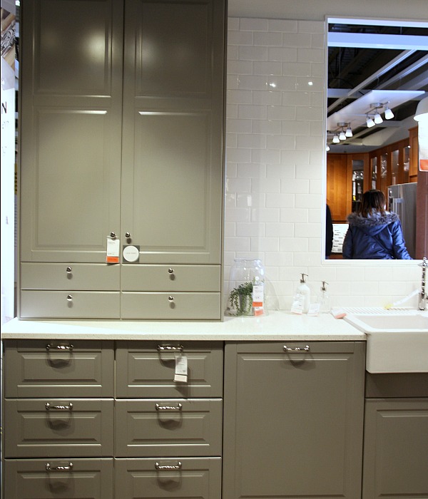
Both upper and lower cabinet frames are available in more sizes (width, depth, height) which I see as an improvement over the AKURUM line. When we were designing our kitchen there were a few places in the layout where we didn’t have much of choice when it came to cabinet size. It wasn’t a deal breaker but it would have been nice to have more options. Also, in the AKURUM line a 15″ cabinet wasn’t really 15″ wide. It was something like 14 5/8″ which made things a little confusing.
The new SEKTION line measurements are true measurements. That means a 15″ cabinet is really 15″ wide. This also means the two lines aren’t compatible or interchangeable. I asked an Ikea kitchen specialist about how Ikea was handling customers needing AKURUM parts. She said AKURUM parts would be available until October 2015. After that, only if there was a warranty issue, Ikea would work to get the customer something comparable. I don’t quite know what that means though, seeing as how the new system isn’t compatible. (I’m hoping we never need to replace anything!) I did see where SemiHandmade will continue making doors / drawer fronts for the AKURUM line so AKURUM owners will be able to switch out their fronts if they want to.
The new sizes allow for an array of configurations. The hutch-like setup shown above was a unique feature that felt somewhat custom as far as Ikea goes. (Notice the shallow, short drawers at the bottom of the upper cabinet.) With the new system, the base and upper cabinets can be installed via a wall rail whereas with the old AKURUM line, only the upper cabinetry had the option of a wall rail. I’m guessing this will help DIYers (and professionals alike) who may be installing on their own or in a home with uneven walls or floors. We used the upper rails so Steve could install the wall cabinets on his own (I was preggo at the time) and they worked out really well for us.

The one feature I’m so, so happy to see (and a little jealous of, quite frankly) is the brown wood lookalike color option for the cabinet frames. I was surprised this wasn’t an option when we were designing our kitchen. Slivers of the white cabinet frames are barely noticeable in between a few black drawer fronts / doors on our base cabinets. Guests say they don’t notice, but it’s the one thing I would change about our current setup if I could. I’ve contemplated painting those areas black or applying strips of black veneer. No need to worry about that with the new system though. As seen above, the “wood effect brown” frames work well with darker colored drawer fronts and doors. They look less cheap when opened, too. No white box staring you in the face.
I noticed a few other interesting design elements like open shelf base cabinets and freestanding units made up of cabinets + legs. I think both of these could help lighten a room visually.
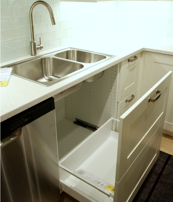
One new option I didn’t like was this undersink pullout. It’s made to look like two drawers from the front but it felt flimsy because the front panel is so tall. Plus, I don’t think it’s very practical. What if one person is washing dishes and another person needs to grab something from under the sink? You can’t move to one side like you can with two doors.
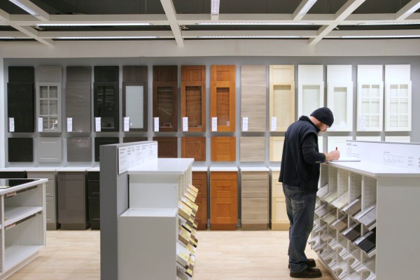
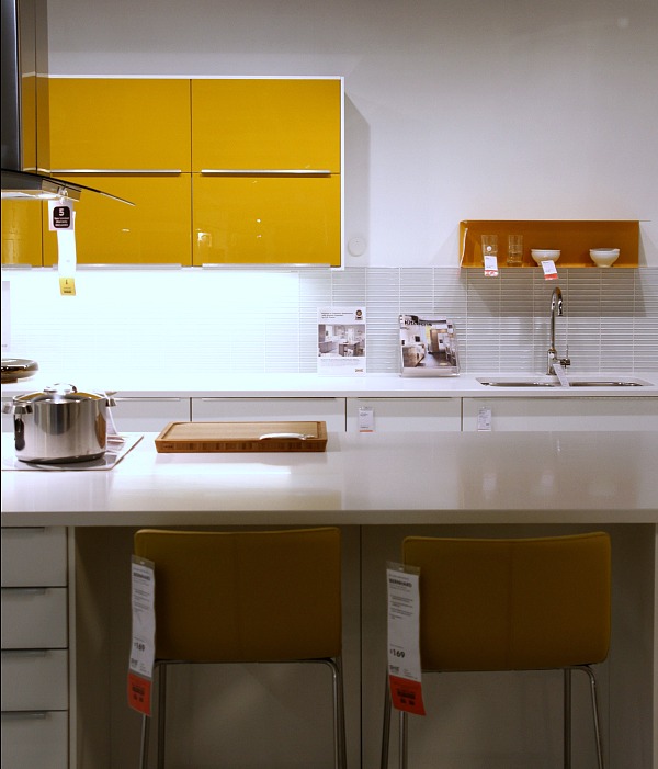
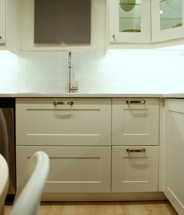
As far as aesthetics go, many of the “new” drawer fronts and doors look a lot like the “old” options. There are a few new finishes in the mix including glossy yellow and glossy green if that floats your boat. I really wish Ikea offered an unfinished wood option that would be less expensive than the ready-to-hang designs and could be painted any color of the rainbow for a truly custom look. Ikea, are you listening?!

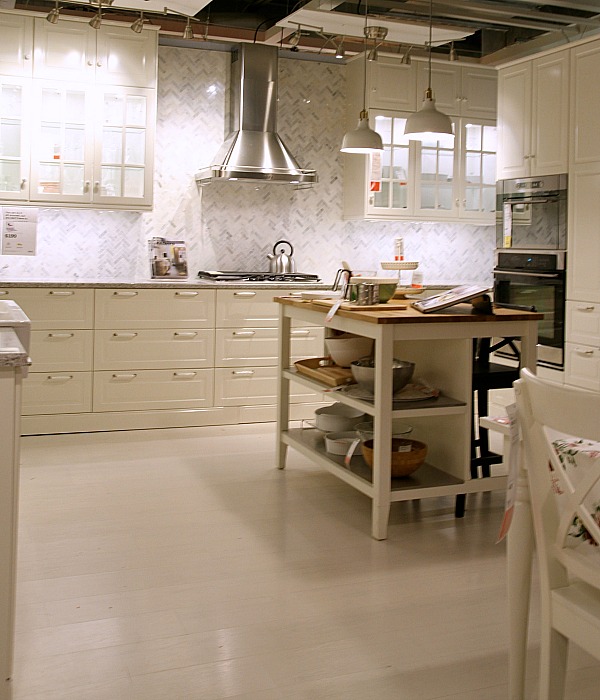
I totally understand that Ikea caters to the masses but I do wish they would push the envelope a bit more when it comes to their kitchen displays. It was nice to see an island sporting a waterfall edge and a herringbone backsplash.
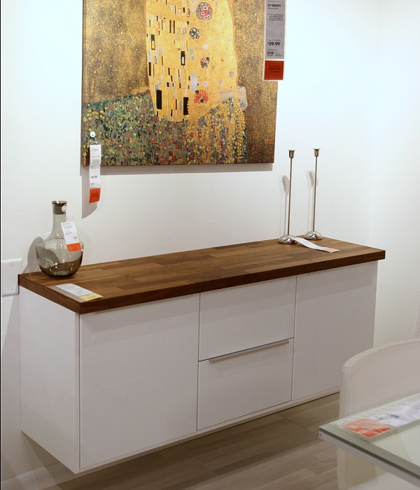
I didn’t get a chance to scout the countertop and hardware selection but I did see a walnut butcher block! On a fauxdenza no less! Ikea must read blogs. They’re on to us. Update: it appears the walnut butcher block is actually solid wood veneer over particleboard.
Some more drawer-in-drawer action because I couldn’t get enough…
In conclusion, I’m pretty impressed with the new system. I was a little afraid Ikea would veer off course with the SEKTION line but I feel like they made smart improvements upon the old system that was so popular. Here are my take it / leave it suggestions in case you’re interested.
TAKE IT
*varied selection of new true cabinet sizes
*drawer-in-drawer action
*dark wood lookalike cabinet frame option for darker fronts
*freestanding units / open base cabinets
LEAVE IT
*integrated drawer lighting
*undersink pullout
Have you checked out the new SEKTION line in person? If so, I’d love to hear your thoughts. If not, you should make a day of it and go open & close a bunch of drawers and doors. You know, if that’s your thing. (It’s my thing.)
P.S. – A great write-up on the new SEKTION line.
images: Dana Miller for House*Tweaking
Ohhhhh, the kitchen.

The original kitchen was walled off from the living and dining rooms.
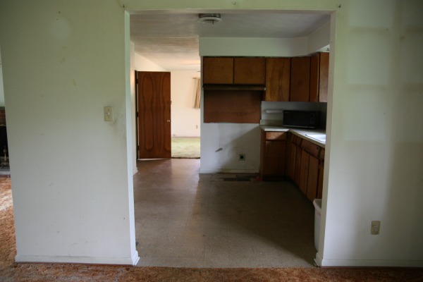
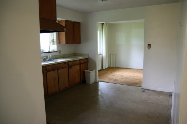
If the cabinets had been in better shape, we might have tried to work with them but, sadly, they were rotted and the doors / drawers didn’t open or close properly. The odd layout assigned the refrigerator to a lone corner with no storage or counter space nearby. There was no dishwasher.
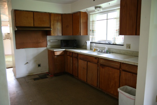
One thing we liked about the kitchen was the window above the sink which looks out onto the backyard. It was one of the few windows that had been replaced by the previous owner.
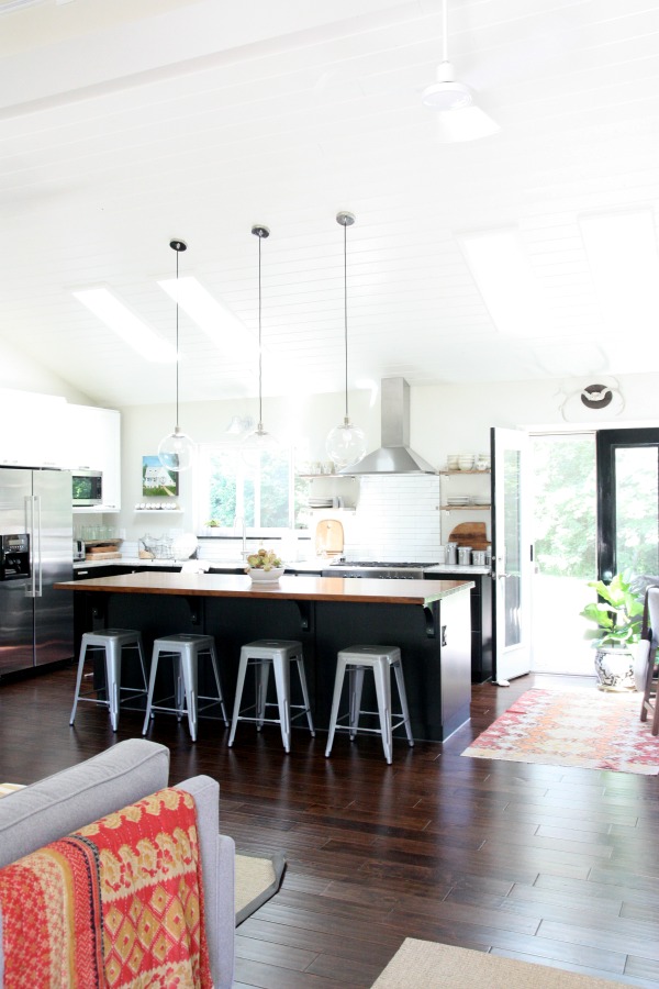
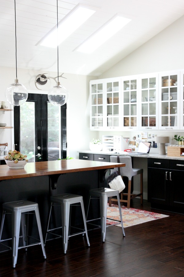
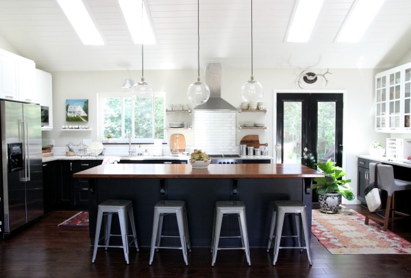
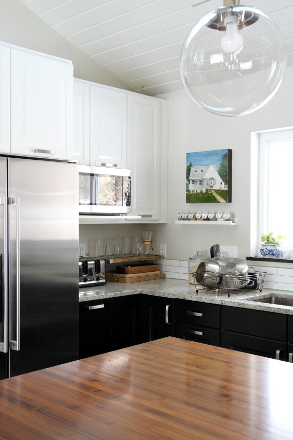
To enlarge the kitchen and create a more functional layout without altering the house’s original footprint, we removed walls separating the kitchen, living and dining rooms. We aren’t formal people so the small dining room was relocated to allow for a large island. The dining room window was replaced with french doors to connect the kitchen to the backyard. A vaulted ceiling and skylights flood the north-facing space with natural light. It’s a far cry from the dark, soffit-heavy room we started with.
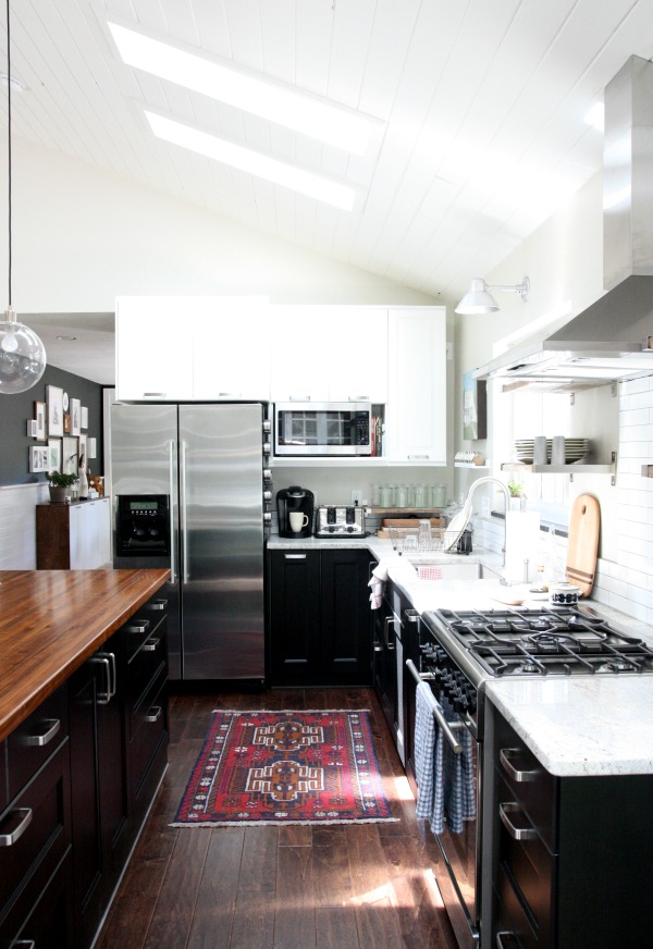
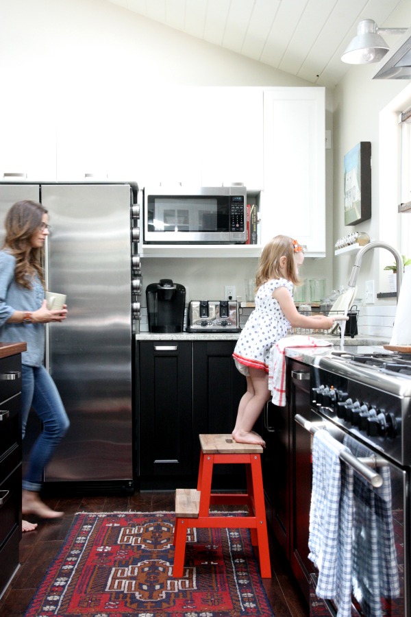
We had our plumber run new water and gas lines to accommodate the current layout. A counter-depth refrigerator stands where the stove once lived. A freestanding range occupies the site where a wall used to separate the kitchen from the original dining room. A new dishwasher is located to the right of the sink. It’s hidden behind a cover panel that matches the base cabinetry. When the house came to us, a microwave sat in a corner eating up precious counter space. We added a shelf next to the refrigerator to house the microwave and a few cookbooks which freed up counter space for a coffeemaker, toaster and shelf of drinking glasses.
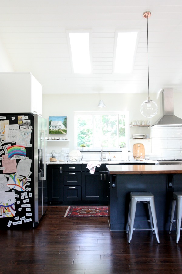
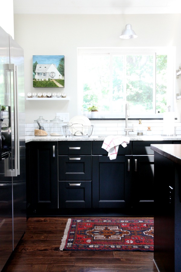
One thing we didn’t change was the location of the sink. I like that I am able to look out the window when I’m washing dishes to admire the greenery or watch the kids playing.
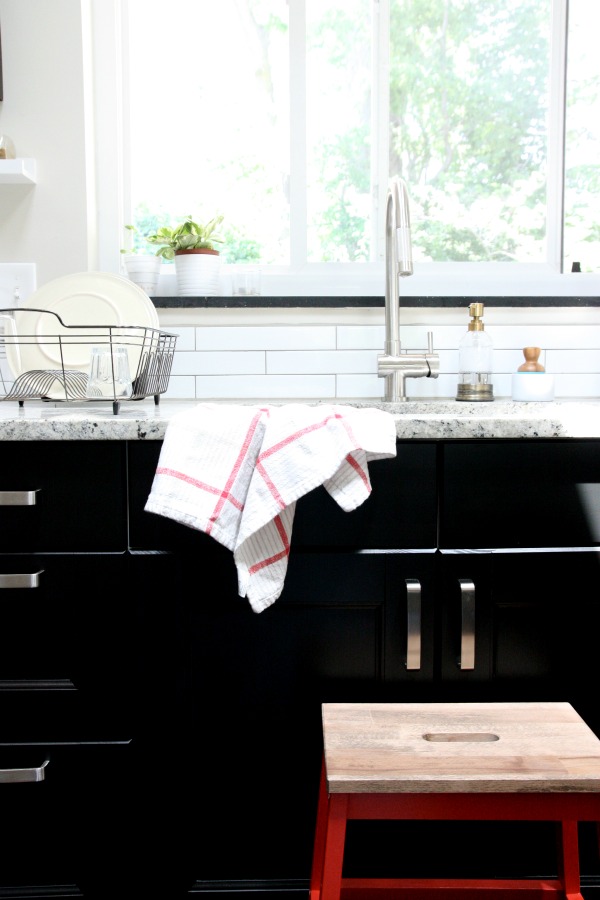
We opted for solid surface countertops around the perimeter of the kitchen for easy maintenance. An extra deep, under-mounted, single basin sink makes cleanup a breeze.
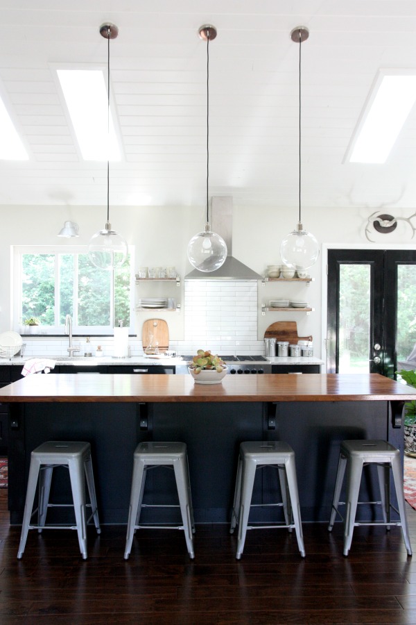
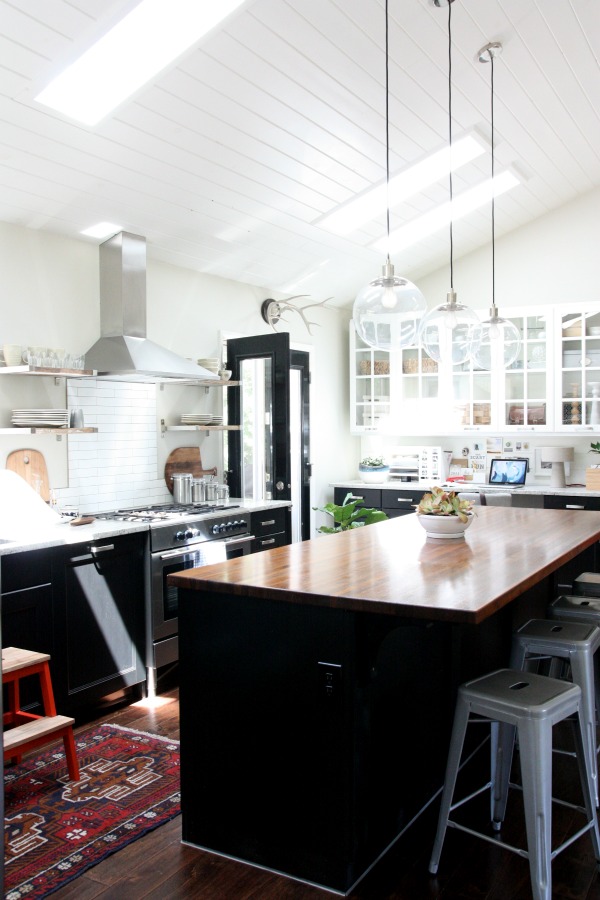
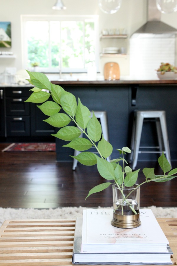
The nine-foot-long island is the hub of the house. It sees as much Play-doh, crafting and homework as it does meal prep, entertaining and casual dining. We topped it with a walnut slab to give it the feel of a wood table since we eat most of our meals here. It’s a warm contrast to the granite in the rest of the room. Guests always comment on the island and wood top saying they feel like they’re at a bar. We take it as a compliment.
We suspended a trio of pendants above the island. I wanted something that would punctuate the island but not impede the view of the kitchen from the adjoining living space. Clear globe lights were an ideal choice. I especially like the black cloth cords. The pendants are on a dimmer so we can have bright light for food prep or low light for dining and ambiance.
I chose durable metal counter stools to stand up to the kids and their inevitable messes. I wipe them down with a wet cloth and they look brand new. To keep the view from the living room to the kitchen uninterrupted, the stools are backless. This feature also makes it easy to turn around to talk with someone in the living room. Initially, I had some reservations about using backless stool with kids but it hasn’t been an issue.
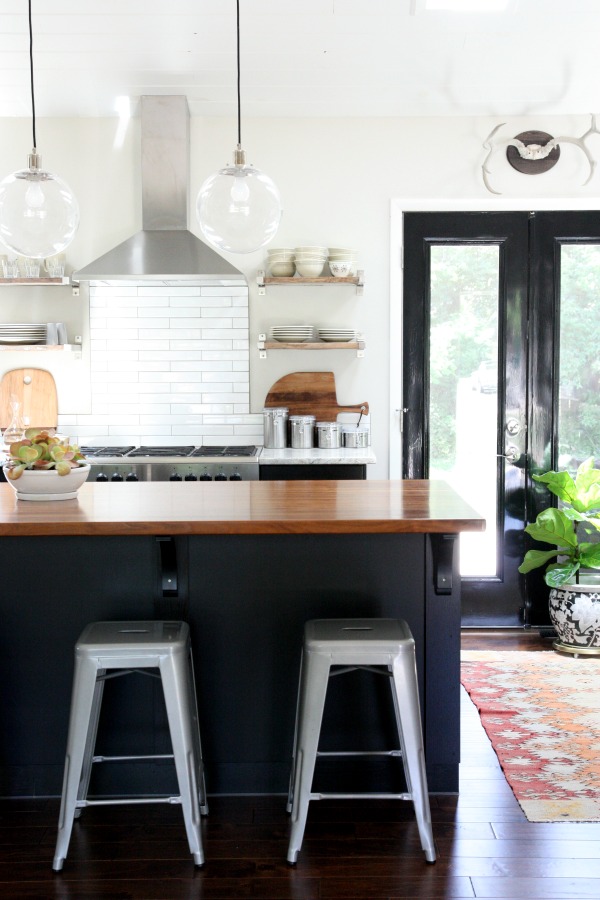
We kept the back wall free of upper cabinetry and installed reclaimed wood shelves. A sleek range hood and minimal backsplash add to the open feel. It’s nice to look over from the living room and not be bombarded with a slew of wall cabinets or an entire wall of tile. I really wanted the kitchen to feel like an extension of the living space instead of a kitchen thrown into a living room. To achieve this, we continued the engineered hardwood flooring into the kitchen. The wood flooring, walnut island top and reclaimed wood shelving help bring warmth to an innately utilitarian room.
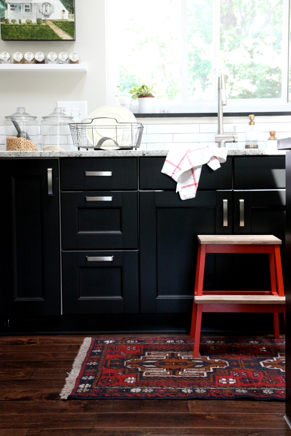
The cabinetry is Ikea. From the get-go, I had my heart set on a tuxedo kitchen: dark lowers, white uppers. I wanted dark base cabinets to ground the kitchen in such an open space. I wanted white wall cabinets to keep things light. A mix of black and white just made sense.
We fell hard for the Ramsjö black-brown base cabinets but were disappointed with the slightly pink tone of the coordinating white wall cabinets. In the end, we used three different door styles. (Ramsjö black-brown, solid front for the bases and Lidingö white, solid and glass-front for the uppers.) I was a little worried about the mix on paper but in real life I think it goes a long way in helping the kitchen feel less generic.
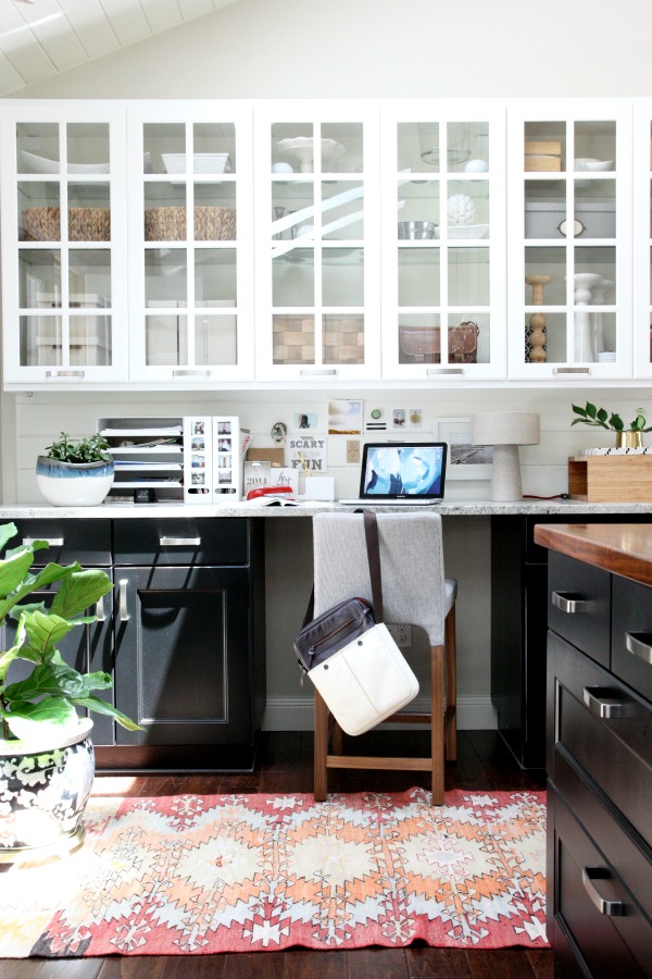
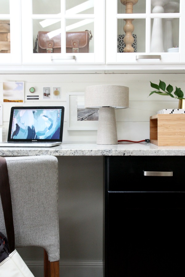
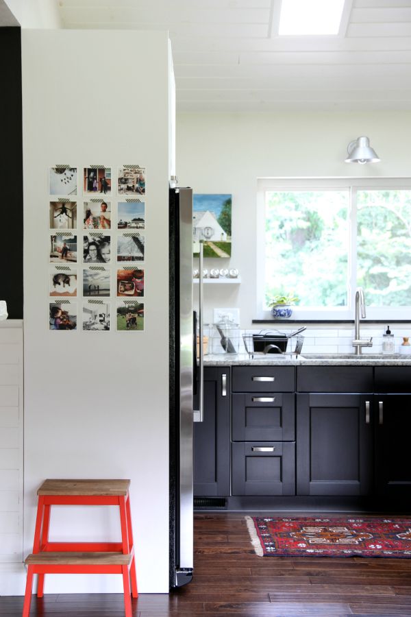
One end of the kitchen is devoted to paying bills, making grocery lists, creating meal plans and all the other secretarial tasks that go along with running a household. It’s also where I do the majority of writing and photo editing for the blog. Essentially, it’s a home office. Base cabinets hold a printer, office supplies and the kids’ crafting supplies. Upper, glass-front cabinets provide pretty storage. I use an assortment of baskets, bins and boxes to corral vitamins, batteries, camera accessories, receipts, crayons and a bunch of other miscellaneous. The planked backsplash is a repeated element also found on the ceiling and TV wall.
To give the kitchen space a cozy vibe, I added greenery, artwork, vintage rugs, an upholstered desk stool and a linen-covered lamp. It feels lived. It is lived in.
There are a few tweaks yet to be made in the kitchen. (We need to add a trim piece next to an upper cabinet in the corner near the microwave and I’m brainstorming an interactive side panel for the refrigerator.) But I’m very lucky to be able to spend the majority of my time in this bright and airy space. In the evening when the kitchen is tidy after dinner and the dishwasher is humming away, I pour myself a glass of wine and golden light glows through the skylights. It’s my happy place.
UPDATE: The trim piece and side panel are done! See the trim piece here and the side panel here.
Resources of note:
wall paint – Benjamin Moore tapestry beige
trim, ceiling, planked backsplash paint – Benjamin Moore white dove
french door paint – Glidden trim & door oil paint, extra high gloss in deepest black
flooring – Jasper engineered hardwood handscraped birch in Texas brown via Build Direct
base cabinets – Ikea, Ramsjö black-brown
wall cabinets – Ikea, Lidingö white
perimeter countertop – kashmir white granite via Stone Design
walnut countertop – Hardwood Lumber Company
island corbels – The Home Depot
hardware – Ikea (Värde handles sans rosettes)
refrigerator, dishwasher, gas range, range hood – Ikea
microwave – LG
sink – Kraus 32″ undermount single bowl
faucet – VIGO stainless steel pull-out
backsplash tile – imperial bianco gloss 2″ x 12″ via The Tile Shop
backsplash grout – Laticrete epoxy grout in natural grey
globe pendant lights – West Elm
counter stools – Overstock
wall sconce above sink – Barn Light Electric
house artwork near sink – gift
spice rack – Ikea
glass storage containers – Wal-mart
kitchen towels – Crate & Barrel
step stool – Ikea, painted & stained
rug near sink – ebay (seller was manhattanrugs)
open shelving – DIY using Ikea brackets and reclaimed wood
oil & vinegar drizzlers – Amazon (These are the best!)
stainless steel containers – Target
antlers – etsy
black & white planter – vintage
rug near desk – etsy
desk stool – Blu Dot knicker stool
laptop bag – STM
blue & white planter – JoAnn’s
letter tray – Ikea
magazine files – Ikea
linen lamp – Crate & Barrel
wood cubby – Kalon Studios
highchair – Ikea
art above highchair – Clare Elsaesser
mat & frame – Utrecht art supplies
tongue & groove planks – Home Emporium
skylights – Velux
In case you’re interested in seeing how this space came together over time, a slew of kitchen-related links:
KITCHEN RENOVATION
*https://www.housetweaking.com/2011/08/21/kitchen-island-pendants/
*https://www.housetweaking.com/2011/08/30/a-few-new-things
*https://www.housetweaking.com/2011/10/25/light-skies/
*https://www.housetweaking.com/2012/02/03/let-there-be-light-and-some-cabinets/
*https://www.housetweaking.com/2012/04/14/if-you-cant-stand-the-heat/
*https://www.housetweaking.com/2012/05/22/finishing-the-walnut-butcher-block/
*https://www.housetweaking.com/2012/05/24/installing-the-walnut-butcher-block/
*https://www.housetweaking.com/2012/05/25/countertops-are-in/
*https://www.housetweaking.com/2012/11/01/kitchen-backsplash-tweaked-shelves/
*https://www.housetweaking.com/2013/12/06/cabinet-lighting/
*https://www.housetweaking.com/2014/03/11/our-pantry-a-tasty-giveaway/
IKEA KITCHEN
*https://www.housetweaking.com/2011/06/03/an-ikea-kitchen-in-the-making/
*https://www.housetweaking.com/2011/06/15/an-after-dinner-ikea-run/
*https://www.housetweaking.com/2012/06/29/ikea-appliance-reviews/
*https://www.housetweaking.com/2012/07/09/designing-our-ikea-kitchen/
*https://www.housetweaking.com/2012/07/12/purchasing-our-ikea-kitchen/
*https://www.housetweaking.com/2012/07/20/installing-our-ikea-kitchen/
*https://www.housetweaking.com/2015/07/21/fridge-side-panel-in-a-tuxedo-kitchen/
DECOR
*https://www.housetweaking.com/2011/08/21/kitchen-island-pendants/
*https://www.housetweaking.com/2012/08/06/those-stools/
*https://www.housetweaking.com/2012/08/22/our-kitchen-cabinets-color-matched/
*https://www.housetweaking.com/2012/10/05/ill-take-it/
*https://www.housetweaking.com/2013/03/14/a-new-desk-rug/
*https://www.housetweaking.com/2013/08/11/what-happened-to-the-wall-planter/
*https://www.housetweaking.com/2013/09/30/a-kitchen-rug/
*https://www.housetweaking.com/2013/12/01/sink-hole-quick-fix/
*https://www.housetweaking.com/2014/02/04/the-cheapest-most-loved-fiddle-leaf-fig/
*https://www.housetweaking.com/2014/04/11/how-im-not-killing-my-fiddle-leaf-fig/
*https://www.housetweaking.com/2014/02/24/i-call-it-the-stop-stool/
*https://www.housetweaking.com/2015/01/20/how-i-clean-the-globe-lights/
*https://www.housetweaking.com/2015/01/23/how-i-clean-the-wood-floors/
*https://www.housetweaking.com/2015/01/28/lots-of-little-things/
*https://www.housetweaking.com/2015/05/19/a-play-kitchen-before-and-after/
*https://www.housetweaking.com/2015/07/21/fridge-side-panel-in-a-tuxedo-kitchen/
KITCHEN DESK
*https://www.housetweaking.com/2012/09/27/organizing-the-kitchen-desk/
*https://www.housetweaking.com/2013/12/12/kitchen-desk-backsplash/
*https://www.housetweaking.com/2013/12/16/the-kitchen-desk-backsplash-painted/
*https://www.housetweaking.com/2014/03/04/baby-steps-in-the-unfinished-bathroom/
*https://www.housetweaking.com/2014/02/16/my-home-workspace/
*https://www.housetweaking.com/2014/02/26/diy-sueded-cord-cover/
*https://www.housetweaking.com/2016/02/03/diy-wood-bead-styling-strand/
For ease, you can access this kitchen tour under the “See My House” tab in the side bar along with a general house tour and other room tours. Thanks for reading!
images: Dana Miller for House*Tweaking


budget decor, DIY, inspiration, interior design, renovation