I shared how we wrangle the household paper trail a few weeks back, and it spurred a tangent question: What do you do with all the kid art? I thought it might be helpful to share some ways we save and display the kids’ creations while still keeping our home mostly clutter-free. This is just what we do and what works for us. It’s not meant to be a strict ruleset. In fact, it’s a pretty loose system. But if you come across something you can implement in your home, great!
For starters, all three of my kids are creative in their own ways. Layne makes the most intricate Lego and origami creations. Everett LOVES to draw and work with clay. Give him a pencil and a blank piece of paper and he’s a happy camper. (He’s exceptionally good at capturing facial expressions.) Mabrey is really into painting with watercolors, coloring, writing her name (sometimes on her bed, ugh), copying text and taking pretend food orders. (Sorry, I don’t have any burgers. Would you like some fish and a lemon? Her restaurant never has what I ask for and she always suggests “unique” alternatives. Cracks me up every time.) She’ll also sit beside Everett while he’s drawing and try to reinterpret his pictures in her own way. It’s pretty cute. We rarely buy cards. The kids almost always make the cards we give for all sorts of occasions.
Layne and Everett are in grade school (6th and 3rd grade, respectively) and they occasionally bring home art-related stuff from school, but I remember the preschool years when it felt like every day was a damn art show! Haha. That’s where we are with Mabrey now. For the most part though, the majority of kid art is made at home. Art supplies are of one of the few things (books are another) that I tend to let pile up because they really do hold my kids’ attention in constructive ways. (Toys and clothes, not so much.) Art supplies are stored in the base cabinets in the desk area of the kitchen, and art is usually made at the kitchen island.
As for what we do with the masterpieces once they’re made…it really depends. Coloring book pages and preschool art are usually displayed on the fridge or fridge side panel temporarily. Mabrey has been known to tack her paintings on the wall near her play kitchen with washi tape, too. I usually give them a week or two, then they’re recycled to make room for inevitable new art.
Everett often gifts his drawings to friends, neighbors and family members. (You can spy one of his creations in Mabrey’s room.) He absolutely loves sending snail mail. He also likes to display recent drawings on the book ledge in his bunk.
Custom Lego airplanes and RV’s make their way on to the living room shelves and usually stay there until the pieces are needed for the next big thing. I’ve found origami sculptures in the laundry nook (and even the car!) when Layne is on one of his origami folding sprees, but we try to keep them contained to the top of his dresser and woven floor baskets in his room. He’s also been known to take requests from friends and teachers, so those pieces follow him to school.
Some art ends up in Steve’s cubicle at work. (Mabrey has the funniest exchange going on with one of Steve’s co-workers. Each week they trade handmade pictures or cards via Steve. It’s hilarious and super sweet.)
When projects are sent home at the end of the school year, I take a picture from above of them all laid out on the floor. We hang on to them for a week or so then pick our favorites to store in a tote up in the attic. If we both like the same one best, we keep one. If we like two different ones, we keep two. (Seasonal pieces like handmade ornaments are handled a little differently and stored with similar decorations to be displayed each year during the appropriate holiday.)
As you can see, kid art is in a continuous state of flux in our home. We hold on to absolute favorites and display others temporarily or gift them to others. I can’t imagine my kids wanting more than two dozen pieces of their own kid art once they’re grown and out of the house. And I can’t help but feel the more I save, the less special it is because it isn’t all that rare. But maybe that’s just me? Luckily, my kids seem more interested in the process of creating and trying new techniques to achieve a certain result than in coveting their actual creations. Still, I’ve been wanting to try to incorporate some kid art in our home in a more permanent way than just a tote in the attic.
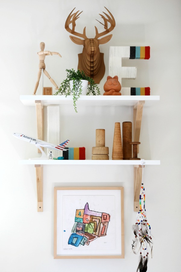
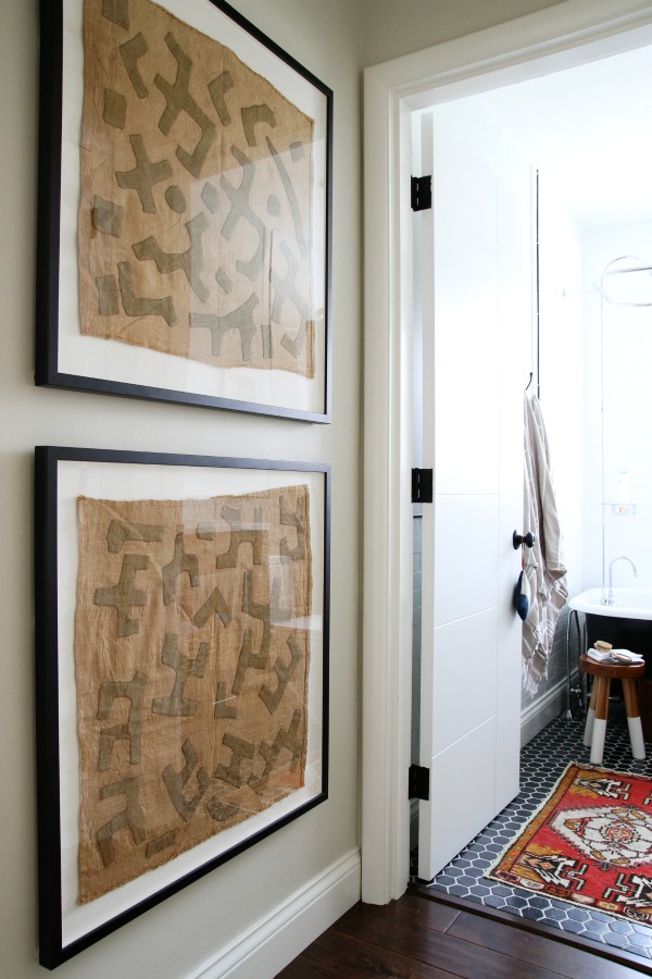
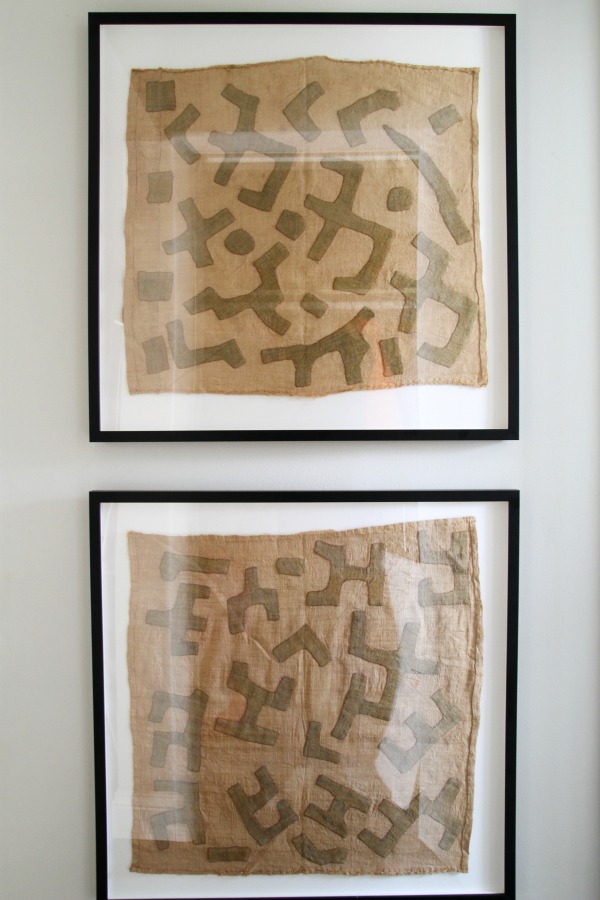
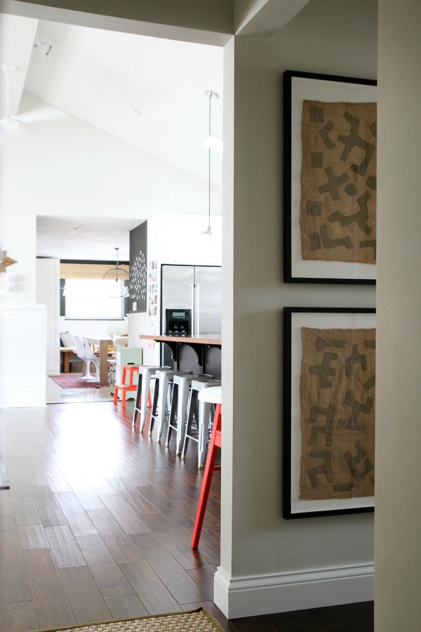
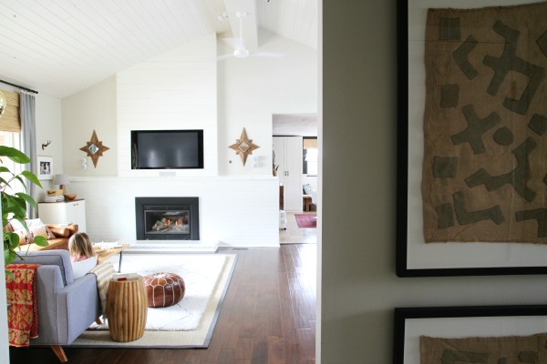
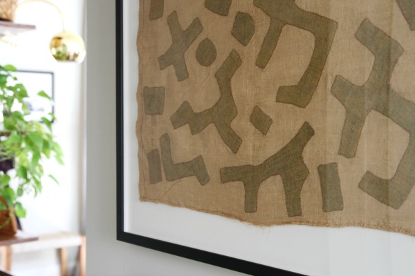
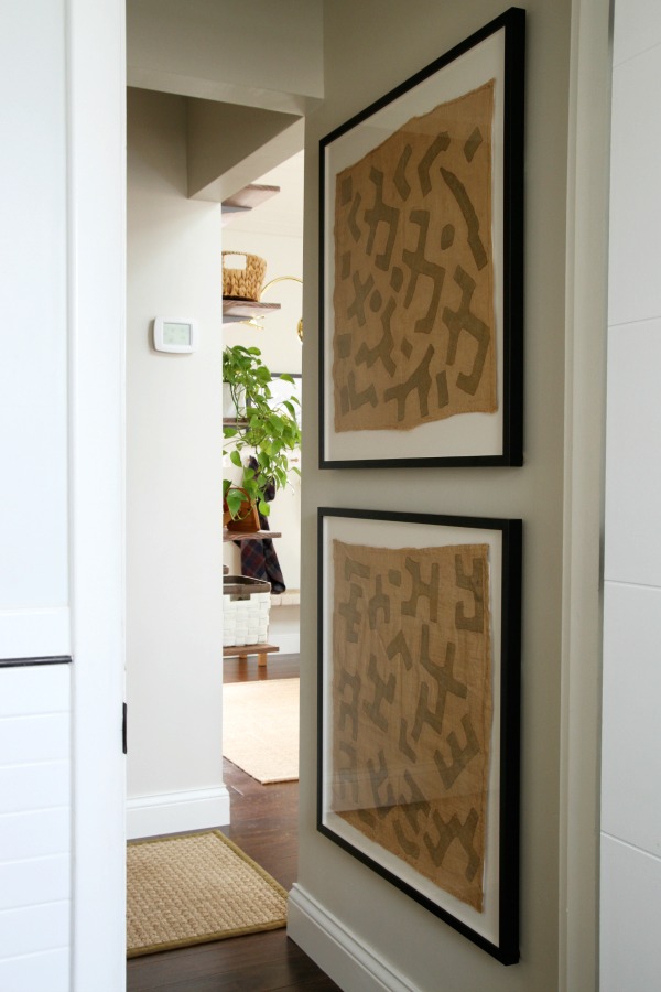
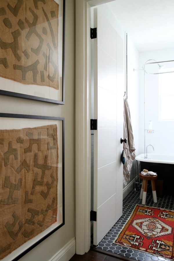
A few months ago, I climbed into the attic and brought down an abstract that Everett made in kindergarten. For years, I had been envisioning it framed via a float mount to show off the stray paint droplets, chalk smears and crinkled edges…all visual evidence linking it to its handmade origins and its journey from school to home in a stuffed backpack. I had such a great experience using Framebridge earlier this year when I had two pieces of vintage Kuba cloth framed that I decided to go that route again. I created my custom framing order online and selected the float mount, Marin frame and mail-in option. A few days later, a pre-paid package arrived so I could send Everett’s abstract to the Framebridge studio to be framed. In a matter of weeks, it was shipped back.
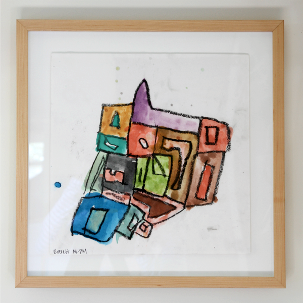
It’s perfect! I wanted to hang it in the hallway, but Everett told me he’d rather have it in his room so I hung it on just about the only wall space left in the boys’ room below a pair of open shelves.
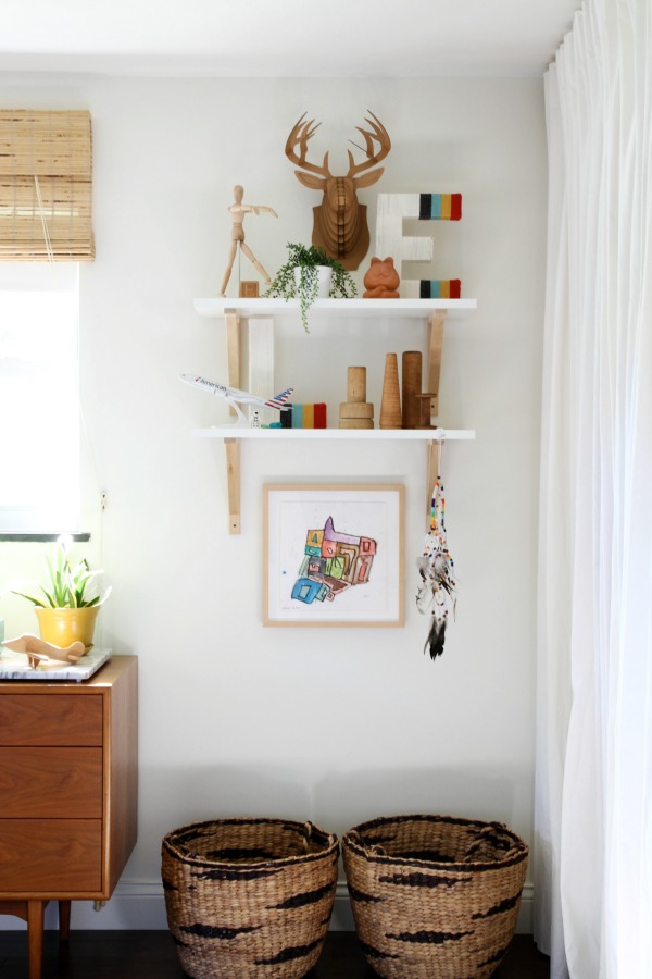
(Those floor baskets are chock full of origami!) Now I have every inclination to grab a few more favorites from the attic and have them custom framed as well to create a mini gallery of sorts in the hallway. I know Mabrey has a few ethereal watercolors up there, and wouldn’t a framed origami collection be so cool?!
Anyway, hopefully that gives you a peek at how we deal with the onslaught of kid art – which isn’t necessarily a terrible thing. As I type, a handmade clay heart sculpture brought home from school is hanging from a hook near the front door. Bricks that the kids found in a nearby creek bed and painted at home are sitting on the countertop next to my laptop. They might not be here a month from now, but we’re enjoying them at the moment.
I’d love to hear your ideas for saving and displaying kid art at home. What works? What doesn’t? We tried a bulletin board a few years back and it just didn’t work for us. It was difficult to see any one thing well. Even though several pieces were on display, they mostly felt lost and jumbled. Maybe if we had more room it could work better?
If you’d like to give Framebridge a try, use the promo code HOUSETWEAKING15 to receive 15% off your first purchase now through January 31st, 2017. Framed art makes a great gift! December 4th, 2016, is the cutoff date for mail-in items. December 18th, 2016, is the cutoff date for print and frame items.
Bring on the kid art!
images: Dana Miller for House*Tweaking


family life, inspiration, kid-friendly, organization