
This past weekend Steve and I met up with some friends from college at their home in Nashville. John and Sara happen to have the same disease that plagues Steve and me. It’s called “We Love Old Houses and Want to Save Them All.” Ever heard of it? Symptoms include weight loss (because who has time to eat when there are cabinets to hang, walls to paint and tile to install?), insomnia, shortness of breath, muscle pain and general fatigue. There is no known cure. Haha.

Anyway, John and Sara bought a lovely 100-year-old home last year and have been working non-stop to update it, doing a lot of the work themselves. (Sara points out that she is very good at holding stuff and telling John how bad his ideas are.) The first major project was a complete kitchen overhaul. The couple’s goal was to optimize the kitchen’s function while merging their modern masculine aesthetic with the home’s age and good bones. As with any renovation of an older home, obstacles were plentiful and included wavy walls, sagging ceilings, uneven floors, ancient electrical wiring and even a case of pneumonia. (That was John. He ran himself ragged working his full-time job and then working on the kitchen until the wee hours of the morning for months.)
But nearly a year later, the couple is enjoying the fruits of their labor. And, fortunately, they were kind enough to let me snap away so I can share their amazing kitchen with you. We spent much of our time catching up and eating our way around the town but I had a few minutes of downtime one evening to set up my tripod. The sun was setting quickly so I apologize for the lack of natural light. Enjoy!
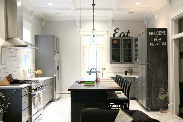
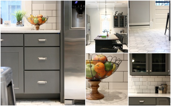
The kitchen sits at the back of the house where the original kitchen once lived. An original door leads to a backyard patio. A wall separating the kitchen from the living room was removed during renovation to open up the space. The original butler’s pantry was closed off from the kitchen. During demolition, John discovered a doorway and transom (seen on the right above) that had once joined the kitchen and butler’s pantry. The couple restored it and plan to set the butler’s pantry up as a bar / coat room.
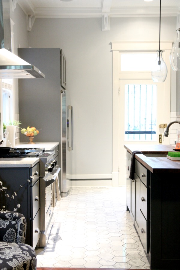
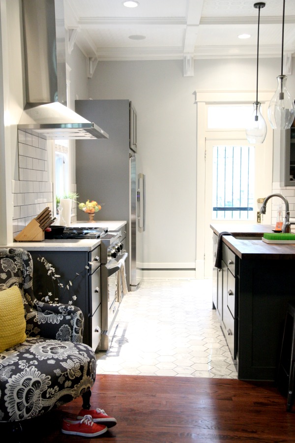
Looking in from the adjacent living room, the left side of the kitchen houses the stove and refrigerator. The thick baseboard is original but I love how John updated it with a stripe of gray paint. It’s little details like this that had my eye traveling all around the room.
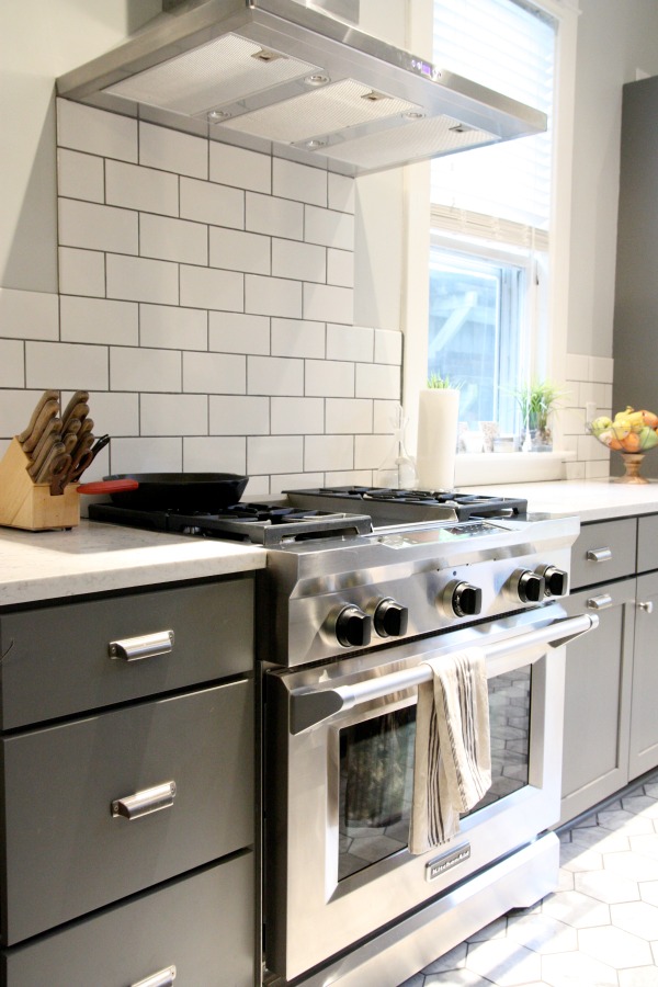
The stove is Kitchen Aid and features a built-in griddle. I had to wipe the drool from Steve’s chin.
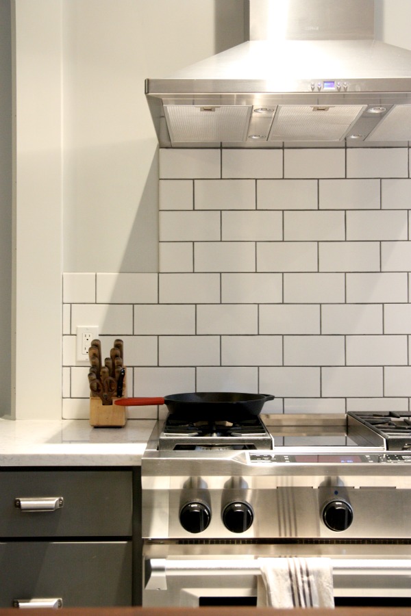
The backsplash is composed of white subway tile with contrasting grout.
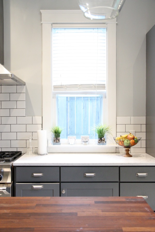
Between the stove and refrigerator is a tall window that extends down to the countertop. I am so envious of this window! The perimeter countertops are quartz. John wanted the look of marble. Sara wanted something low maintenance. It was a no-brainer.
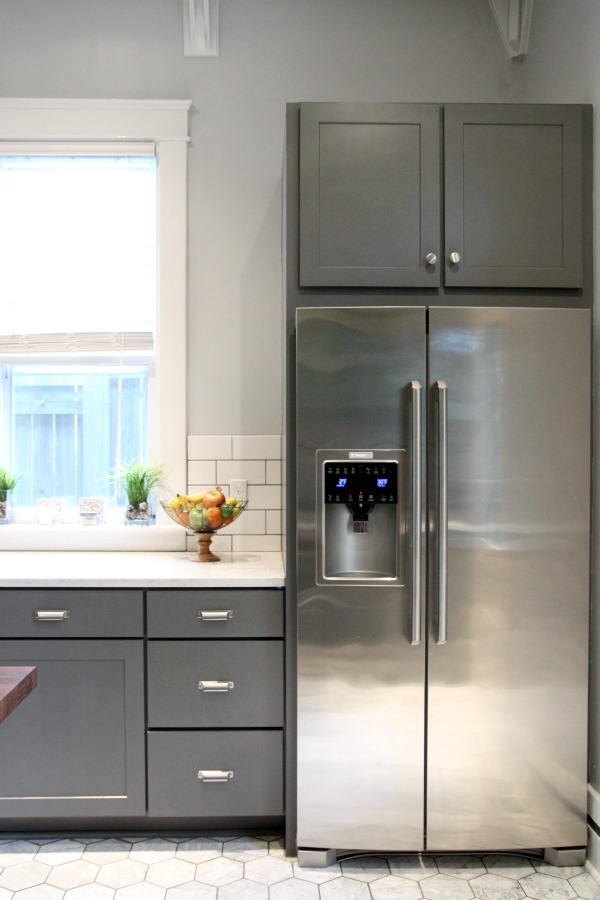
Built-in cabinetry surrounds the refrigerator. The gray cabinets are from Anderson, a local business that specializes in custom cabinetry. Satin nickel hardware complements the stainless steel appliances.
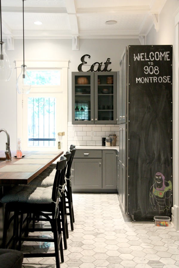
The other half of the kitchen houses more cabinetry for storage, including a large pantry. A magnetic side panel painted in chalkboard paint is a fun touch and a great spot for writing down grocery needs or just doodling. (John and Sara’s two-year-old daughter, Avery, is obsessed with Buzz Lightyear.)
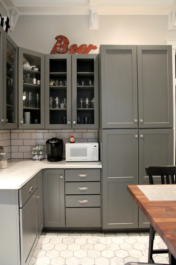
This corner of the kitchen functions as a coffee station. The couple doesn’t rely on a microwave most days so a small one sits discreetly on the counter next to the pantry. Glass-fronted upper cabinets hold dishes and glasses. The “eat” and “beer” signs were bought at a local flea market. (And they pretty much sum up what the weekend was all about.)

Avery likes to hide in the pantry. It’s that big!
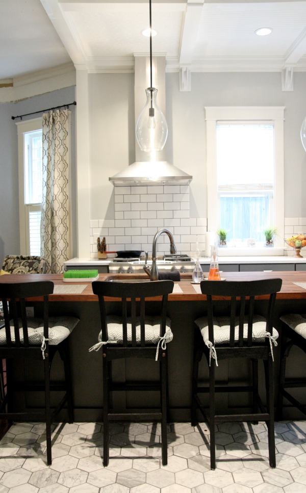
A large island in the center of the kitchen is the hub of the house. It’s topped in walnut butcher block and seats six comfortably. (Four farmhouse stools with backs line one side of the island and two backless stools slip under the overhang at each end.)

The island houses a wide, deep undermount sink. The style of the sink is unique and was new to me. It has two basins which are separated by a divider only a few inches tall. It’s conducive to washing large pots but still allows for that separation that many homeowners prefer. I’ve always been a single basin sink lover myself but this sink’s creative design might convert me.
The walnut is unfinished. John oils it regularly but admitted it was due for another oil.
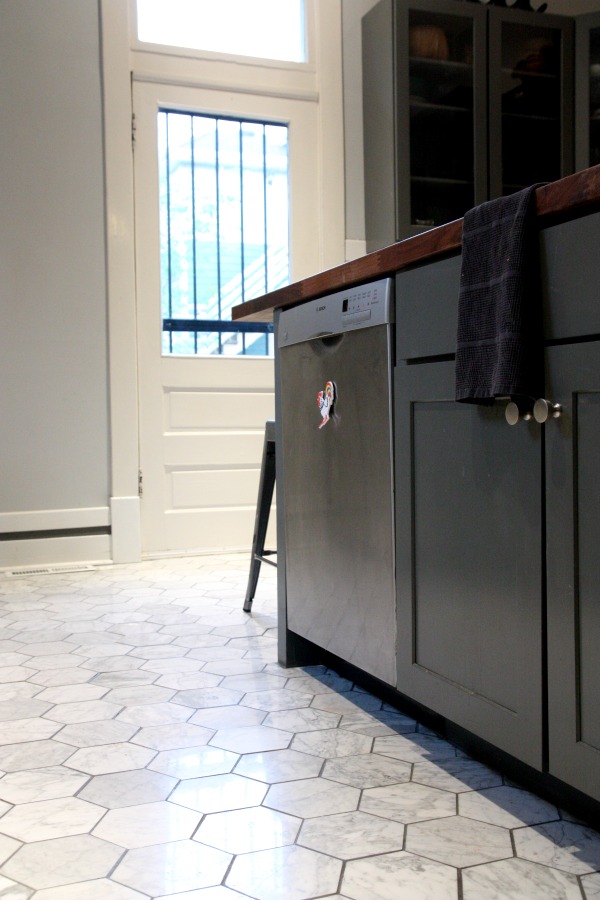
The dishwasher is next to the sink, housed within the island as well. I really liked this setup – with the sink and dishwasher in the island. The person washing dishes can interact with those at the island or in the living room instead of turning their back to them.
Marble hexagon tile covers the floor. The oversized scale of the hex is spot on for a room with 12′ ceilings. And speaking of soaring ceilings…
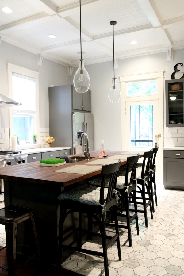
The coffered ceiling was the icing on the cake for me. It gave the entire room a feeling of grandiosity that suited the historic home. The DIY ceiling is decked out in alternating bead board and decorative tin tiles – all painted white. Steve and John installed the last of the ceiling corbels and bonded over caulk during our visit.
Throughout our stay, John had music streaming in through surround sound speakers in the ceiling. It is Music City after all.
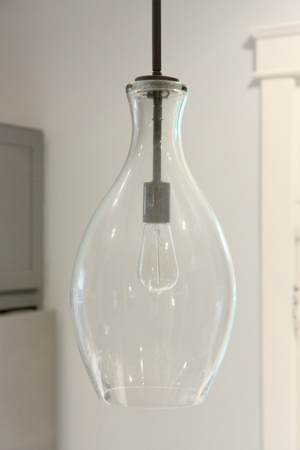
The pendants, sink and many other fixtures are from Ferguson’s, a local bath, kitchen and lighting gallery.
Even though the kitchen is in all regards “new”, it doesn’t feel contemporary. The color scheme, fixtures and finishes are all classic in style, making the kitchen a perfect fit for this old home. I’m so happy John and Sara found this home and are invested in updating it while respecting the things that make it special.
With the kitchen reno finished, the couple is slowly plugging away at other projects as time and money allow. They affectionately refer to the home as their “ten year plan.” Their home has amazing bones and potential but they want to be considerate and patient when it comes to renovating. I can’t wait to visit them again and check out their progress.
Thanks to John and Sara for allowing me to share their kitchen. Because it’s just too good not to!
P.S. – Check back later to see the home’s newly constructed mother-in-law suite! Steve and I stayed there during our visit and basically didn’t want to leave.
images: Dana Miller for House*Tweaking, published with the consent of our friends John & Sara


budget decor, DIY, inspiration, interior design, renovation