Our baby grew up and the nursery is now a legit big girl room.
The biggest difference I made was brightening up the space. I absolutely love dark, moody walls – especially in a nursery (I like sleeping babies) – but I also think rooms should evolve with their inhabitants. My baby preschooler has developed a spunky, colorful personality so I ditched the dark walls in favor of a lighter, carefree boho vibe. Nothing is too perfect. Nothing really matches. It’s all very playful and a bit hippieish. In one word, it’s: Mabrey.
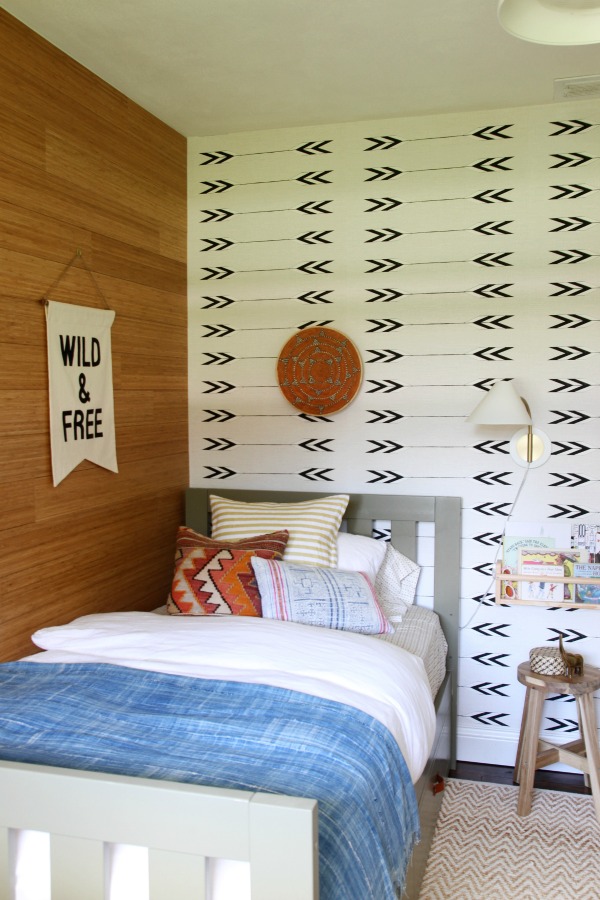


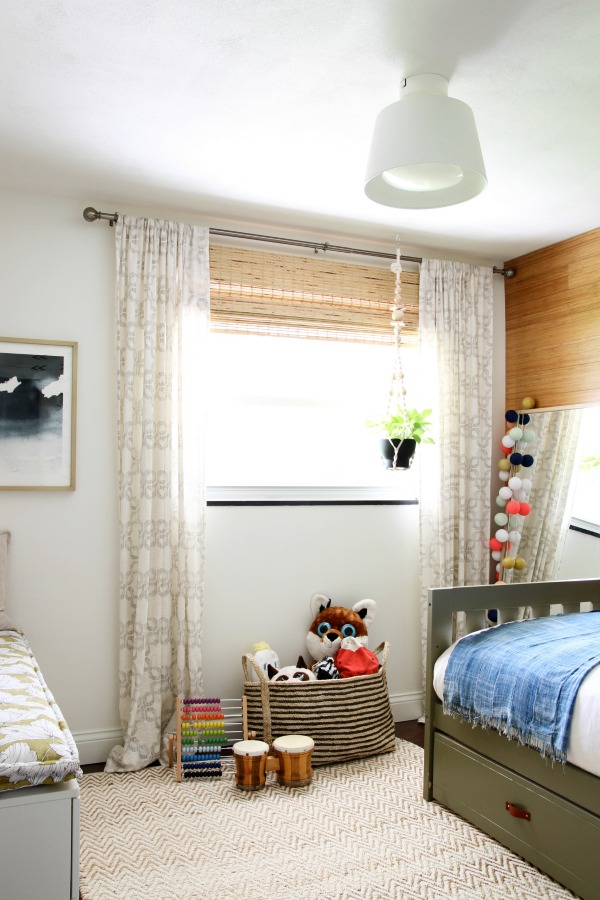
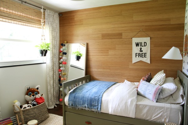
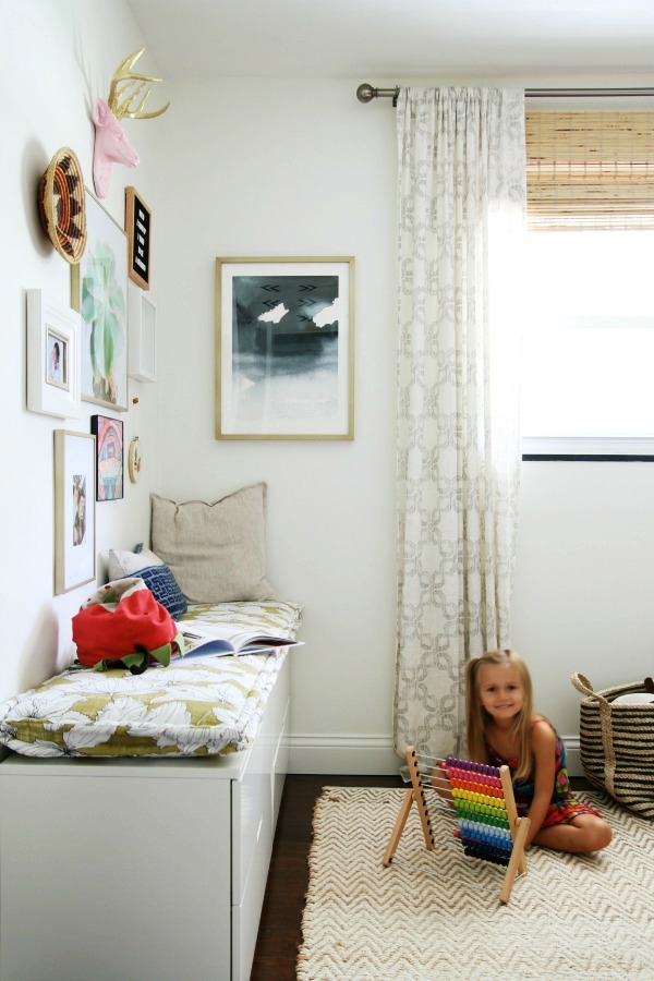
Since the room is tiny (not even 10′ x 10′!) and I only had so much square footage to work with, I decided to have fun with the walls. Two are painted white. One is covered in bamboo planks. One is wallpapered in a Native American-inspired print. If you asked me what the color scheme is, I couldn’t tell you. I guess it’s mostly white and green with hits of pink, blue and rust? Black, wood and woven accents make it feel like a continuation of the rest of the house, but this room is definitely doing its own thing. Often times, so is Mabrey.
I relocated the wood dot hooks to a sliver of wall behind the door. Every inch counts! The hemp string bag keeps borrowed library books separate from our personal library. #sanitysaver I moved the dollhouse and most of the toys and books to the closet to make room for the bed. I guess that means I need to post a closet update soon!
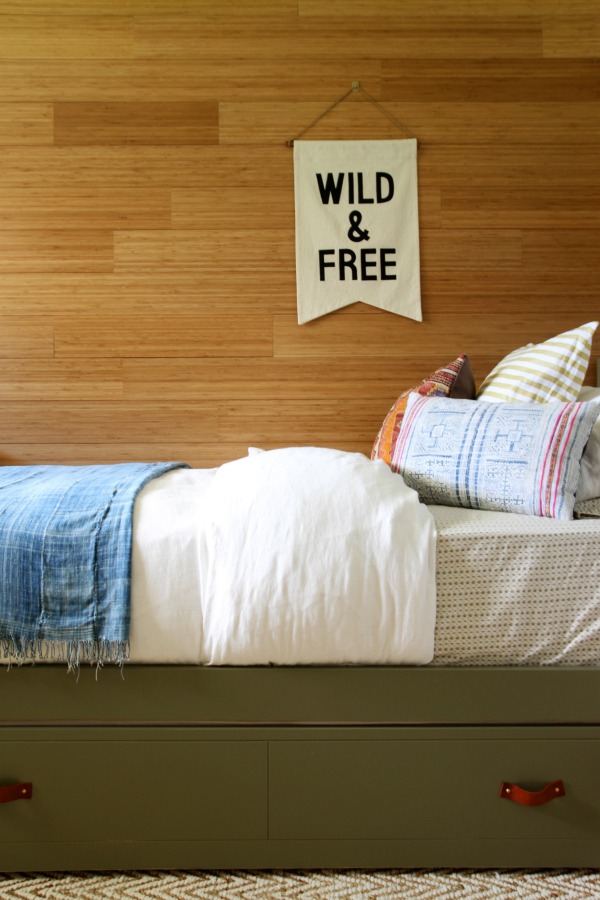
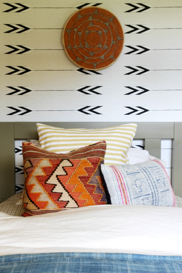
I sold the crib/toddler bed and brought in a new twin trundle. I painted it olive green and added leather pulls to give it a less generic look. The bedding is comprised of new and vintage textiles featuring a mishmash of pattern and color. I opted for a simple, white linen duvet cover to tame things. (It’s actually from the boys’ room. When IKEA was here last winter for a photo shoot, the stylist brought in different duvet covers for the boys’ beds. The boys liked them so much we decided to keep them on the bunks. I held on to the linen covers for Mabrey’s bed.)
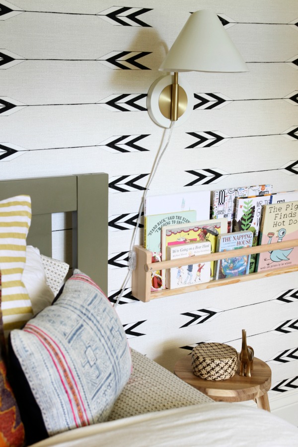
To accommodate the larger bed, I took down the chunky floating shelves circa 2012 and added a wall sconce and shallow bookshelf. I tacked the in-line light switch to the side of the bookshelf with a strip of double-sided tape. A small stool doubles as a nightstand. It can be easily moved away to roll out the trundle bed. (We’ve already hosted a sleepover and it worked great!)

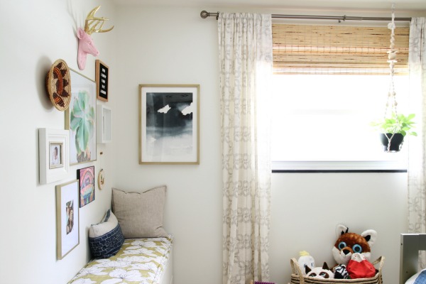
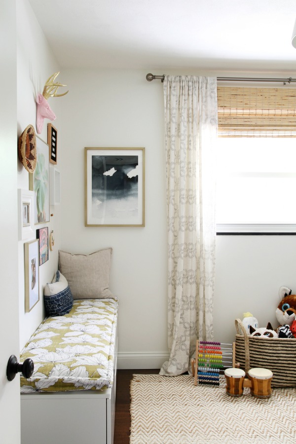
The mirror that previously hung above the changing table leans against the wall at the foot of the bed. (No worries. It’s secured to the wall.) I can remember Mabrey slapping against her smiley reflection in the mirror as an infant. Now she likes to make funny faces in it and check herself out when she’s wearing her mermaid costume. It makes me a little teary thinking about all the different life stages this mirror has seen and will see.
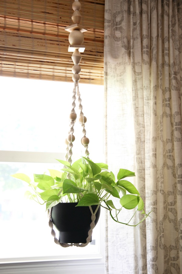
A neon pothos hangs in front of the window.
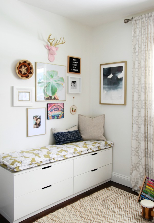

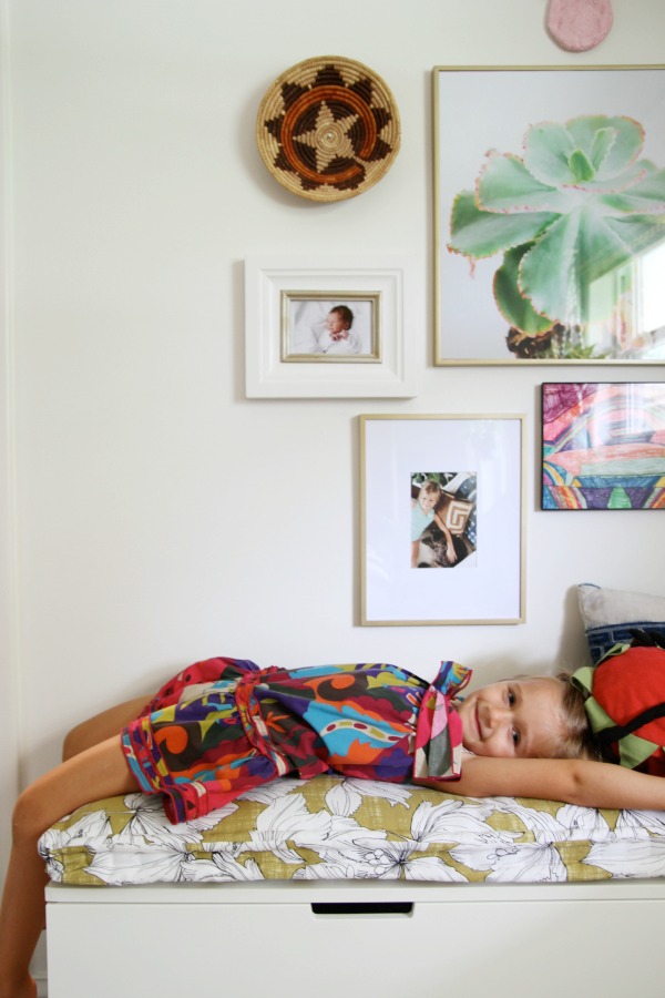
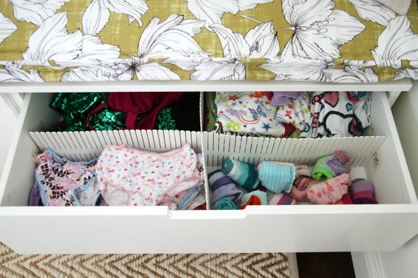
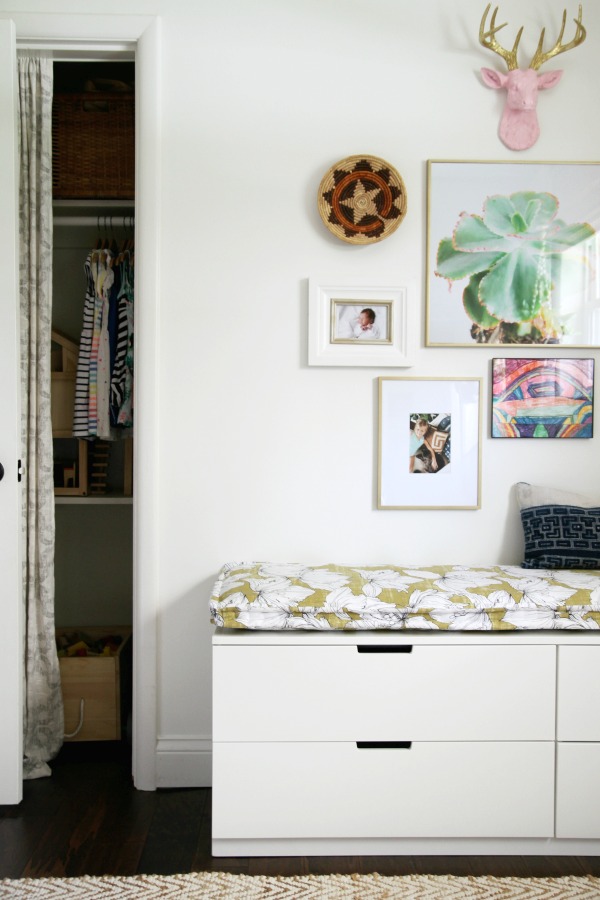
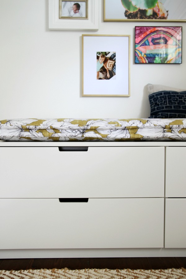
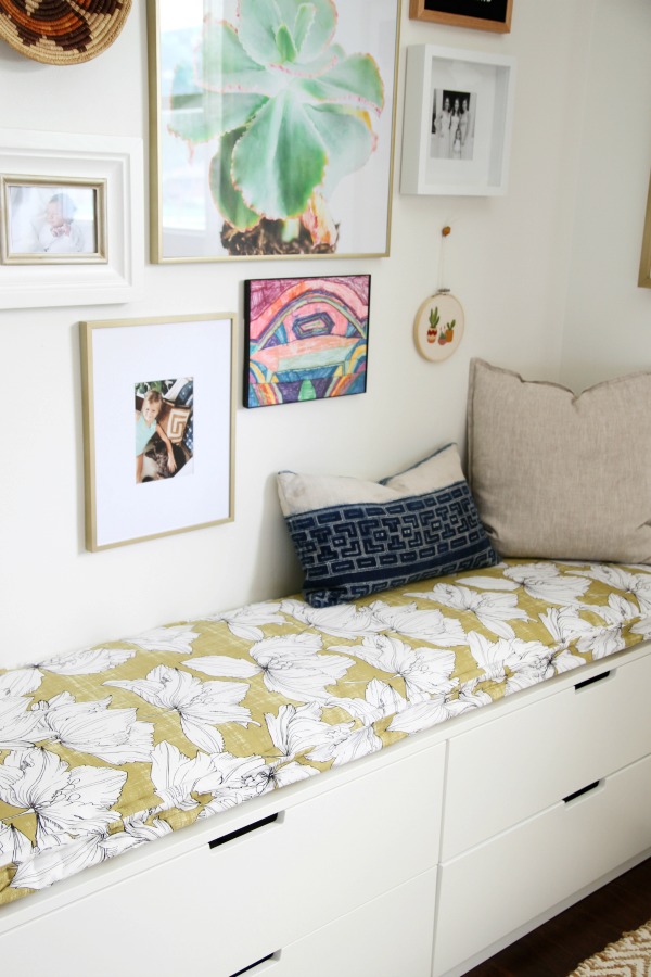
I replaced the changing table with a multipurpose dresser. To personalize the setup, I sewed a custom cushion for the top and created a mini gallery display.
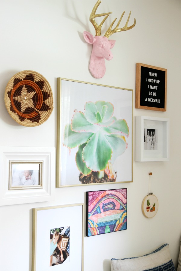
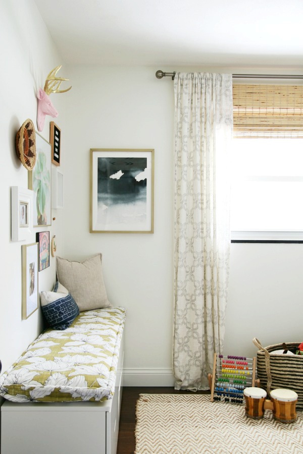
The resin deer head lived in the nursery in its original all-white version, but Mabrey asked me to paint the head “ballet pink” and the antlers “shiny gold” for her big girl room. I happily obliged. The succulent print was a gift from a long-time reader who just so happens to take beautiful photos and sell prints online. (Thanks Joni, it’s perfect!) I framed it in an IKEA STRÖMBY frame that I spray painted champagne gold. FYI – Rust-Oleum’s universal spray in metallic pure gold is a surprisingly excellent match to Minted’s matte brass framing option. The watercolor art on the adjacent wall sports a Minted frame, and I couldn’t believe how similar the finishes are!
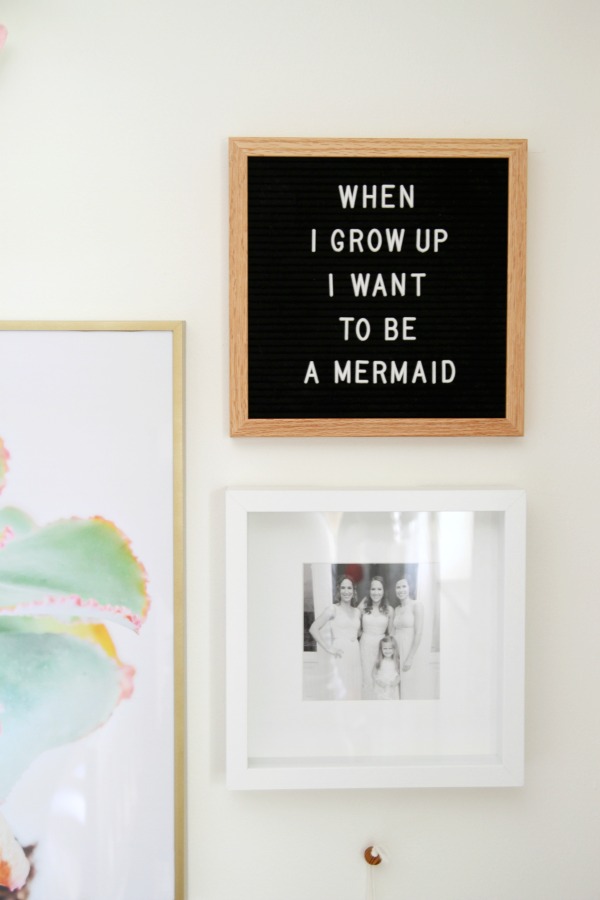
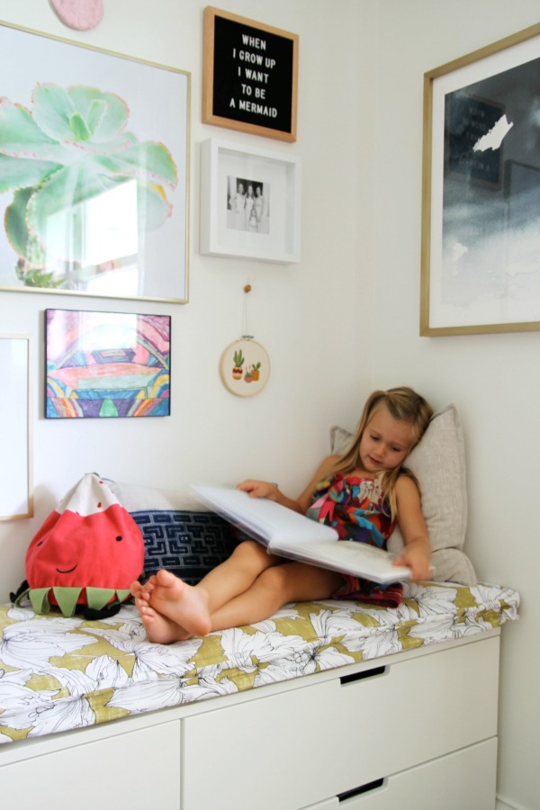
I hung a small letter board to display favorite, of-the-moment Mabrey-isms. Below it is a photo of Mabrey, my two sisters and me on my sister’s wedding day. Mabrey was the flower girl. It makes me so happy knowing she has strong, funny, intelligent aunts as role models.
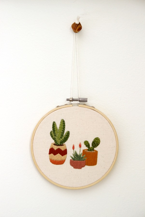
I found this embroidery art on etsy and thought it would pair well with the larger succulent print. It’s adorable!
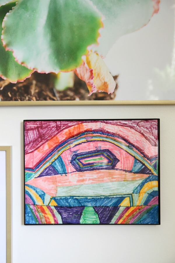
Everett created this marker masterpiece for Mabrey on a family vacation last year. She cherishes it. I had to frame it.
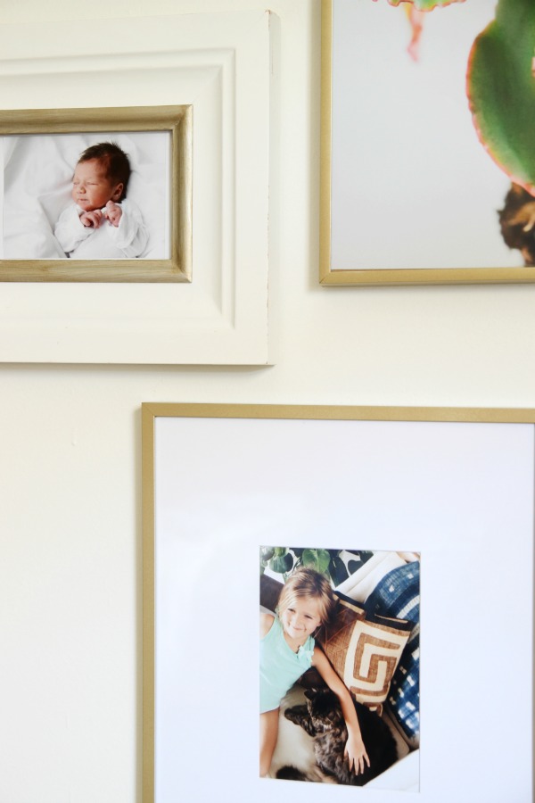
I included pictures of Mabrey as a newborn and as a four-year-old. I took the bottom photo with my phone on a regular Tuesday afternoon a few weeks ago. She was sitting with Cheetah talking to her about “funderstorms” and not wearing any pants. Candid photos are my favorite. They remind me of everyday moments I’d otherwise forget.
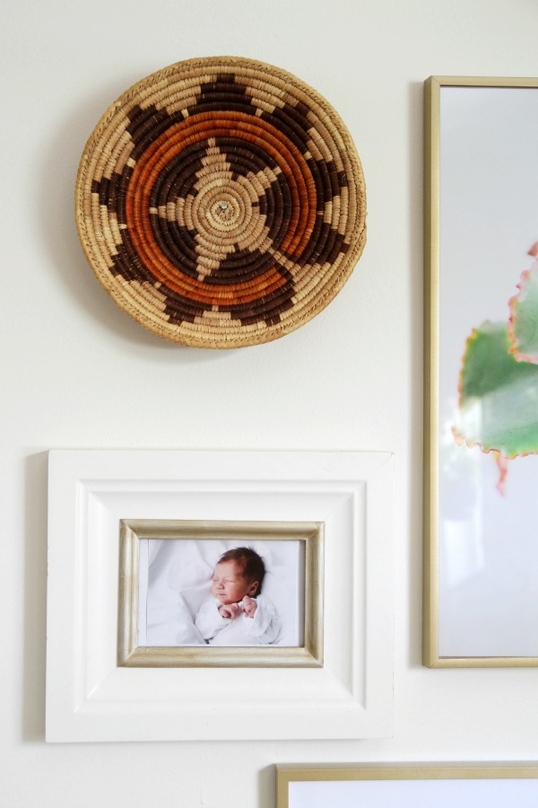
I thought a coiled Mexican basket would be a nice contrast to the sleek frames. It ties in with the other basket hanging above the bed.
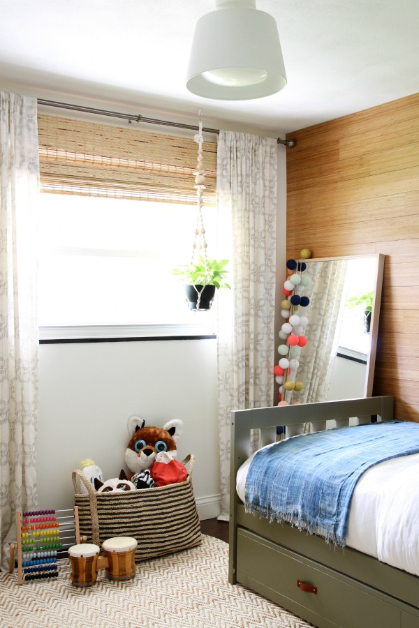
Like I mentioned, I moved the majority of the playthings to the closet, but a large jute basket corrals a menagerie of stuffed friends including “B”, the beloved red strawberry that follows Mabrey everywhere. The vintage bongo drums were a requested birthday gift. “I want drums like my ballet teacher.”
Mabrey loves her big girl room. Not that she didn’t like it before, but I can tell she really loves it now. When anyone comes over, she grabs their hand and says, “Come see my new room!” I’ll walk by the doorway and find her playing or reading books. Once, I found her napping on the bench with B. A few weeks after it was finished we were packing for a family vacation and she said out of nowhere, “But I’m going to miss my room! It’s so beautiful.” Melt. my. heart.
I love her room, too. I like that it feels youthful but not juvenile. I like that it looks feminine but not too sweet or girly. I like that it doesn’t feel overly designed. I like that there are elements that link it to the rest of the house: woven textures, a mix of wood tones, hits of black, vintage textiles, the bamboo planks (which are also in the boys’ room) and a healthy dose of white. I like that it can grow with her. I like that it’s unique. Just like my girl.
Resources of note:
wall & trim paint – Benjamin Moore white dove
wood wall – vertical caramelized bamboo, Stikwood
wallpaper – Cavern Home tapestry wallpaper in zuni
flooring – Jasper engineered hardwood handscraped birch in Texas brown, Build Direct
ceiling light – IKEA, discontinued
curtains – West Elm, discontinued
curtain rod – Target
woven shade – petite rustique bamboo shade, Overstock
room-darkening roller shade – Levolor, Lowe’s
watercolor art – Mist Rises Over the Water in matte brass frame, Minted
rug – jute chenille herringbone, West Elm
bed – Canwood Alpine II slat bed with trundle, Wayfair
bed paint – Benjamin Moore pine grove
leather pulls on trundle – etsy
linen duvet cover – etsy
indigo throw blanket – etsy
patterned sheets – Target (the neutral color option)
striped pillow cover – McGee & Co.
kilim pillow cover – etsy
Hmong pillow cover – etsy
wall sconce – midcentury task sconce, West Elm
coiled Mexican wall baskets – eBay
bookshelf – IKEA
stool – IKEA
small circular basket with lid – vintage
brass elephant – Target, discontinued
wall dot hooks – CB2
wood dollhouse – Plan Toys, Amazon
hemp string bag – The Dharma Door
‘Wild & Free’ wall hanging – Urban Outfitters, discontinued
mirror – IKEA
cotton string lights – Bright Lab
plant hanger & pot – IKEA
striped jute basket – The Dharma Door
vintage bongos – eBay
abacus – IKEA
dresser – IKEA
bench cushion – DIY
cushion fabric – Jo-Ann Fabrics
succulent print – Red Curls, Joni Tyrrell Photo / IKEA frame spray painted gold
resin deer head – White Faux Taxidermy, spray painted
letter board – poet in oak, Letterfolk
square shadow box frame – IKEA
succulent embroidery art – etsy
thin black frame – Target
vertical frame with mat – Target
In case you haven’t seen enough of this itty bitty room, here are a bunch of links documenting its evolution:
RENOVATION
*https://www.housetweaking.com/2012/01/04/the-painting-saga/
*https://www.housetweaking.com/2012/01/11/the-flooring/
*https://www.housetweaking.com/2012/07/05/hold-the-door/
*https://www.housetweaking.com/2013/10/15/a-date-with-my-doors/
FURNITURE, DECOR, TOYS & ORGANIZATION
*https://www.housetweaking.com/2016/02/24/brainstorming-a-big-girl-bed/
*https://www.housetweaking.com/2016/04/25/a-moodboard-mabreys-big-girl-room/
*https://www.housetweaking.com/2016/07/24/diy-trundle-tweak/
*https://www.housetweaking.com/2016/08/28/wall-treatments-in-mabreys-room/
*https://www.housetweaking.com/2016/08/30/a-multipurpose-dresser-for-mabreys-room/


budget decor, DIY, kid-friendly