
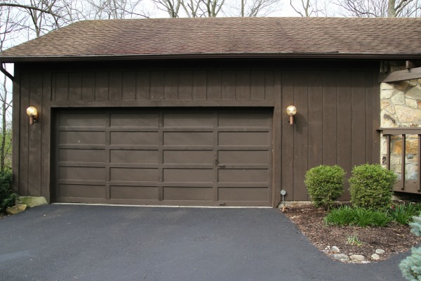
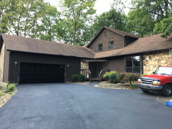
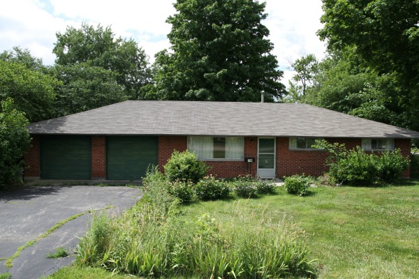
I took this picture of our current house on the day of the inspection.
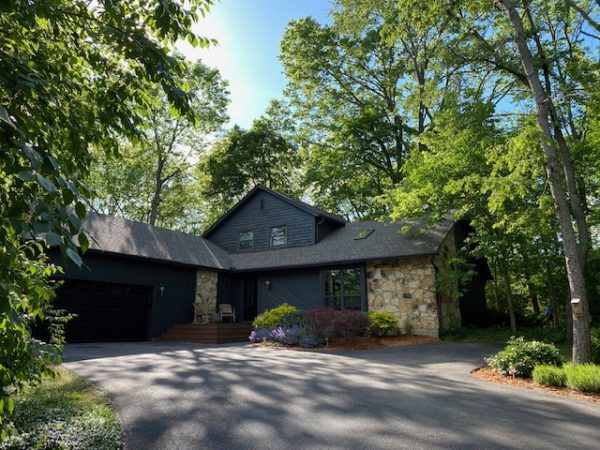
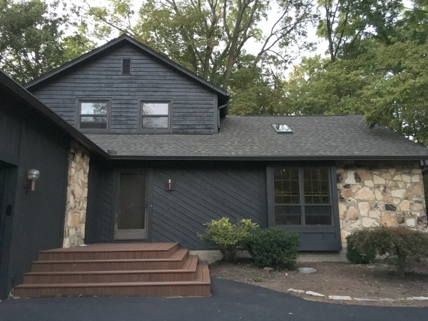
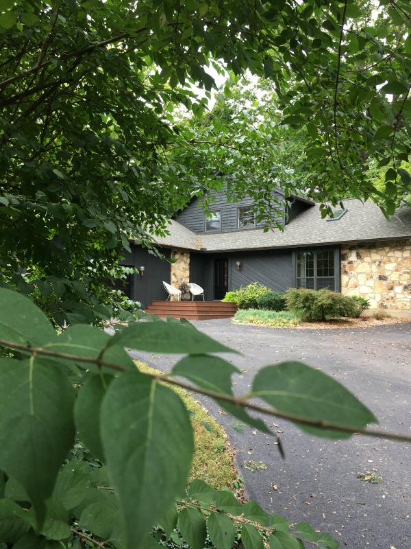
I snapped this picture of our house with my phone a few weekends ago. These photos were taken nearly three years apart and a LOT has changed! As you can see, the house was once very BROWN. Brown siding, brown garage door, brown roof, brown gutters, brown stonework, brown front door, even brown exterior lights! ALL. THE. BROWN. Obviously, the brown facade wasn’t a huge selling point but we saw the potential.
During the inspection, we learned that the roof needed replaced and my reaction was, “Thank goodness!” (Said no other homeowner ever.) I knew switching up the roof color would go a long way in de-browning the exterior and give us more freedom in selecting a new color for the cedar siding. There were brown elements we liked (namely the ’70s stonework and funky exterior lights) but they were getting lost in a sea of brown on brown on brown. Our goal was to update the color scheme while paying homage to the house’s original, defining features. The last thing we wanted was to strip the house of its innate quirk.
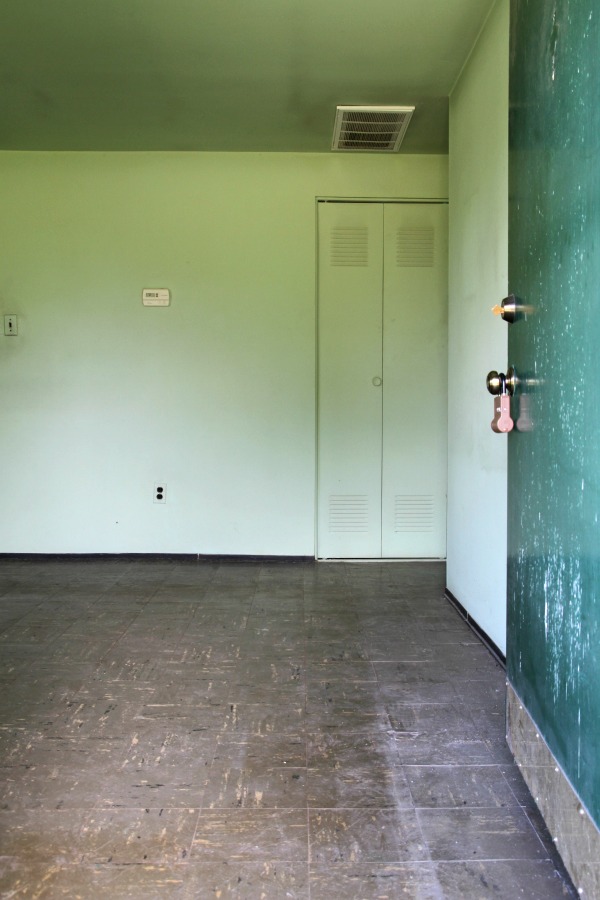
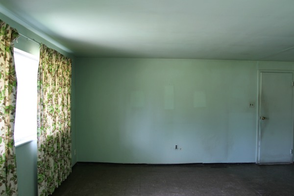
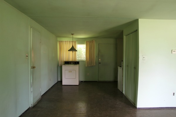
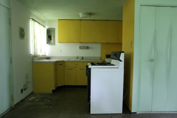
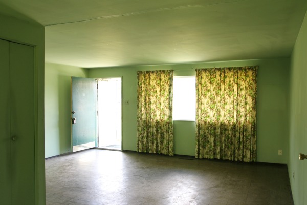
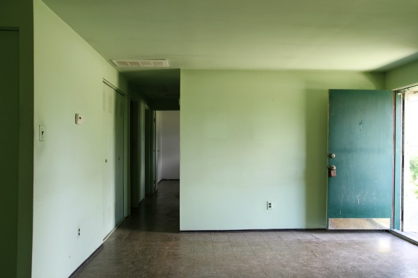
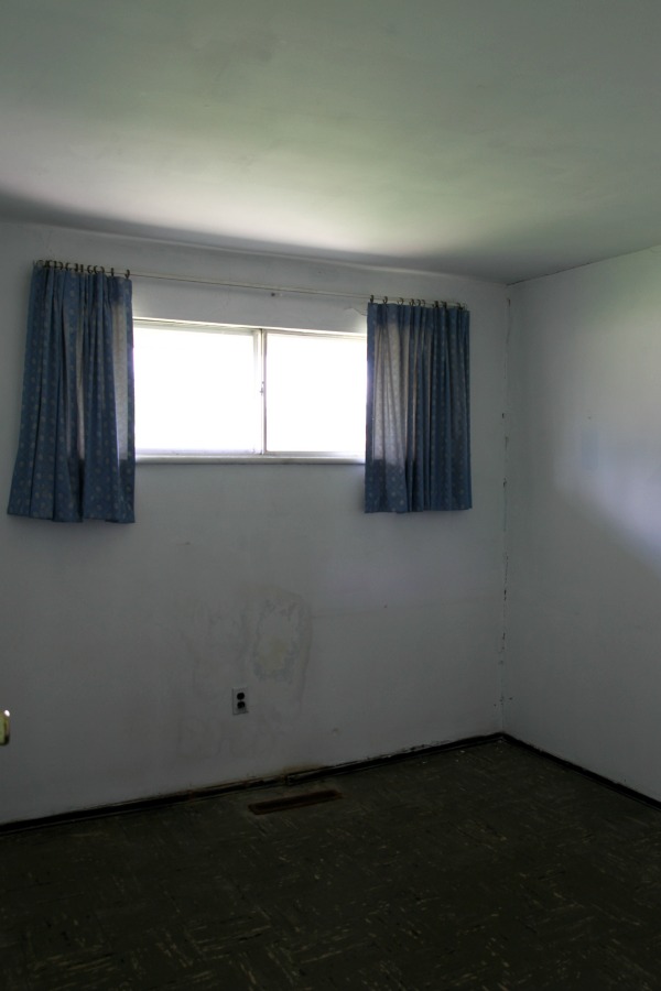
This house differed from our last home and the Pee House in that the interior, while extremely outdated, was livable. Because of that and the fact that we anticipated spending way more time outside here (the trees!), we decided to live with the interior as-is for a while and focus our initial efforts on the exterior. Early on, we knew this place was meant to be dark. It wasn’t even a decision. It just felt right.
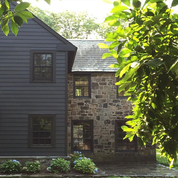
This image was a HUGE inspiration when it came to nailing down an overall color scheme. I love the *almost* black siding with true black accents juxtaposed against stonework in shades of brown and beige all under a gray shingled roof. It feels a bit, dare I say, country?…but modern. I thought it would look great on our woodsy lot all year long, too. Dark exteriors always seem to be living their best lives, no matter the season! But before painting, we addressed the roof and garage door which both needed replaced. Our thinking was it would be easier to pair paint with those big ticket items versus choosing a roof/garage door to go with a specific paint color.
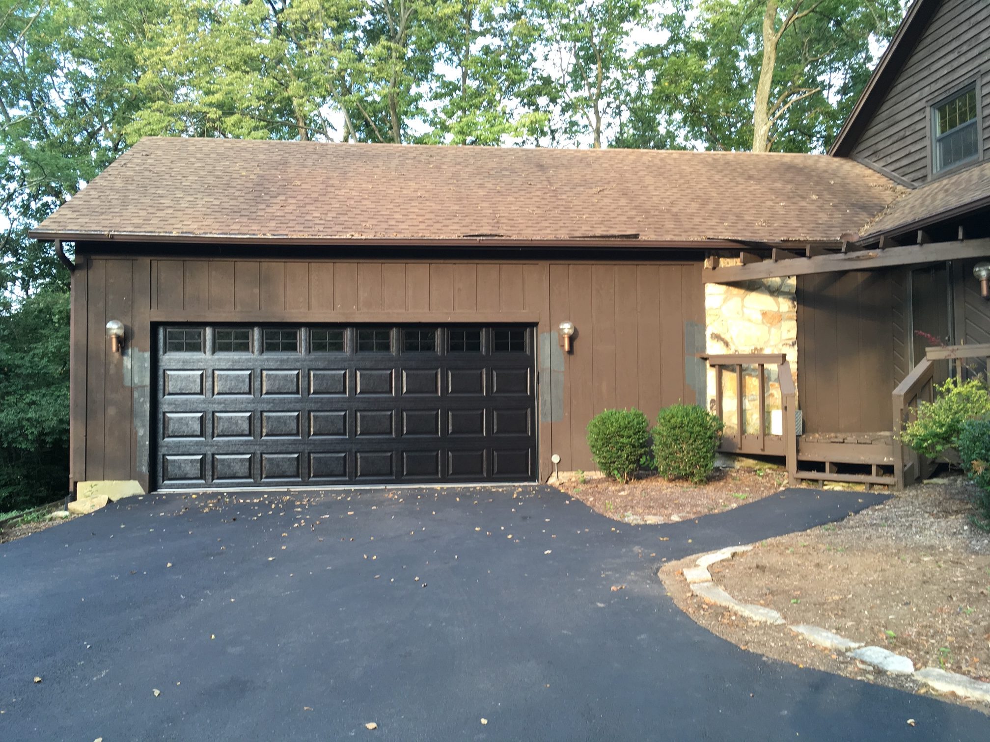
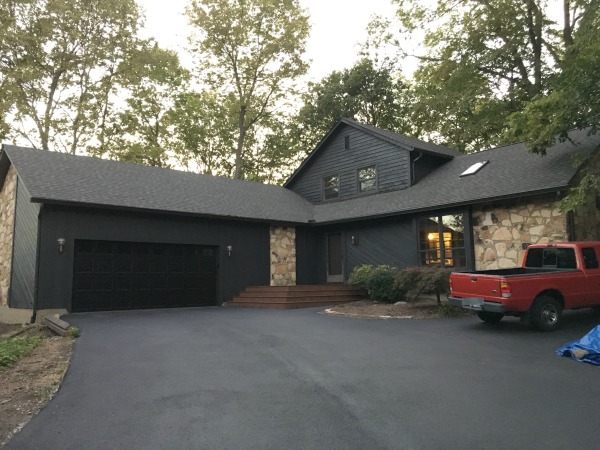
We chose a black garage door and had it installed with a keypad. (Luckily, the opener had been replaced by the previous owners and was in excellent shape.) We’ve never had a garage door keypad before. It feels like a complete luxury – even now, three years later! The window panel along the top lets natural light pour into the garage without making the contents of the garage visible. The muntins in the windows (they’re the Stockton design in the link to the garage door) are removable and entirely decorative. We like how they mimic the windows on the house.

Speaking of windows, I removed two dinky flower boxes from the front bay window because the scale and style felt all wrong. Too small, too cottage-y. See the similar window muntins?
We also removed an awkwardly placed pine tree from the front bed. (Scroll up to the first image of this post to see it.) Nothing against the tree, but the placement was impractical. It blocked light from the bay window and made for a prickly welcome to the front door…not exactly the first impression we had in mind for visitors.
With the garage door in place, next up was the roof. You know we totally considered a metal roof (like the one at our previous house) but decided against it for two reasons. 1) We had minor issues with ice damming and mini snow avalanches from the metal roof at our previous home. Nothing that made us wish we would’ve done anything differently there, but the slope of this roof is much steeper and we anticipated more problems in the winter. 2) We really felt a dimensional shingle would give the house a softer texture that would pair well with the cedar siding, stonework, asphalt driveway and surrounding trees. Metal felt too “slick” and out of place to us. I kept going back to those gray shingles in the inspiration photo.
After checking out all the options and speaking with our roofer, we landed on the 30-year Tamko Heritage shingle in weathered wood. But just to be sure, our roofer gave us the addresses of a few homes in our area that he had used the same shingle on recently. This was super helpful! We drove by the homes to see the shingle in real life (on a larger scale and in outdoor light) and it solidified our choice. Weathered wood it was! (Apologies to the homeowners we house-creeped.)
Goodbye brown roof!
Hello warm gray roof! Even with the siding still brown, things were looking so much better. Immediately, the stonework felt less brown. I couldn’t get over how the gray roof was bringing out the masonry grout of the stonework. We hadn’t even noticed it before! If you look closely, you’ll see that we also had our roofer install a new skylight (just above the bay window) to let more light into the living room. There’s an original skylight on the backside of the house which we loved and wanted to balance out with another skylight opposite on the front of the house. As soon as it was in, it felt like it had always been there!
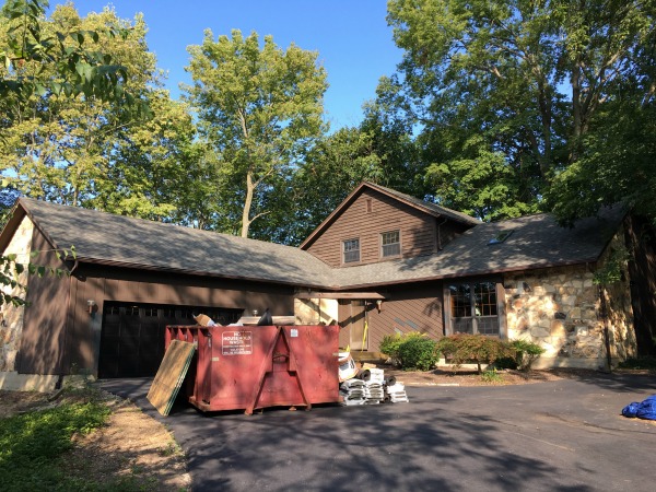
Per our roofer’s recommendation based on the slope and size of our roof, we also upgraded to oversized 6″ gutters and downspouts. (Not shown here but they’re visible further down the post in the porch pictures.) We chose a dark finish to help them meld with the dark exterior vibe we were hoping to achieve. And since we’re surrounded by trees, we had gutter guards added to prevent leaves from clogging the gutters. No more cleaning out gutters!
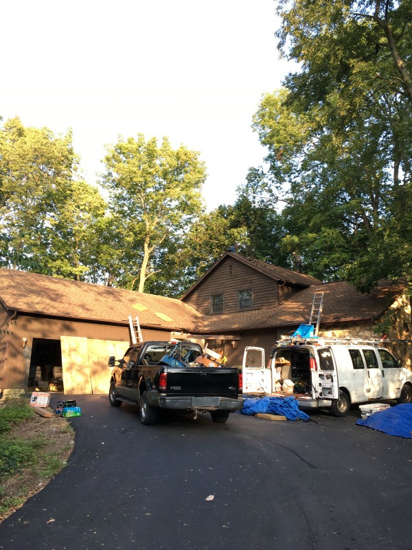
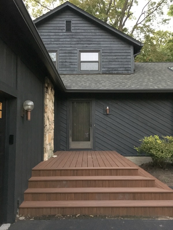
Once the new roof was installed, we turned our attention to the front porch which was the final element we wanted to address before paint.
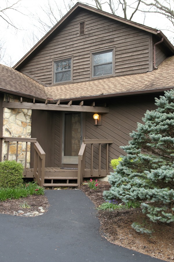
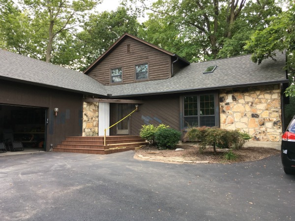
The original porch (shown here with that prickly pine!) was basically a few steps up to a small triangular platform just outside the front door. Oh, and there was a pergola. That served absolutely no purpose. The entire thing was rotted and, even if it hadn’t been, we would’ve pulled it anyway. It was too small for more than one person to stand on while opening the front door, and the whole “let’s cram an angled porch into the corner” wasn’t working for us. It also felt a bit low in relation to the front door. Crossing the threshold required taking an awkward high step at the entrance. From a distance, there was nothing leading the eye or visitors to the front door. We wanted something more substantial, yet simple in design.
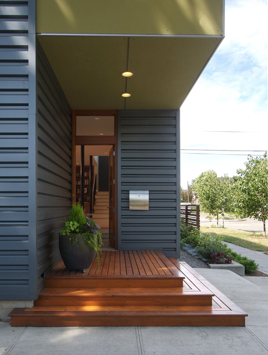
This corner porch by Mohler + Ghillino Architects was our inspiration. We liked the rectangular design with steps on two sides. The larger size would provide room for a small seating area and planters. Being able to enter/exit the porch from two sides was ideal. The longer side would meet up with the small existing walk while the shorter side would give us access to the adjacent garage.
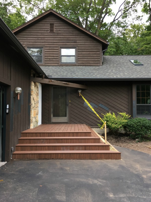
This is what we ended up with! (We relocated two boxwoods that lived between the old porch and garage to another bed closer to the road.) The material is TimberTech in mahogany from the AZEK vintage collection. It’s composite and we hired out for the construction and installation. You may be wondering why we didn’t use Trex this time around and the answer is that TimberTech is about 30% cooler in full sun. The Trex deck at our previous home would nearly scald bare feet after absorbing heat from the sun, but that deck faced north and we added shade sails. It didn’t get a ton of sun but there were random hot spots throughout the day. Since this porch faces south and has no overhead cover, we wanted something that would feel comfortable walking on barefoot at any time of day. Of course, we love that it’s virtually maintenance-free, too.
I really wanted a warm color on the porch to act as a buffer between the asphalt and (future) dark exterior and to tie in to the original stonework. The fact that it also pulls out the copper color of the original lights was a happy accident :) I love those funky lights so much.
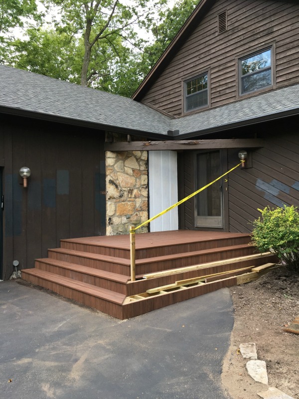
Ripping out the old porch revealed a few rotted wood panels in the corner. Luckily, our contractor was able to find a convincing match and replaced them. We knew once everything was painted, they would blend in seamlessly. Eventually, the pergola came down as well.
Finally, FINALLY!, it was time for paint. We had already found a painter who was a one-man show. He told us for exterior projects he preferred to work in small sections, spraying then going back over with a brush by hand for a flawless finish. He was also adamant about using Sherwin Williams Weathershield exterior paint, so I curated a shortlist of Sherwin Williams colors. I narrowed down our options to three or four and painted them in random swatches on the exterior. (If you look back at the images in this post, you’ll see them.) Pretty quickly we landed on “carbonized” (HGSW1481) in satin and never looked back.
We loved the new color immediately! It works great with the warmer brown tones we kept in the stone, lighting and porch. It’s more of a deep charcoal than black which we like because it provides a subtle contrast against the true black of the garage door. It tends to reflect whatever is happening in the sky. So on sunny days with blue skies, it takes on a deep navy hue. On overcast days, it’s more of a charcoal black. Likewise, it changes throughout the day looking bluer during daylight hours and blacker/grayer during dawn and dusk hours. I like it both ways.
It was another six months before we replaced the front door. (We were busy adding a screened porch and upper deck to the back of the house! I promise to share it in another post.) It was so awful. Brown. Solid. Lifeless. And the added storm door slammed every time it shut. I hated opening a door just to open another door. The windowless design made the inherently dark entry even more so. Our goal was to get rid of the storm door all together and, instead, install a single black entry door with windows to welcome visitors and brighten up the entry. I found several exterior doors I loved, but they cost more than we were willing to spend.
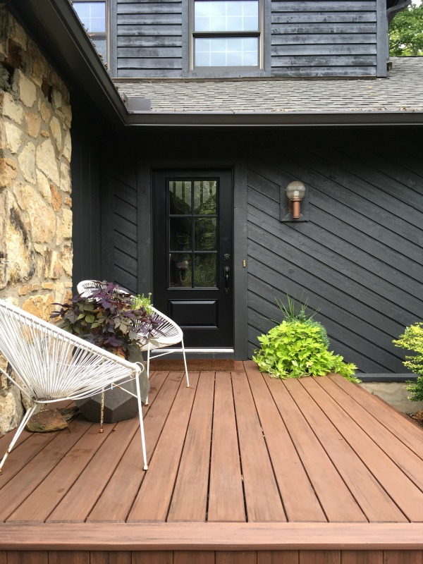
We ended up special ordering the Milliken 3/4 lite 1-panel fiberglass door with six simulated divided lites (model #608SDL) in black from Home Depot. The day of the install we got a call from our local store asking what handle we were using for the door. Crap. In hastily scheduling the door installation, we hadn’t even considered hardware! We quickly selected the least offensive option in-stock at our local store as a stopgap measure but, two years later, we still haven’t replaced it. It’s oil-rubbed bronze and has a curvy profile (not really our style) but kinda fades into the door and serves the purpose. Someday we’ll replace it with something sleeker. We LOVE the door! The true black finish and window muntins repeat elements also found in the garage door.
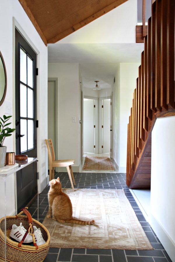
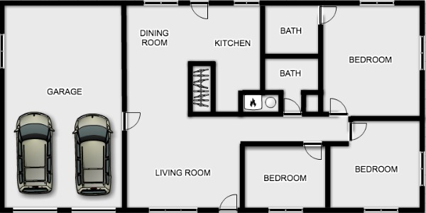
The windows let in ALL. THE. LIGHT. Since our house is set back off the road and screened by trees, we feel comfortable having so much glass in the front door. You can’t really see through it unless you’re on the porch anyway and, even then, you’re just staring at the side of our staircase. (Feel free to reference our floor plan here.) In all likelihood, you’re probably going to see a few cats sunbathing in the entry or frolicking on the stairs :)
It was another year before we had the porch stonework repaired where the pergola had once tied in to the house. (You can see the missing stones and gaping holes closer up in the image with the new front door. Yes, we did have birds nesting in there.) So in real time, it took us several phases spread out over the course of two years to entirely take the house from brown to black, including all the little snowball projects that evolved along the way. We’re so happy with the modernized color scheme and how it showcases some of the original features we love (stonework, lights) while toning down some of things we don’t (angled wood siding). We like the subtle contrast between the deep charcoal siding and black doors. The porch provides a “hello!” and hangout spot we were missing before. An unexpected benefit of the design is that the steps double as additional, casual seating. We hosted a neighborhood block party last year and had chairs set up, but people naturally gravitated to those steps. Can’t wait (but will) to host that shindig again!
We’ve had so many neighbors and visitors say, “I’ve never seen a black house before. I love it!”
So do we.


inspiration, interior design, renovation