Remember the secondhand media cabinet I bought back when we were in the throes of renovating? It was the perfect size for our needs but after living with it for a year and a half, it was clear that something lighter in color and design would work better.
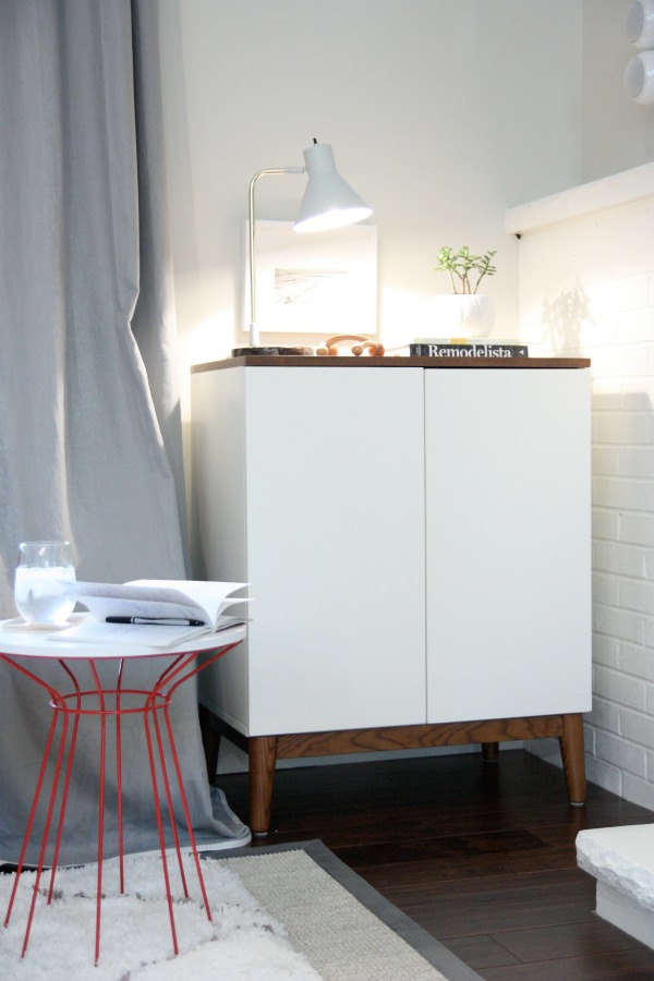
This little number fits the corner of our living room like a glove. I like that it’s white with solid doors and a leggy base. HH bought and installed this sensor back when we had the old cabinet because we were having problems with our universal remote not working properly. The sensor worked great then and now it allows us to control the media equipment through the solid doors of the new cabinet, too. It’s a crowd pleaser. I like that it lets us keep the ugly black boxes under wrap. HH is comforted by the fact that he can control the TV from any room in the house, including the bathroom. Men. The kids no longer become frustrated trying to point the remote just so. Everybody wins!
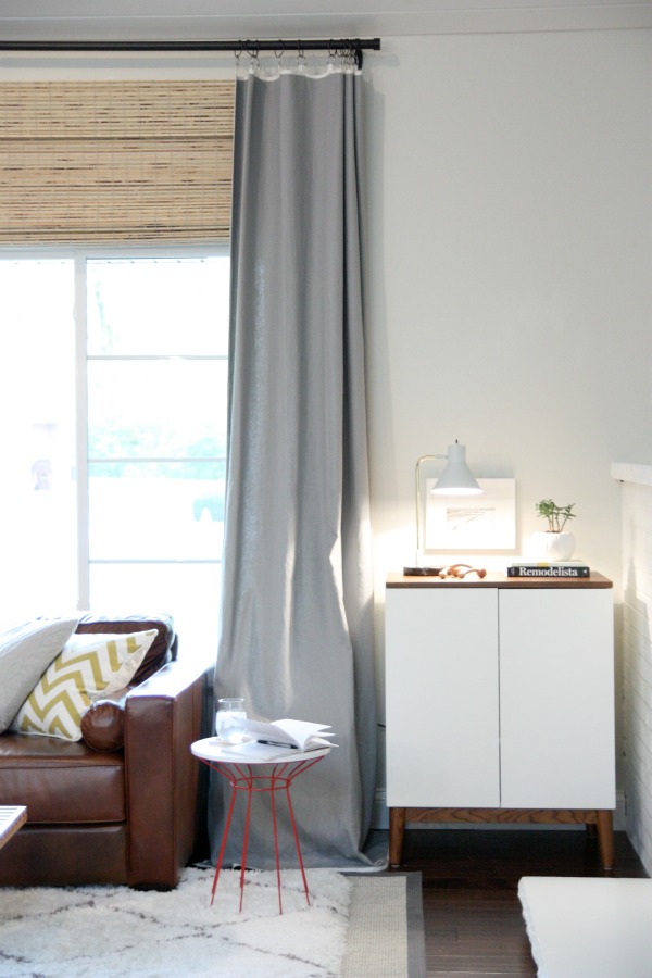
This corner of the living room is pretty dark at night but Nate’s new task lamp does the trick. I’m trying out a few accessories – potted jade transplanted from an outdoor planter, books, a wood back massager and a black and white print. All things I had on hand. But you know me. I can’t guarantee the little vignette will stay this way for long.
Oh yes, little corner, I am going to have fun tweaking you whenever boredom strikes. Beware!
images: Dana Miller for House*Tweaking
I’ve had requests to share my favorite etsy shops and finds. Dare I say I spend more time browsing etsy than pinterest? It’s true. I’ve decided to try weekly etsy features and see how they go over. Let me know if you enjoy them!
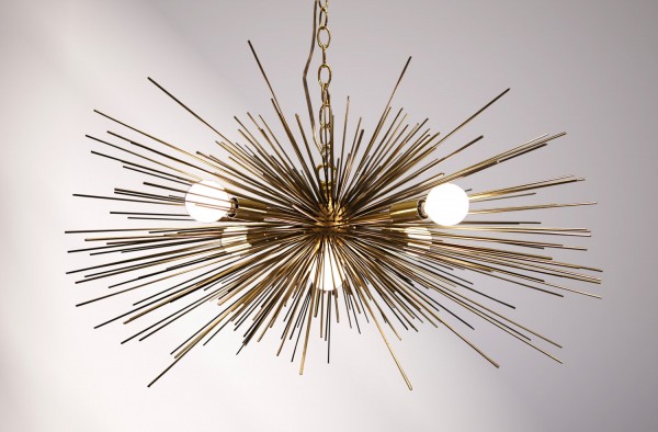
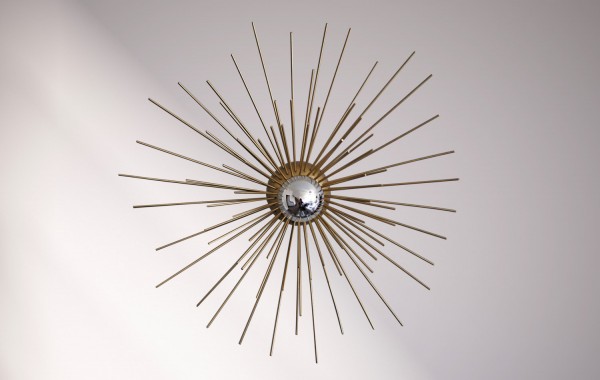
This week on etsy I stumbled upon the most amazing collection of handmade chandeliers and sconces via Stimulight. The urchin-like starburst lighting has a midcentury vibe that reminds me of the Sputnik but is more affordable than the popular vintage pieces. Most of the fixtures are listed with a price tag of less than $400 while true Sputniks and even high end replicas can sell for upwards of $1,000.
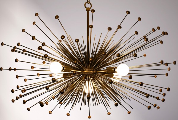
The custom fixtures are made with the utmost attention to detail. The metal spines are crafted from high quality wire and can be adorned with hand painted wood beads for an explosive effect.
Along with chandeliers, the shop also offers handsome wall sconces and table lamps. I could see a pair of urchin sconces above a buffet in a dining room or flanking the bed in a master bedroom. A single sconce near a rocking chair or glider would be so adorable in a nursery.
After discovering this inspiring little shop, I was delighted to find out more about the maker and designer behind the pieces. The shop is the result of a creative collaboration between a visual display manager and an engineer. Zach Dutton, one half of the Stimulight duo, is a visual display designer for West Elm. Yes, THE West Elm. I’m a huge fan of West Elm so it’s really no surprise that I’m drawn to the experimental lighting gig spurred by one of their designers. I don’t think this newly introduced tangent shop will be sitting on the sidelines for long!
What do you think of these affordable spins on a vintage design? Are you a fan of West Elm too?
images: Stimulight


budget decor, DIY, organization