...because home doesn't happen overnight.

Once a month, I like to share an inspiring paint color with you.  Well, really, I’d like to repaint my walls once a month just because there are so many great paint colors out there to try…but that’s not realistic now, is it?  So, instead, I’ll stick with sanity and simply talk about the colors of my painted rainbow here.  This month I’d like to introduce you to Benjamin Moore’s Edgecomb Gray.

Even though the name has the word ‘gray’ in it, it’s more of a tan-y warm greige than the typical cool gray that comes to mind when you envision gray paint.

It’s a great neutral that turns almost creamy when bathed in natural light.

Neutral paint colors: 'Edgecomb Gray' by Benjamin Moore

And it makes a perfect marriage with wood tones.  I could see it being used in older homes with original wood baseboards, floors and moldings.  Wouldn’t it give a Craftsman style home an airy lift?

If you’re searching for a light paint color for a finished basement, I believe Edgecomb Gray could be a front runner there.  In artificial light, it’s bright and warm at the same time…just what you’re looking for in a basement.

Probably my favorite characteristic of Edgecomb Gray is its ability to contrast.  It’s different enough from your bright white trim, doors and wainscoting to make them pop.  Yet, it’s still light enough to be used alongside black and mocha accents for a contrasting effect.

In a children’s room, Edgecomb Gray would make a great backdrop to deep teal and burnt orange.

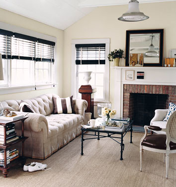
In a grown-up casual living room, Edgecomb Gray could be part of a relaxing neutral scheme including white, black and camel accents a la Nate Berkus style.

Finally, for a fresh and modern guest room pair Edgecomb Gray with a deep taupe and rich coral.

I could definitely see this paint color making an appearance in our next home.  That’s how much I love it.  I really think it has the ability to make smaller rooms feel bigger.  And since we’re looking to downsize, making things appear bigger is going to be key.  What about you?  Have you used Edgecomb Gray somewhere in your home?  What’s one of your favorite paint colors for small spaces?  Chime in.

images:  1) Benjamin Moore  2) T. Keller Donovan for House Beautiful 3) Blossom Interiors 4) Justin Bernhaut for Domino via Flickr 5) Vanessa Francis for Decor Happy 6) Shiloe Bear via Tar Paper Crane 7-9) collages by Dana Miller using Benjamin Moore paint swatches

66 Comments

04.March.2011

We have a basement to paint. This could be just the thing! *running out to snag a paint chip* Muchas gracias, lady! :)

04.March.2011

Thank you! I’ve been looking for a warm grey to pair with cream – what do you think about that combo?

04.March.2011

This just might be the answer to the paint dilemma I am having about our family room. Thanks so much for sharing:)

04.March.2011

Ooo! I love it too! I NEED your advice and input you give on this blog. With only about 6 trillion different beiges and grays and other neutrals to choose from, I need someone to point me in the right direction and narrow down my choices! Love this color – beige enough to be ‘warm’, gray enough to be light and ‘cool’. I don’t want my house to be too bright, cool, and antiseptic, but I also don’t want a heavy beige to take over either. I’ll save this suggestion for later!

04.March.2011

Love it.. I have been looking for neutral color for our master bed and bath..

04.March.2011

Liz – I think Edgecomb Gray and cream would be a great combo! Just be sure to add in one or two darker accents – furniture, pillows, accessories – to keep it all from feeling too monochromatic.

04.March.2011

Yep, our whole house is covered in Edgecomb Gray. Love love love. Friends saw it and did their master bedroom in it. Nothing cool about it. Just a warm neutral for folks like me that can’t do white. Also: it’s great with blacks, browns or grays.

04.March.2011

This is really funny. I had a house guest last October while I was in the process of redoing one of my bathrooms. I asked for his opinion on some paint samples I brought home. He told me that 2 of his relatives are interior designers and both of the recommend this color for a neutral color. So I ended up painting my bathroom this color and it turned out great. If anyone is on the fence for a great gray – this is it!

I love this color…do you know if it is pretty similar to Glidden’s sand white?

04.March.2011

Thank you! We are house hunting, mostly for older homes, and I’ve been searching for a good “catch all” for updating ugly living rooms. I love getting to see it in several different scenes.

04.March.2011

the majority of our house is painted in edgecomb gray, too. we love it. it’s a great neutral.

do you know what the formula is for Egecomb Gray? I’d love to know.
PS, are you a fellow Ohioian?! (Based on your Bengals comment….I am in joint Bengals/Browns territory).

05.March.2011

Oh my gosh I LOVE this color!! Definitely bookmarking this if we repaint our living room! Thanks!

06.March.2011

I loved Edgecomb Gray. I still do, really. But my house ruined it for me. I worked for weeks trying to choose colors for our first floor. The hardest was for the open entryway that leads to the stairs with views into our kitchen, living room (12 foot ceilings) and dining room. It’s a large area and it sets the tone for the whole house. I fell in love with Edgecomb Gray. I painted a large are on the wall and looked at it for days. It was great. I had the painters come and paint (I can’t reach that high) and when they were just about done one of them said “Wow, I never thought of painting a house lavender before.” I cried. He was right. In my ridiculous house, this (and other colors) turn lavender. Ironically given my name, I am not a fan of purple or anything with a purple undertone. It’s funny, but I’ve since seen Edgecomb Gray in other people’s homes and it really does not seem to have this problem. Thanks for sharing views of it with us. Violet

07.March.2011

I used Edgecomb Gray on most of my condo (it’s small – 900sf). It’s perfect with my ultra white trim & oak floors. I love it, thanks for featuring it here.

08.March.2011

Violet – Odd that it would look lavender in a home owned by a ‘Violet.’ What color were the walls before you painted? Sometimes rich paint colors require a coat of primer before painting to get the true color of the new paint. Also, certain types of artificial light can cast blue-ish tones onto walls. I’m sorry to hear it didn’t work out for you.

08.March.2011

Kacey – I don’t know the formula for Edgecomb Gray. However, here’s a link to the swatch @ Benjamin Moore.

http://www.benjaminmoore.com/bmpsweb/portals/bmps.portal?np=colors/HC-173

I’m sure you could call any supplier and get the formula if you wanted. And, yes!, I am in Ohio! Southwestern Ohio to be more exact.

18.April.2011

I love Edgecomb Gray, and after much searching for the right neutral, I am thinking of putting it in the “main areas” of my downstairs (entry way, family room, kitchen) and in the upstairs hallway. Two things I’m hesitant about – the hardwoods throughout our downstairs are that orangey/yellowy-maple color. Will the Edgecomb Gray tone down the color of the floors (hopefully) or will it completely clash? Second, would a medium brown OR natural linen sofa work in the family room? (can’t put off-white or white due to kids!) Thanks for any input you can provide!

18.April.2011

Amy – I think the Edgecomb Gray would pair nicely with your floors {how lucky you are to have wood floors!}. As far as the couch goes, I think either one would work. I just depends on what look you’re going for. A brown couch would contrast {not the same as clashing} with the floors and the light paint color. Personally, I like the idea of some contrast or things can start to look too one dimensional for me. A linen couch would blend in more seamlessly with the walls and kind of recede…making a good backdrop for contrasting throw pillows. You’d need to add in some darker contrasts elsewhere with a linen couch {coffee table/side table/lamp/accessories} just to keep things from feeling too stark. Good luck!

22.April.2011

Dana, thanks for sharing this info with us. We have been living in a home that has those ugly oak paneling walls all over the place. All trims and cabinets are done in the same paneling. I cannot wait to paint them but I was considering leaving the trims unpainted, since I really do enjoy the warmth and look of wood colors and my attempt is to create a farmhouse type of feel (we live out in the country). I’m really drawn to your barn door btw – great idea! Anyway, do you think that BM Edgecomb gray will work for me? And also, most importantly, I wanted to ask if you think this could go well with a country red (like a burgundy I guess?) and yellow? I was planning on painting my kitchen cabinets in those colors. I may change my mind considering any suggestions you’ll make (!) hehehe. Thanks so much, in advance. Gabrielle.

22.April.2011

Gabrielle – Absolutely! I think Edgecomb Gray would be a great light & neutral backdrop for your farmhouse look along with pops of brick red and yellow. Sounds very Sarah Richardson farmhouse-esque!

27.April.2011

I just pick up a swatch of this the other day and I think this convinced me to use this in my new home. I’m thinking of painting this in the living room which is connected to my kitchen, which I’d like to paint a very soft, light blue-ish green… any good suggestions for that kind of color that would go well with Edgecomb Gray?

26.September.2011

I agree w/Violet. I used Edgecomb Gray in my kitchen & it has a lavendar undertone. My “professional” painter assured me that by using the ben line I did not need a primer or a 2nd coat. Do you think either of these could help? My original color was SW Restrained Gold.

27.September.2011

Jennifer – Hmmm…the undertones that come out {with any paint} depend on the lighting in the room. Sometimes different natural/artificial lighting can affect the way the paint looks on your walls. I always suggest painting a large piece of foam board and leaning it against the wall{s} you are considering painting and watching how it changes throughout the day and night…and how it changes on sunny vs cloudy days…to make sure you like it. I guess you could always paint an inconspicuous spot with a second coat to see if that makes a difference. Normally, primer isn’t need unless you’re painting over a very rich or dark hue with a much lighter color. Good luck! I hope you end up with a kitchen you love! The good news…it’s just paint and can be easily remedied if desired…although I know you probably don’t want to pay for more paint/painting.

14.October.2011

Hi,
I am thinking about painting my kitchen edgecomb gray. I have white cabinets and black granite (not flat black) countertops with dark brown hardwood. However I am nervous about the white cabinets going ok with the edgecomb gray and would really appreciate a 2nd opinion! I would carry the colour through to the living room and the feature wall at the end of the room I was going to paint Dolphin (deeper richer gray) by BM – this wall has a large white fireplace on it. And tie it together with revere pewter. Do you think these combo’s go well?? Such a big step and I am so nervous! Any comments are truly appreciated!

18.October.2011

Dana – thank you for opening our eyes to this color! We love it and recently re-did our bedroom and spare room in this color with white trim. Our spare room is now going to be our nursery and I’m really stuck on what draperies and color scheme to do since we won’t be finding out the sex of the baby. The room gets a lot of sunshine but gets terribly cold in the winter, so I was thinking something heavier for window treatments. Would a rich brown velvet be too much? My other option is a fun kid print like the green and blue trees fabric from Ikea. Any thoughts or inspiration?
Thank you!!!

18.October.2011

Daniela – We live in the midwest where winters are cold and looooong too. I wouldn’t be so quick to choose a curtain based on winter temps though.

Rich brown velvet panels could work if done in a taupe-y hue like this…

http://plantationshutterss.com/2011/07/04/brown-curtains/

…I’d avoid the deep browns with reddish undertones. They can come off heavy, dark and cheap. For sure the botanical IKEA print would work great! I guess it just comes down to what feel you’re going for and how you think the curtains will stand the test of time…i.e. all the different phases from baby to teenager…if you’re planning on keeping them for a while.

Good luck!

29.November.2011

how do you think Edgecomb compares to Cedar Key or Pale Oak? I am trying to go light gray with white wood accents in our currently off white (same color walls and trims) home. My challenge is our house is very very small especially for 2 adults with 2 teens. I need a color that “opens up” the rooms, makes them look larger. Our rooms open up into each other (from kitchen I see dining room, living room, mudroom…) I want contrast, but not too much. We have many windows, so with rooms opening to the next (door frames) and many windows its not much wall space.
I tested Stoningtoon, gets too dark…. I’ve considered Paper White in living +dining room, darker gray in Kitchen (Gray Owl, Stonington) and warmer gray in mudroom (Edgecomb or Cedar Key?) Maybe Simply White in all rooms on all trims? Sorry, many colors mentioned, what do you think opens up a room, is Paper White too light to be condidered light gray? We live in a 30’s cottage style home.

01.December.2011

Hi,
I used edgecomb in hallway, living room and foyer. In hallway with limited light – I love the puddy look but in living room where there is more light it shows pinky beige and there is not much contrast to the trim. I think it looks washed out in the daytime as in first photo. It does give an airy feel. Still didnt get around to adding decor with darker colors so not too mono.. This color is better in the evening. Pro-I can go with a darker color or same density in any other room. It wont limit me like a darker color. To Janna who is using revere pewter-November Rain looks nice with the RP. Green undertones like the revere. It is a good neutral but cooler. Katja- I like simply white on trim everywhere-love this soft white but ended up using snowfall white which has more yellow and reduced it so it is step between the two colors.The simply white is a popular color according to BM and Pottery Barn. Edgecomb to me is a cleaner look and I like it with the white. Be careful with all the natural light with windows.-Edgecomb may end up pink/violet as in previous comment. Try it on large construction paper/or paint cheap wallpaper and hang it up- look at it multiple time throughout the day in all rooms and on different walls of room. It is all in how your lighting hits that wall. You may love it in one room and hate it in another room.

22.December.2011

Would Edgecomb Gray look ok with Brazilian Cherry floors

08.January.2012

I used Edgecomb as the trim color – in the family room. I don’t know what colors to use for the walls and ceiling. We don’t want dark – light. Was thinking china white for the walls and 1450 for the ceiling?

11.January.2012

Lori – I’ve seen China White used in many interiors featured in magazines. It must be good but I’d still test out the ol’ paint sample on foam board to get a good feel for how it would look in your particular space.

13.January.2012

Dana, this is so funny: I just bought a quart of Edgecomb Gray to sample for my almost-finished basement. After I put painted a swatch, I googled the color and up come a photo from this post. So glad you would recommend it for a basement…I’m feeling a little more confident with the choice now. Thanks for posting these inspiration photos :)

28.January.2012

I have used Edgecombe Gray for years now on a number of Minneapolis Lofts and Condos–the airy feel of the color is perfect for small spaces! Check out some photos at: http://www.yoururbanlife.com

04.February.2012

Love color but my local store could not reproduce the color! Anyone ever have that problem? If so, what did you do? I love the color.

08.February.2012

Cr – I have heard of some of the BM colors not being able to be reproduced. Do you have a local paint store that sells BM paints?

02.March.2012

Hi

How do you think Egdecomb Grey would work as an accent wall with the rest of the room being simply white with super white trim . My look is 20 c Danish meets Italian contemporary with lots of art and some antiques. Do u think simply white goes with this.
Thanks cheryl

03.March.2012

Cheryl – It would be a subtle difference from the white, I think. I would suggest getting a sample of it, painting out a large piece of foam board and putting it on the wall you are thinking of painting. It looks different in every room!

20.March.2012

Hi! I’m about to paint my very old Creole Cottage home – living, dining & kitchen (all dark hardwood floors) edgecomb gray with BM cotton balls for the trim work. The part I’m going CRAZY over is the ceiling color?!?! I’m leaning toward white, but which one?? PLEASE HELP!

21.March.2012

Amy – Why not BM Cotton Balls? Have your tried taping a swatch to your ceiling to see what it would look like? Ceilings don’t receive as much light as walls, so whatever color you use just know that it will look different than it would on a ceiling.

26.March.2012

Hi! I happened upon your post after reading about Edgecomb Gray on Pinterest. We are considering this color for our main living areas, basically everything you see when you walk in the door. Couple of questions: 1) How will this sit next to honey oak wood trim? 2) What would be a good contrast on a wall with a very beige sofa? (The walls were a dreary beige when we moved in and our sofas just got lost in all the beige + beige carpet, so they really need to be set against a contrasting color but nothing too terribly dark.) And 3) Would you do something different in the kitchen (open floor plan) to bring in some more color/contrast? Thanks!

16.April.2012

You are SO right about the effect lighting can have on a paint color! I had never experienced such a dramatic example of that until my husband and I moved into a rental house on the lake recently. The SW facing kitchen has white cabinets, terracotta floors and a white tile backsplach with a medium blue, buff yellow and warm gray boarder. There are lots of old double sash windows and gets plenty of natural light so anything with yellow undertones looks VERY yellow or takes on a green cast. The dining area connects to the kitchen but is gets more NE light as it’s more centrally located and tends to be dark. Edgecomb gray looks like a wonderful oatmeal color in the kitchen and looks like a harsh steel gray in the dining room. These two rooms can be painted different colos of course, but share a ceiling at the doorway of the kitchen so the ceiling color needs to compliment both. We just purchased Greyson Chairs for our dining room from World Market which are upholstered in a creamy linen. I was convinced we were going to be painting the dining room and kitchen two shades of greige….but the lighting effect has steered us in another direction. So far Shaker Beige seems to be the best compliment to the dining room chairs and looks warm (not too dark) in the dining room. Edgecomb gray appears to be a good neutral beige in the VERY white kitchen with terra cotta stone tile floor. BM White Sand seems to be the front runner for the ceiling color…seems to work with both paint colors and the lighting conditions in each room. I’m ready to make a final decision… but before I do, I’d LOVE to hear suggestions for other samples I should try before making a committment, encouragement for the choices I’ve made, contstructive criticism that will prevent me from making a mistake….whatever it is I’d love to hear it! Thanks!

04.June.2012

I love this color! We just painted the exterior of our house Edgecomb Gray. The trim, garage, shutters were painted white and our door a light blue–their Wythe Blue! I’ll be posting it on our blog as soon as we’re finished!

30.August.2012

Could you suggest a carpet color that would look good with Edgecomb Grey?

31.August.2012

I like seagrass or a short berber that would imitate seagrass. I think a textured heather gray could work too for a more masculine, contrasting look. I definitely wouldn’t try to match the carpet to the paint.

07.October.2012

I too used edgecomb in my kitchen. And next to my cupboards it has a violet undertone to it. Subtle but its there. Now I need to find something else to go with my off white cabinets! The living room is also edgecomb and looks great. Any suggestions for a color that works with both edgecomb and cream?

07.October.2012

Oh and green. My counters are a mix of grey/smoky green

11.October.2012

Hey. I am wanting to paint my home these same colors. Do you have a pic of your home?

Thanks!

11.October.2012

I don’t have Edgecomb Gray in my own home. You Hue features great paint colors so I don’t change paint colors in my house every other week!

12.October.2012

Robin,
If you follow this link to my blog you’ll see the pics. I’ll be posting better pics soon! If you have any questions just leave me a comment and I’ll email you!

http://www.thebeverlyfam.blogspot.com/2012/08/updates.html

06.November.2012

Hi, I’m falling in love with Edgecomb Gray and had a designer friend suggest that I use it as a trim color. I’m loving the idea of a gray trim and the subtle departure from the norm that it will give our new house. We tested a bit of it in a bathroom we recently painted SW Chatroom and it looks fantastic with it. I’m moving onto other rooms and am trying to find other gray paints that are neutral that could pair with Edgecomb Gray as the trim. Do you have any suggestions for complimentary grays that could be used as wall colors? I’d like to keep things neutral with cooler tones…and plan to stick with grays. I love your taste and appreciate your opinion!

I completely agree with Violet, Jennifer and others who have had it turn purple/pink on them, it happened to me as well and it also happened with the darker version of it – Revere Pewter. Just a word of warning – and yes, I certainly agree as well, that different lighting can make paint undertones appear to change.

07.January.2013

Hi,

I have Edgecomb Gray in my upstairs bedrooms, and I was thinking of doing Revere Pewter in the downstairs living room. The question is, do Revere Pewter and Edgecomb gray work well enough together that I could carry the Revere Pewter up the stairs and into the hallway connecting the bedrooms? Do you have any other warm grays you would recommend with Edgecomb gray that are not too dark? Thanks in advance!

I was checking out pale Oak and also revere pewter. Loving the edgecomb gray now! I hadn’t really looked at that one before. Also, Sheryl, I have the chip in front of me and revere pewter and edgecomb gray are on the same chip, I think they would go great together, but I am definitely no expert on this!

19.July.2013

Grays are difficult. I tried 14 colors before I got it right. Home Depot sales 2×2 drywall repair board, I bought several boards to try out paint samples on. They are light weight, portable, and don’t mess up your walls. The grays were too dark, too blue, too light, too beige, etc. I stumbled onto to BM Edgecomb gray and it is the perfect color. I am using it for an entire interior, truly lovely. The trim color is white dove and it looks like a model home color combination. I was really nervous about 2800 sq feet of interior ending up the wrong color, my jaw dropped when I saw the color on the walls. I’ve done a lot homes, and this is my favorite color!

13.October.2013

Love your blog. In the blog about edgecomb gray I also fell in love with the mantle with the carved fish. Do you have any information on where we could talk to someone who can make one for us? Thank you!

14.August.2014

Hellew! I love Edgecomb Gray, but like Violet and a couple of the other comments have mentioned, it has a violet undertone for me, but the strange thing is that it only happens when I paint it on my walls (primed). I painted a 16″ x 24″ piece of canvas with Edgecomb and when I hang that sample on the same wall, it does not look violet. Are there tricks that I could do with the primer to make the edgecomb’s true color come through? I don’t know what is going on with my walls that is making this undertone come out. I also have a sample of SW Worldy Gray and that is looking pale blue on my primed wall, but my large canvas sample on the same wall does not have any blue tinge at all. HELP!

24.September.2014

I am going through the decision process too and it has been an ordeal!! I am planning to do Edgecomb Gray throughout my house but now I’m so nervous about it appearing pink or purple!! Ugh. I sure hope not. Corinna…I’m definitely not an EXPERT but during my process I too found that painting on the wall makes the colors look VERY different. I don’t think painting on the wall is a good idea. Edgecomb against my current yellow color looked like a very pale blue. When I taped white paper/poster board around the swatch of Edgecomb on the wall the true color showed. I’m hoping that is how it will look once all over the wall. Try it and see what I mean. :-)

01.December.2014

I wanted to love Edgecomb Gray so bad. I put up samples on different walls and loved it. Then I had my whole downstairs painted in it to give it a fresh look while I decide what accent walls to do. Sadly, it was extremely lavender. You would have thought my bulbs were actually lavender. Bought new lights, no change. It looks gorgeous in the evenings when the sun is down but the first hit of natural light and it looks horrible. I am going to have to pay to get those tall walls repainted and spend a weekend painting over the other walls myself. Now I have no idea what color to do because I’m scared of hidden undertones! Ha…. I have since read many times over people complaining about the purple undertones after goggling the paint name with “purple”. Wish I had done more research.

01.December.2014

How did it go? I just finished my entire downstairs and its lavender throughout the first half of the day. Doesn’t look pretty until sun goes down. :(

06.December.2014

The difference is your walls have warm yellow undertones which are
making the gray look purple because the two are complementary colors. When complementary colors are placed next to each other, they create the strongest contrast and will start making other colors look like their opposite. I experienced this with sampling grays, and our walls were saturated deep gold. Trim painted with yellow undertones can also give gray walls the “lavender effect”.. white is best for trim with gray.

04.January.2015

Hi
I am leaning toward Edgecomb Gray but am also affraid that my house could turn purple. What is a good ceiling color that would help show the true color of this paint?

23.March.2015

I have been trying to match up a color with my new granite… Alaska white… so I had a girl come over and she picked edgecomb gray for me… I was hoping for a taupe color… I bought a very small tin and painted it in the kitchen and it looks yellow to me… I have white cabinets and alaska white granite… any suggestions? please and thank you…

11.July.2015

My daughter is currently converting an office room into a nursey. The carpet is a berber oatmeal hue and she was not thinking of replacing it. Also , the room is paneled and she wants to paint it in tones of gray. I am afraid that the color of of the panel will make the Edgecomb grey look lavender. One paneled wall will be painted in vertical colors with every fourth panel an accent color.What colors would you suggest with the oatmeal berber 1) for walls and 2a0 for the three tone wall?

14.August.2017

Our main hallway (2-story with stairway), living room, and family room are painted Edegcomb Gray. It seems more oatmeal near windows or when brightly lit. In the center, of our house near the windowless stairwell, it goes cool gray on a cloudy day, with a more lavender look down towards the medium brown wood floors. I actually picked it out because of multiple forum posts describing a pinkish or lavender undertone that came forward in a particular poster’s situation. I was looking for something that wouldn’t flash yellow and fight with our trim.

I think this is one of those chameleon colors that really depends on the colors around it, particularly trim colors. If you’re using a yellow-undertoned white trim like BM Simply White, Edgecomb Gray is more likely to flash lavender. We have BM Atrium White trim, which is a high-LRV off white with a pink (!) undertone, meant to complement the pinkish travertine-like tiles that cover half our first floor. In a brightly lit area, up against that barely pinkish trim, Edgecomb Gray actually flashes its true green undertone along the edges. It would probably stay more putty/oatmeal colored with BM White Dove or Chantilly Lace trim colors.

22.June.2019

I am having trouble with edgecomb looking a bit flesh tone but have tried so many colours and best one so far for part of the day. Small open concept with north, east and south smaller windows. I was hoping someone posted a solution!