Erin contacted me wanting help with her newly refurbished vintage condo. Although she liked the open floor plan, she was needing help separating the spaces into zones that still felt cohesive. As far as function, the space needed to incorporate zones for dining, watching TV, reading, working and occasionally entertaining. Erin professed to loving midcentury design, neutral big ticket items with pops of color elsewhere, and bold patterns…especially Moorish ones. Other than her fiance’s TV, ceiling surround sound speakers, and subwoofer, Erin was open to replacing all other items. With great bones {neutral wall colors, hardwood floors, architectural columns, fireplace, massive mantel, built-ins}, all Erin’s space needed was a little tweaking. I set to work creating mood boards for three separate areas in her long, narrow living space: dining area, media room and living room.
To keep things simple, I’ll share and discuss each zone separately in 3 different posts. Yep, that’s one space, three posts! Let’s start with the dining area.
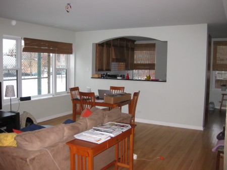
BEFORE
As you can see, the dining area is just off the kitchen and adjacent to the media area. The walls are already painted Benjamin Moore’s Quiet Moments, an airy blue-gray, and Erin wanted to keep the paint color as-is. Here’s the mood board I came up with for her space…
1 – Hang stuff! This IKEA pendant light will ground the open dining area and create a focal point when looking into the dining area from the living room. The woven bamboo window shades are keepers but added curtains will soften them up a bit. Erin mentioned she liked Moorish prints, so I found these West Elm curtain panels to use throughout the space. {You’ll see them in each mood board.} In the dining area, they’ll frame the large window seen above in the before image. Of course, they should be hung high and wide! Rubbed bronze curtain rods will work well throughout the entire space.
2 – To fill the dining space better, I chose this 60″ rectangular dining table. At less than $320, it’s a steal! On the long side of the table adjacent to the media room, I’d love to see this slat bench that can be used as extra media room seating when people turn around to face the TV. The bench will finish the U-shaped conversation area nicely in the media room, as you’ll see later.
What do you think? I’m totally loving those retro classic white dining chairs. Hang tight for the rest of Erin’s mid-modern condo…
images: 1) courtesy of Erin 2) Polyvore collage created by Dana Miller for House*Tweaking













inspiration