Once a month, I like to share an inspiring paint color with you. Well, really, I’d like to repaint my walls once a month just because there are so many great paint colors out there to try…but that’s not realistic now, is it? So, instead, I’ll stick with sanity and simply talk about the colors of my painted rainbow here. This month I’m all about Benjamin Moore’s Newburg Green HC-158.
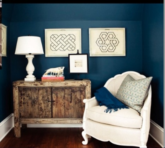
I’m normally drawn to light and airy backdrops, so this color is definitely off the beaten path for me. But I still think it’s great. Newburg Green is a rich, deep teal that works well in different color schemes. It’s moody but can be used like a neutral. Without sufficient lighting and light furnishings, fabrics and/or accessories, it can steer towards dark and cave-like real quick. Be warned! Done right, it can take a plain Jane room to va-va-va-voom.
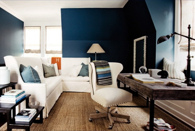
Take these guest house living quarters for example. Paired with lots of white and cream, textured seagrass, rustic reclaimed wood, black gloss accents and a pop of orange, the feeling is cozy and fresh. Notice all the natural light.
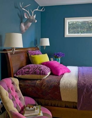
This L.A. guest room takes Newburg Green on a whole different spin. With even more natural light {thanks to the region’s warm and sunny climate}, the hue comes across as blue-er and teal-er and doesn’t require as much white to brighten it up. Instead, warm woods, hot pinks, deep plums, fresh chartreuse and shiny accents make for an inviting little jewel box of a room. Take note of all the textures used to soften the feel of the colorful room. There’s velvet, chenille and shaggy wool fabrics dressing the bed. The tufting on the curvy side chair helps to soften things up too.
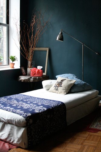
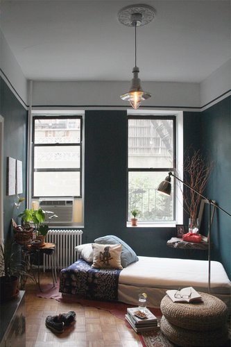
I’m not the first in blog land to take a liking to Newburg Green. Apartment Therapy named this bedroom one of its Room for Color winners last November. The owner used white bedding, woven ottomans, industrial lighting and burgundy accents in the masculine space.
Tamara over at Get It Girl Style used Newburg Green in her open living space to envelope the dining area. Again, there are many lighter elements {tile flooring, dining chairs, trim, place settings} to counteract the rich walls. A few pops of green and a woven veneer pendant work well against the moody backdrop.
I think Newburg Green would look splendid paired with denim, white and pops of orange in a modern nursery for a boy or even in an older boy’s room. Throw in a few dark pieces like an espresso changing table or nightstand along with a rubbed bronze floor lamp to add sophistication.
Switch up the orange accents for pea green ones and the combo becomes a little beachy. Still use it in a boy’s room or wander out to a young family room with it. Fun!
Get all Nate Berkus like with a masculine color scheme of deep teal, warm white, gloss black and a camel tone. Tone. Not toe. I could see this palette going over well in an office, study or den. Classic and timeless. Just don’t forget good lighting!
How about throwing Newburg Green in with white, linen and doses of raspberry? Bring in the raspberry with fresh flowers, artwork, pillows and printed fabrics. This color combo could take a girl from crib to dorm just by mixing up the accessories. Very fresh.
And no pictures of this one except in my head. What if in an all white kitchen you painted an island in a glossy Newburg Green finish? It’d be a happy surprise for sure. Can you imagine white walls and cabinetry, mocha floors, stainless steel appliances and a shiny teal island in the center of it all? Possibly topped with a chunky wood top? Mmmmm. I’d also like to note that Newburg Green is a good option for builder, cookie cutter homes. With the light cream carpet and white trim and white doors that seem to come standard in most of these homes, a rich teal could really cozy up an otherwise blah room. Do you have any ideas for using a deep, moody teal somewhere in the home?
images: 1) Benjamin Moore 2 & 3) Atlanta Homes & Lifestyles Christmas House 2009 4) Reed Davis for House Beautiful 5 & 6) Apartment Therapy 7) Get It Girl Style 8-11) Benjamin Moore paint collages by Dana Miller for House*Tweaking















budget decor, DIY, inspiration