...because home doesn't happen overnight.

We’re not ready to paint the Underdog yet.  In fact, we don’t even have drywall up!  But that’s not stopping me from gathering a bunch of paint samples to get a color scheme going.  Handy Hubby is 100% on board the figure-out-the-paint-colors-now train. And he’s leaving it up to me.  He says he trusts my eye.  We’ll see if he really means it when the paint goes up.

In the past, I’ve mostly used Valspar {Lowe’s} and Sherwin-Williams paint colors and paints.  No particular reason.  Those were just the nearest stores to our previous home.  Things might be a little different this time around.  We live in a new city that has a Benjamin Moore paint store located just minutes from the Underdog.  Seeing as how many of the paint colors I find inspiring online hail from BM, I decided to hit ’em up for some paint swatches.

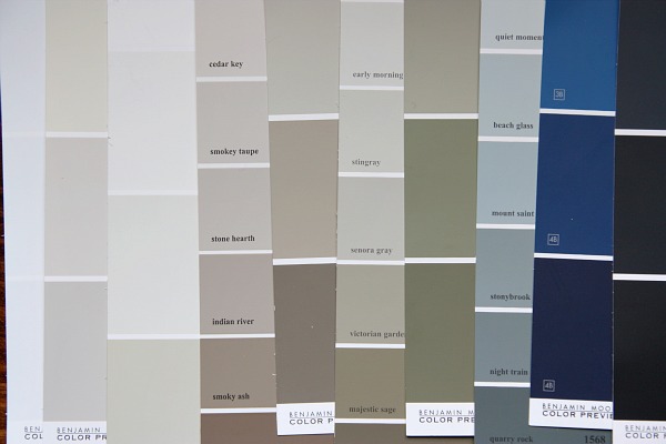
That first image is a pic of some of the BM colors {Coastal Fog, Stone Hearth, Stingray, Mount Saint Anne, Old Navy, Gravel Gray, etc} I’ve been adoring from afar, online, in various settings.  I decided to grab them up for reference in case I ever want them but they aren’t available anymore. Yes, I have an ongoing list of paint colors I like on my iPhone…categorized by brand.  It makes things a lot easier when I’m actually in the store.  I just look at my phone instead of standing there blankly pondering “Now what was that color I saw online that I wanted to check out?”

This week I stopped by our new {to me} BM paint supplier store and browsed through all the swatches.  Let me tell you that paint swatches are to me what free crack samples {do they even do that?!} must be to a crack head.  No offense to the crack heads out there.  When I get back in my car with a stack of free paint samples, I’m on a high.  That’s healthy, right? Healthier than crack at least.  And completely legal.

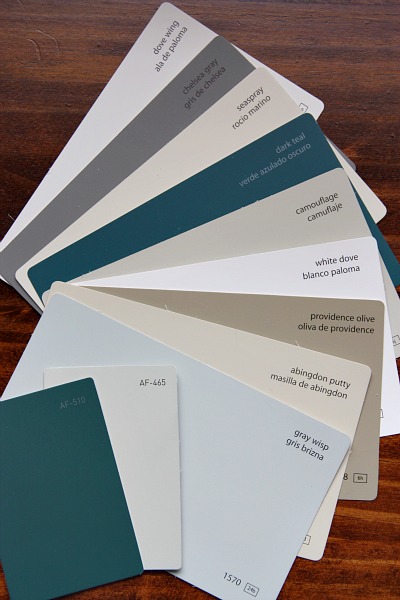
I left with this assortment of swatches.  I didn’t really have a deliberate scheme in mind – just started pulling swatches that spoke to me or that I thought would work well in the Underdog and work well together.  So far, the only sure thing at the house is the kitchen cabinetry which we purchased over the summer during an IKEA kitchen sale.  The lower cabinets are black and the few uppers are white.  Pretty much everything goes with either of those neutrals, so, like I said, I was just feeling the moment and grabbing what tickled my fancy.

In the mix, I ended up with a few light gray-ish, tan-ish, taupe-ish neutrals that I could see working well in the main great room.  I have every intention of keeping that space light and airy since we’re working so hard to make it that way {removing walls, vaulting the ceiling, adding skylights}. Painting it out in a dark taupe or gray would totally defeat the purpose…even though there are some great darker colors out there that I do love.

I also chose a few whites {man, there are sooo many white choices!} as possible trim paint options.  Then there are those pops of contrast and color in the more saturated teal, gray and olive swatches.  Not sure that any of those will actually make it onto walls in our house, but I like the overall scheme.  Bringing those colors into rooms either as painted pieces of furniture, throw pillows, patterned curtains or artwork would be a more subtle way to incorporate them.  I’m already picturing one of the dark teals on the front door in a nice, glossy finish.

What’s more…when I got home from the paint store and started looking more closely at the swatches, I made a fun discovery.

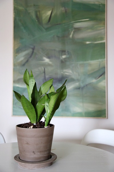
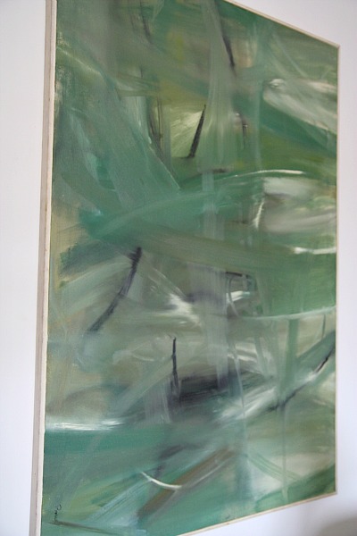
My on-a-whim color scheme loosely mimics the original art that I purchased at the Underdog’s estate sale back in late spring.  {Yes, I finally hung some stuff in our apartment!}

Can you see the light grays, tans and taupes?  The whites?  The contrasting jades, teals and charcoals?  The dark olive is in there too.

We have big plans for this large piece of art.  Without giving too much away, we’d like to use it as a ‘unique’ focal point in the living room area.  So pulling color inspiration from it – albeit subconsciously – seems like a reasonable idea.  Who knows? Maybe this original artwork {painted by the Underdog’s previous owner} will become the color inspiration for the entire house.  I think it’d be a great way to pay homage to the house’s previous owner. While the house may be unrecognizable by the time we’re done with it, I like the idea of letting this artwork take center stage and pulling subtle color inspiration from it. I’m being nothing but sentimental when I think of honoring it in such a way.  But it feels good.  It feels right. Plus, I like the colors.  Guess that’s why I bought it in first place.

images:  all Dana Miller for House*Tweaking


28 Comments

21.September.2011

We thought we liked Benjamin Moore colors better, too… until we saw the price. We got contractor pricing on their cheapest paint, and it was still around $40 per gallon. That wasn’t even low-VOC. This was a couple years ago, so pricing may have changed. But, sheesh! I’ll stick with getting the contractor pricing at Sherwin Williams. (You could probably get that pricing too if you tell them you’re a designer).

21.September.2011

Hi Dana,

Love your site and I hope this is a compliment but I am duplicating a couple of your rooms in my home. You do have a great eye. I just wanted to give you a warning about the bm paint. I bought my paint from BM too and I love it. Only thing is it cost me about 5 times as much. They don’t sell the paint in 5 gallon sizes. So you have to buy a lot of one gallons to paint your whole house the same exact color. I was on the spot when I found this out. I would love to have bought a five gallon bucket from somewhere else for the large spaces and then the one gallons for the smaller rooms from BM. Im from california so it may just be a california thing.

21.September.2011

Love the color scheme, and the connection with the artwork…that teal swatch is simply stunning!

21.September.2011

Personally I’m a blue-purple-pink sort of decorator so I’m loving the Gray Wisp. And I’m liking the Camoflage or AF-465 swatches if you want to lean green rather than blue (at least based on how they look on my ancient monitor).

Is that the way the art will be displayed? It is hard to tell if it is framed or not.

Just read everything on your blog over the past week – you are on quite an adventure – thanks for having us along for the ride!

21.September.2011

Love your paint choices. Can’t wait to see the finished product. I have grey wisp and night train. I love it.

21.September.2011

Love your site and the colors you picked.
My parents have Stone Hearth in their bedroom and it is a beautiful color. I’m actually going to use it for the upstairs of my house.

Good luck….

21.September.2011

Cheryl – The canvas painting is actually meant to be hung horizontally – at least that’s what I can tell from how/where the artist placed her signature. But in the apartment, it wouldn’t have looked right hanging that way, so I hung it vertically. In the living room over at the Underdog, it will be hung horizontally. There is a sad, sad wooden frame around it that’s probably original. It needs a fresh coat of paint to clean it up but that’s all I’ll do to it. I don’t really want to change it up too much. As for the paint colors, the artwork is showing up a little greener on the computer than in real life. Still, it is greener than the teals I picked out. I’d like to avoid the whole matchy-matchy thing, so I like the deep teal accent even with the slightly greener painting. We’ll see what happens!

21.September.2011

Melanie – Thanks for the heads up! I may try having swatches color-matched at another store in their own brand but I’ve always heard great things about BM paint despite the cost. My entire thought on going to BM was just to grab paint swatches since so many colors I like via other blogs and design sites hail from there.

21.September.2011

If you are thinking about low VOC in Benjamin Moore, you don’t need to go the Natura road. That is their overkill line, just buy the Select Regal line. That is also low VOC and cheaper than the Natura.

On another note, three really good whites for trim and casings are Decorators White (this is great ceiling paint too), White Dove (this is the usual color of white cabinets) and Acadia White.

21.September.2011

Ha! Great minds! The paint swatches for my bedroom makeover that I have been pulling are in EXACTLY the same family as the ones you have picked out. Teals, grays, navy, light-bluish/seaspray- I am in love with this palette. I’ve been really leaning towards going daring and painting the bedroom ceiling a moody shade of teal, since its such a private room I thought that might be the place to try it…

21.September.2011

We’ve done all BM paint in our last two homes and I will never use another brand. It is more expensive but I have never had a paint that washes/scrubs and blends so well! I like the color scheme – can’t wait to see it on your walls!

21.September.2011

I like your color choices. I have used Benjamin Moore’s regal matte line (their mid-grade) and absolutely love it. I recently tried a Valspar signature gallon and found it to be extremely difficult to work with. BM levels much smoother and is easier to clean up the brushes and rollers afterwards. I actually have the camouflage color in my foyer .. It has been there almost six years and still looks fresh. Recently, I painted my son’s room in BM edgecomb gray with simply white trim and love it as well. Also, my BM paint store always gives me a discount so I only paid $44 a gallon which was about $10 more than the Valspar gallon. Additionally , BM keeps a record of my paint colors in their system and their service is excellent… They carry the paint to the car for me every time…even offering if it is just one gallon. The quality of the product and the customer service is worth every extra cent! I’m sure your choices will be great and that the underdog will be as beautiful, if not more so than your previous home. You have great style.

22.September.2011

Dana, I am a huge BM fan. I’ve tried lots of other brands over the years and I always come back to Ben. It’s expensive but my husband & I both find that it goes on more smoothly than other brands, covers in less coats than other brands and is SO scrubbable. The new “BEN” line is low-VOC and I like as much as the traditional Regal. The Aura is great but even more expensive. After painting every room of 4 houses (some rooms multiple times)….I strongly recommend investing in fan decks to make your life easier!! In my most recent house I used Muslin (1037) everywhere and LOVE it! It’s so easy on the eyes and isn’t to beige or too gray. Also as mentioned, Decorator’s White is the perfect white; White Dove is a great creamy-white that I used in this house. Big decisions to make!! Can’t wait to see this all unfold!!

22.September.2011

Dana – do you happen to have the formula for Valspar Bonsai?? I prefer BM paint but I am in love with Bonsai!

22.September.2011

The entire first floor of my house is painted BM gray wisp– pics at http://robandbethstewart.com/wp/?p=187. In retrospect I wish I had introduced a bit more variety, but it is a great color and a color match to restoration hardware’s silver sage. It looks lovely with sandy sorts of colors, dark wood, white and black. Also works well with dark cherry wood, much to my surprise. I’ll note though that it doesn’t look especially good with creamy off-white trim, which my house unfortunately has in abundance! It changes significantly with lighting.

22.September.2011

Beautiful colors, and I love the inspiration!

I love the cool, more masculine color palette! For some reason, I really like those colors in mid-century homes (which always seem more masculine to me… maybe because of their cleaner lines?).

Great choices!

22.September.2011

I cannot wait to see he house done. I am excited!

22.September.2011

I love the color scheme, and I think the fact that it matches the painting so well is proof that your instincts are right about how cohesive the colors you’ve chosen will be together.

If you are intending to use the painting as a focal point in the living room, might I suggest a unique matting option? I have friends with a great painting like yours who didn’t want to mat and frame it traditionally, but did want to increase the size of the piece a bit and include some sort of border between the art and the frame to really set the frame off. They ended up frosting a piece of plexiglass and using that to mat the painting, and it’s absolutely gorgeous. Just a thought!

22.September.2011

Monica – What a great, inexpensive way to frame a larger piece of art! I would have NEVER thought of that.

22.September.2011

Beth – The gray wisp is very soothing and clean. It has a nice cool blue tint to it. Thanks for sharing pics of it in your home!

22.September.2011

Dana – I don’t know that I have the formula but I think I can scrounge up a paint swatch if that would help. Or I could ask my local Lowe’s for the formula. If you’re interested, email me {see ‘contact me’} and I’ll do whatever I can to help!

23.September.2011
23.September.2011

Kim – Awesome!!!

24.September.2011

I’ve used Stingray and Quiet Moments in my house and love both of them! Fun to see we have similar tastes and can’t wait to see what you decide on!

05.October.2011

Came across a beautiful BM color today… wanted to use Bonsai but was nervous it would be too dark on the walls in my house that are now painted Pale Moon (Yellow)..
I found Revere Pewter HC-172 – it’s just a tad lighter and airier that Bonsai. You may want to check it out.

05.October.2011

Dana – I have that swatch!!! It is great. Try googling images of ‘bm revere pewter’…there are some great ones.

05.December.2011

Love your blog already and i just discovered it tonight..(long boring night at work)!I will surely be stealing some ideas.