If you’ll remember from our apartment tour, this is the kitchen…
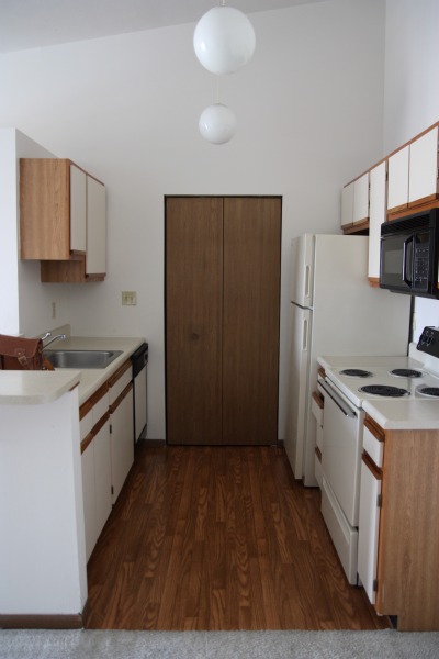
Looks like an apartment kitchen, doesn’t it? It’s teeny but fine for what we need right now – which is just somewhere to store and cook food while the Underdog undergoes some major surgery.
Right away {even before we moved into the apartment} I noticed something about the kitchen that caught my eye. The countertops appear to have been painted. Not by us.

That’s the breakfast bar countertop above. {Yes, I ordered the new Design*Sponge at Home book last week. No, I haven’t even cracked it yet. It’s just been sitting on the bar ever since it arrived. I’m waiting for a rainy day…}

The main background color is creamy with flecks of tan and gray on top to give it a little more dimension. For an apartment countertop, it’s not bad. Not bad at all. It’s light, clean, stain-free and wipes down easily.

On the other side of the breakfast bar is the sink with a little bit of counter space on either side of it. This is where I prepare meals/snacks and where dirty dishes sit before they’re washed. {I’m hand washing everything because, ironically, the dishwasher does NOT wash dishes. It just squirts some water around and makes a bunch of noise, leaving our plates and silverware looking like they did right after we finished eating with them.}

I’ll be honest. I don’t necessarily try to be nice to the countertops. Sometimes, I put hotter-than-recommended pots and pans on them, cut directly on them and clumsily drop pointy/heavy dishware on them. But the counters have held up very well so far. No dents, scratches, blemishes or anything. Of course, I have no idea how long the countertops have been painted. We very well could be the first to use the painted surface. Still, it seems quite durable.
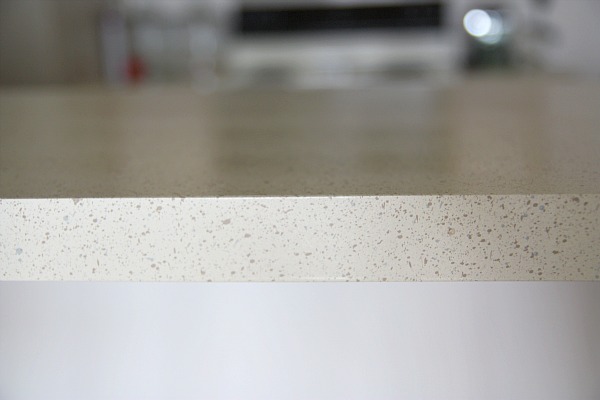
Even the edges are holding up. I told Handy Hubby that I thought the countertops had been painted and he didn’t agree at first. But we got to looking around and there is telling evidence that they have been painted. Some of the countertop paint is on top of the caulk around the 4″ backsplash against the wall. There’s no other explanation for it. Must have been due to a shoddy tape job. HH believes me now.

The surface is what I would call a satin finish. It has some shine to it but it’s definitely not glossy. It’s textured too. I’ve tried my darndest to figure out what the original countertop may have looked like because I’m weird/curious like that. But the original surface is covered really well and I can’t find a single painting ‘miss’ that would give me a clue as to what it was. Because it’s an apartment, I’m guessing faux butcher block. Oh, how happy I am it’s painted if that really was the original look.
I must say I’ve been pleasantly surprised by the durability and appearance of our painted countertops. Although it’s not something I would ever want permanently, I think it’d be a great temporary holdover project for someone saving money for natural stone {or the like} who can’t bear to live with, say, faux butcher block anymore. Needless to say, it’d be a DIY project for a rental too {as long as the landlord gives you the go ahead}. And maybe even a good investment for someone trying to sell a home that has cringe-worthy, dark, hunter green countertops. Taking a peek at some prices, it looks like you could achieve a transformation like this for less than $300 with one of the countertop transformation kits available at home improvement stores.
Have you seen painted countertops before? Ever tried ’em yourself?
images: all Dana Miller for House*Tweaking
We’re not ready to paint the Underdog yet. In fact, we don’t even have drywall up! But that’s not stopping me from gathering a bunch of paint samples to get a color scheme going. Handy Hubby is 100% on board the figure-out-the-paint-colors-now train. And he’s leaving it up to me. He says he trusts my eye. We’ll see if he really means it when the paint goes up.
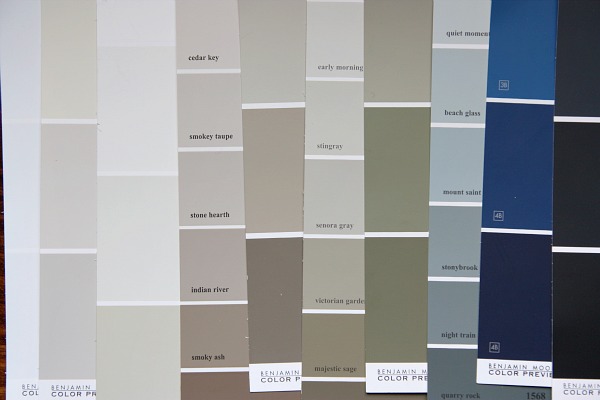
In the past, I’ve mostly used Valspar {Lowe’s} and Sherwin-Williams paint colors and paints. No particular reason. Those were just the nearest stores to our previous home. Things might be a little different this time around. We live in a new city that has a Benjamin Moore paint store located just minutes from the Underdog. Seeing as how many of the paint colors I find inspiring online hail from BM, I decided to hit ’em up for some paint swatches.
That first image is a pic of some of the BM colors {Coastal Fog, Stone Hearth, Stingray, Mount Saint Anne, Old Navy, Gravel Gray, etc} I’ve been adoring from afar, online, in various settings. I decided to grab them up for reference in case I ever want them but they aren’t available anymore. Yes, I have an ongoing list of paint colors I like on my iPhone…categorized by brand. It makes things a lot easier when I’m actually in the store. I just look at my phone instead of standing there blankly pondering “Now what was that color I saw online that I wanted to check out?”
This week I stopped by our new {to me} BM paint supplier store and browsed through all the swatches. Let me tell you that paint swatches are to me what free crack samples {do they even do that?!} must be to a crack head. No offense to the crack heads out there. When I get back in my car with a stack of free paint samples, I’m on a high. That’s healthy, right? Healthier than crack at least. And completely legal.
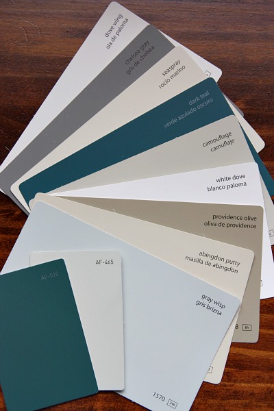
I left with this assortment of swatches. I didn’t really have a deliberate scheme in mind – just started pulling swatches that spoke to me or that I thought would work well in the Underdog and work well together. So far, the only sure thing at the house is the kitchen cabinetry which we purchased over the summer during an IKEA kitchen sale. The lower cabinets are black and the few uppers are white. Pretty much everything goes with either of those neutrals, so, like I said, I was just feeling the moment and grabbing what tickled my fancy.
In the mix, I ended up with a few light gray-ish, tan-ish, taupe-ish neutrals that I could see working well in the main great room. I have every intention of keeping that space light and airy since we’re working so hard to make it that way {removing walls, vaulting the ceiling, adding skylights}. Painting it out in a dark taupe or gray would totally defeat the purpose…even though there are some great darker colors out there that I do love.
I also chose a few whites {man, there are sooo many white choices!} as possible trim paint options. Then there are those pops of contrast and color in the more saturated teal, gray and olive swatches. Not sure that any of those will actually make it onto walls in our house, but I like the overall scheme. Bringing those colors into rooms either as painted pieces of furniture, throw pillows, patterned curtains or artwork would be a more subtle way to incorporate them. I’m already picturing one of the dark teals on the front door in a nice, glossy finish.
What’s more…when I got home from the paint store and started looking more closely at the swatches, I made a fun discovery.
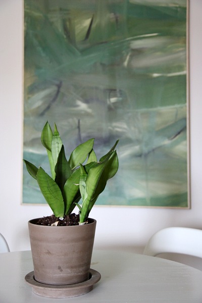
My on-a-whim color scheme loosely mimics the original art that I purchased at the Underdog’s estate sale back in late spring. {Yes, I finally hung some stuff in our apartment!}
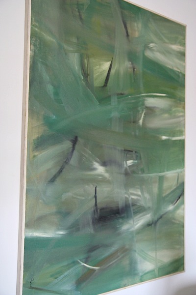
Can you see the light grays, tans and taupes? The whites? The contrasting jades, teals and charcoals? The dark olive is in there too.

We have big plans for this large piece of art. Without giving too much away, we’d like to use it as a ‘unique’ focal point in the living room area. So pulling color inspiration from it – albeit subconsciously – seems like a reasonable idea. Who knows? Maybe this original artwork {painted by the Underdog’s previous owner} will become the color inspiration for the entire house. I think it’d be a great way to pay homage to the house’s previous owner. While the house may be unrecognizable by the time we’re done with it, I like the idea of letting this artwork take center stage and pulling subtle color inspiration from it. I’m being nothing but sentimental when I think of honoring it in such a way. But it feels good. It feels right. Plus, I like the colors. Guess that’s why I bought it in first place.
images: all Dana Miller for House*Tweaking











budget decor, DIY