...because home doesn't happen overnight.

Last week I shared our friends’ renovated kitchen and dining space. There was interest in seeing how the renovation affected other areas of the house so I thought it would be helpful to feature the entry, family room and office as well. First, let’s recap how James and Kristina reworked the floor plan without adding square footage. (FYI – These are rough sketches showing changes made to the layout. They are not to scale.)

BEFORE

modern family reno floor plan before

AFTER

modern family reno floor plan after

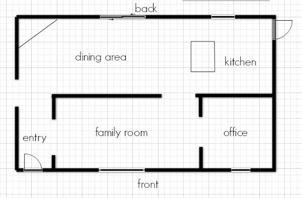
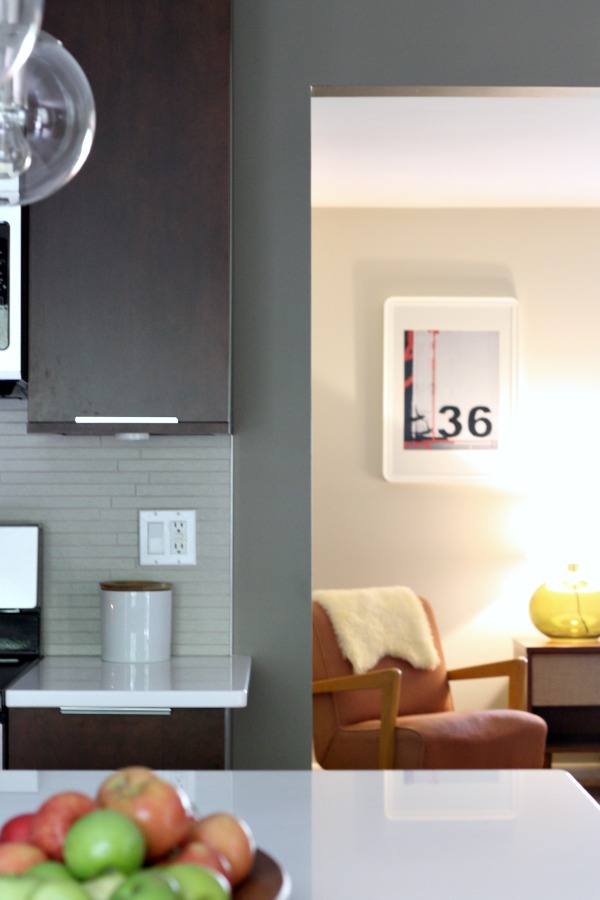
A wall separating the kitchen from the original family room was removed and a doorway in the kitchen that provided access to the original dining room was closed up. Keeping their casual lifestyle in mind, the homeowners turned the former family room into an open dining space. The original (more formal) living room at the front of the house became a family room and the original dining room became a home office. Part of the wall separating the new kitchen from the new family room was opened up to give the space better flow.

modern family entry before

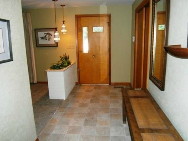
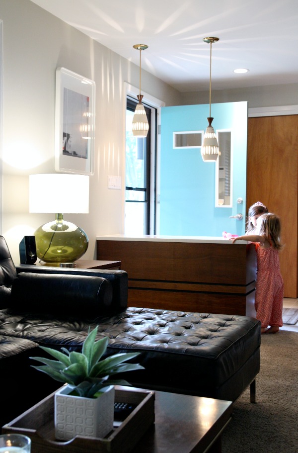
The original entry included vinyl flooring and a few midcentury gems (i.e., front door, pendant lights and brick pony wall planter).

modern family room 1

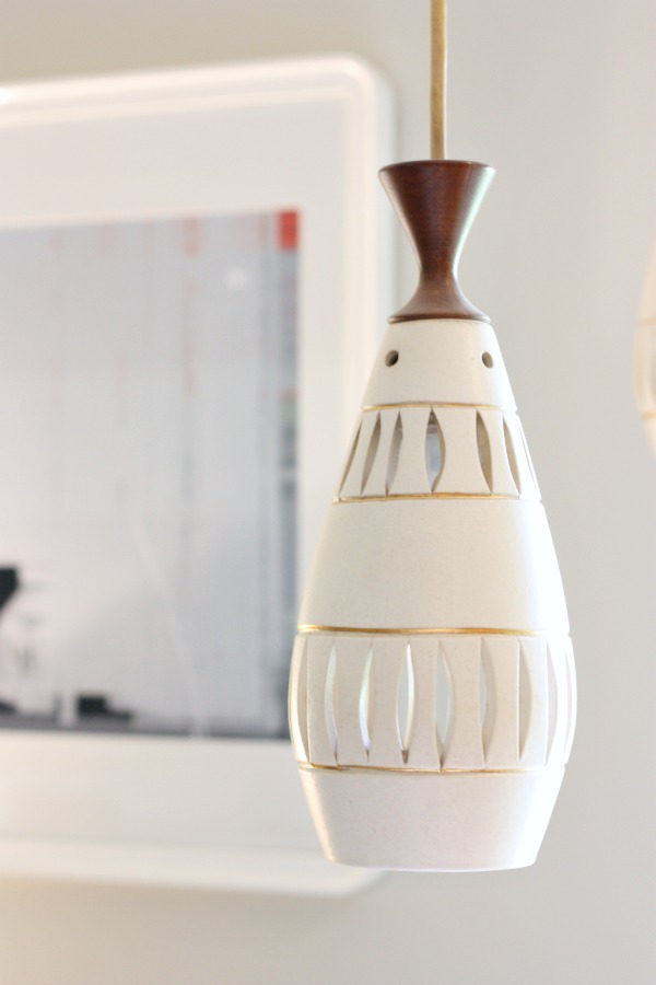
Not wanting to stray too far from the home’s midcentury roots, the homeowners kept the original front door but painted it a lively turquoise. They kept the statement pendants and pony wall but chose to nix the planter setup. (They didn’t think the planter would go over well with their two young kids and two dogs.)

modern family entry 2

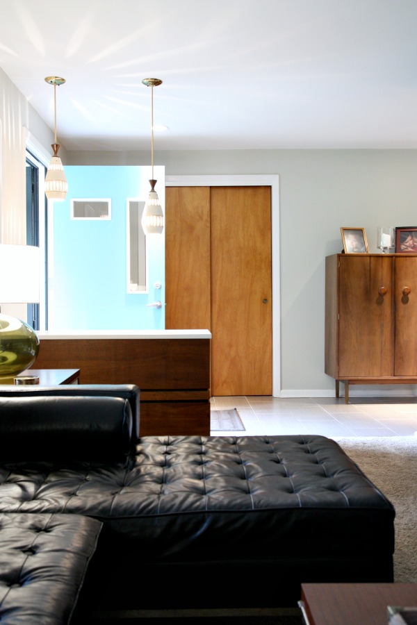
Instead, James covered the brick pony wall with MDF, painted it black and then wrapped the entire thing in walnut paneling salvaged from the paneled wall that once separated the kitchen from the old family room. (You can spy a glimpse of it here.) He capped it with the same quartz countertop material found in the new kitchen. The pony wall provides a welcome pause upon entering the home without completely blocking off the entry. James was able to reuse more of the walnut paneling as shelving in the entry closet for added storage.

modern family entry 1

The new entry boasts the same large scale tile found in the kitchen and dining space. It’s durable and provides a cohesive look.

modern family room before

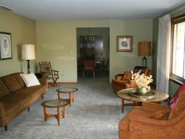
To James and Kristina, the original living room felt too formal and too disjointed from the heart of the home (the kitchen). The adjoining dining room was dark and didn’t jive with the family’s desire for an open kitchen-dining space.

modern family room 2

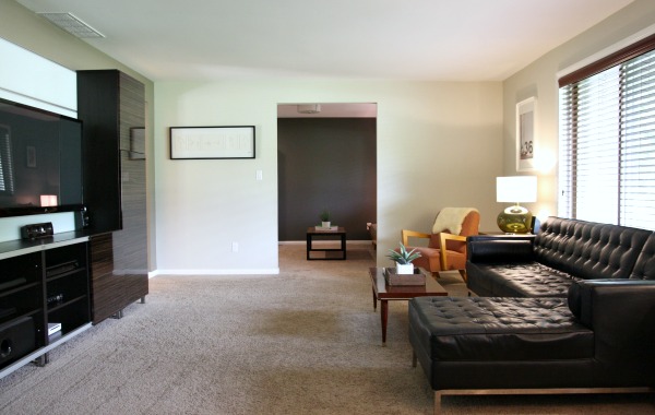
They decided the formal living room was unnecessary and repurposed it as a casual family room. The dining room was sealed off from the kitchen and relabeled as a home office. James is a self-employed contractor and runs his business from home. Kristina is currently taking college courses. The new room designation just made sense.

The entire home’s carpet had recently been replaced when James and Kristina took possession of the house. They considered installing hardwood flooring but the new carpet was in excellent condition and reminiscent of a 50s shag. In the end, they decided to keep the carpet out of the landfill and embrace it.

modern family room 3

modern family room 8

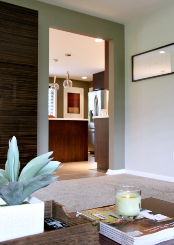
A wide doorway between the family room and kitchen lends an openness and a simplified traffic pattern between the two spaces.

modern family room 6

modern family room 5

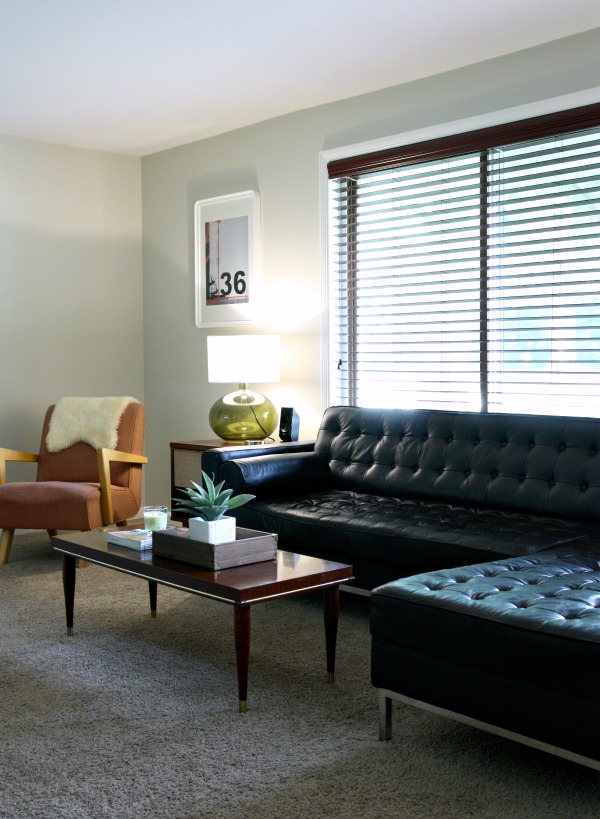
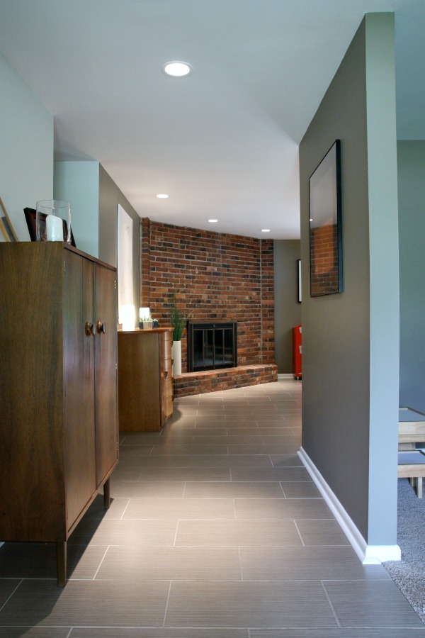
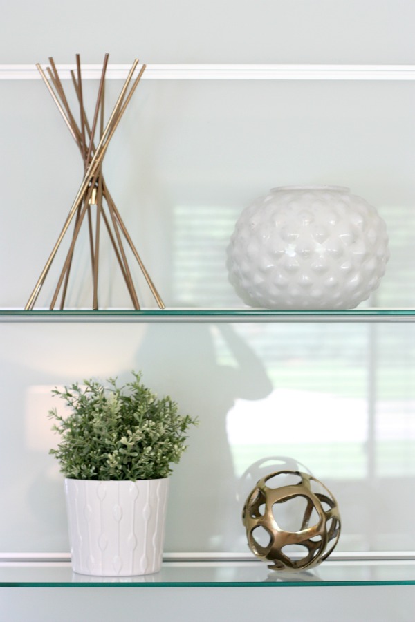
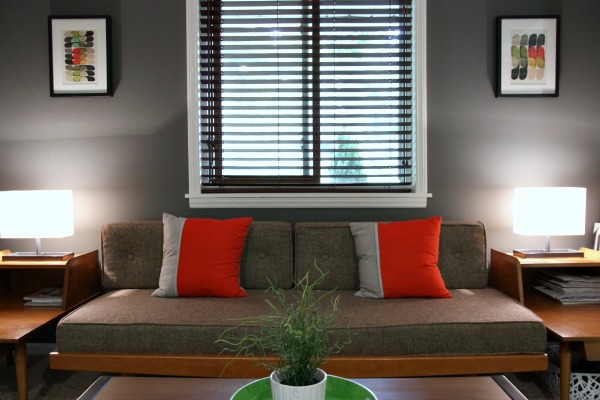
Staying true to their preferred minimal and masculine aesthetic, James and Kristina mix midcentury finds with clean-lined contemporary furnishings.

modern family room 4

For contrast (and to play up the room’s inherent darkness), the office is painted a deep charcoal with blue undertones. Since photographing the space, James and Kristina have hung an oversized black and white print on the far wall to draw the eye into the office.

modern family office 3

modern family office 2

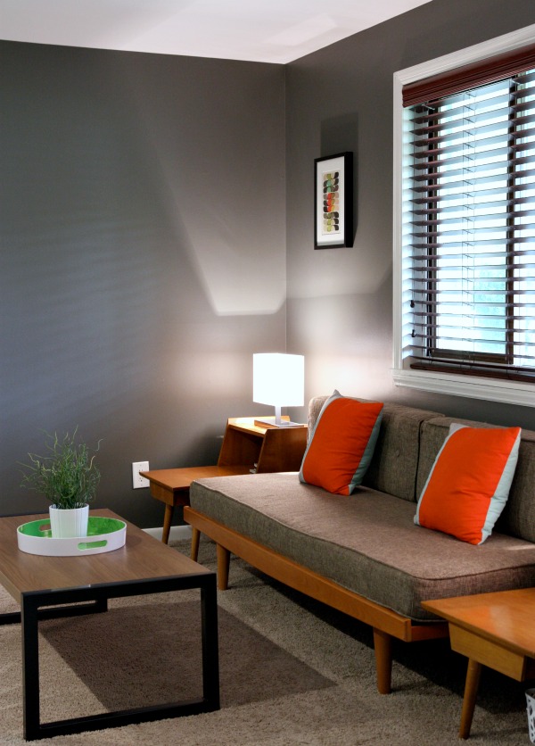
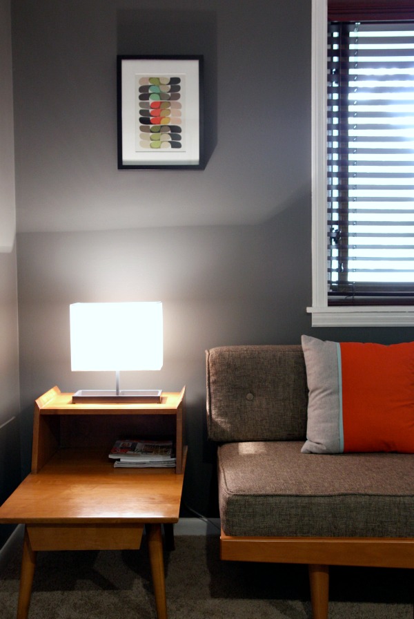
One side of the office features a sitting area and has a cozy den vibe. Vintage end tables play nicely with a big box daybed.

modern family office 4

modern family office 5

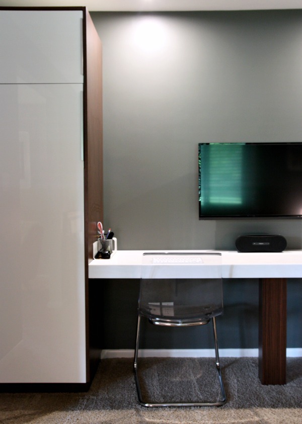
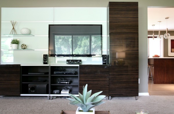
The opposite side of the room functions as a workspace. James installed LED can lights overhead. The wall-mounted flatscreen can be used as a computer screen or a TV screen (for watching movies or playing video games). Two tall Ikea cabinets flank the desktop. James wrapped the cabinets and center desk support in a tiger wood laminate from a countertop supply store. The desktop is marbled Corian with a 3″ lip to give it a chunkier appearance and to hide unsightly wires. Transparent chairs take up little visual space in the small room.

Rescources of note:

family room and entry wall paint – Behr ocean pearl, matte finish
TV wall paint – Behr mocha accent, matte finish
office wall paint – Behr dark ash, matte finish
entry tile – Kaska Italian porcelain tile from Build Direct
entry cabinet – vintage
entry pendants – original to the house c. 1965
walnut paneling – original to the house c. 1965
pony wall top – Silestone white zeus quartz
media center – BESTÅ, Ikea
family room end tables – Urban Outfitters
family room coffee table – $20 garage sale find
family room chair – vintage, given as a tip from one of James’s clients
sectional – Kardiel
family room table lamps – Ikea
desk cabinets – ABSTRAKT, Ikea
desk chairs – TOBIAS, Ikea
office daybed – Urban Outfitters
office coffee table – Target
office end tables – vintage via craigslist
pillows – Target

modern family room 7

modern family media

modern family office 1

modern family light

modern family entry 3

There are so many good ideas to take away from these spaces:

*Don’t be afraid to think outside the box and relabel rooms to suit your needs and lifestyle.

*Always consider what’s on the other side of a wall. Closing off and / or opening up doorways can have a huge impact on a home’s flow.

*Some original statement features are worth keeping – even if it means putting your own spin on things.

*Quality materials can be salvaged and repurposed as a way to pay homage to a house’s past life.

*You don’t have to rip out all the carpet to make an improvement. Replacing the flooring in the most highly trafficked areas will give you the biggest bang for your buck. Keep durability, cohesion and traffic patterns in mind when contemplating materials and location.

*Mix old and new successfully with a unifying theme.

Once again, thanks to James and Kristina for sharing their livable yet stylish, modest yet modern home! I can’t get over the entry pendant lights and the modernized pony wall. What’s your favorite part? I have a few more ideas from this renovation to share as inspiration. Stay tuned…

images: Dana Miller for House*Tweaking

27 Comments

15.October.2014

Beautiful home. Thanks for sharing!

15.October.2014

Beautiful home – but it also feels attainable. Love it!

15.October.2014

If I worked from home, having a desk in a dark corner doesn’t sound ideal to me. Then again, I don’t have kids, so maybe being a little out of the way suits them.

Otherwise, I really love it. Beautiful details, but it still looks so cozy and livable.

15.October.2014

Anyone who can make a black leather couch look that good has my full respect (I’m typically not a fan). This is a cozy, beautiful home. Thanks for sharing!

15.October.2014

Most of James’s work time is spent outside the home, remodeling others’ houses. The office is where he creates designs and handles paperwork. It’s a very quiet, enveloping room in real life!

15.October.2014

I love the house! Thanks for sharing. I did laugh pretty hard at the description of your friend in your introduction. It was very detailed.

15.October.2014

Oh I have so, so enjoyed viewing this house, Dana – thanks for showing more! I love the design aesthetic (which isn’t surprising since yours is similar to mine which is why I’m a reader/follower), even though it is more mid-century than I’d ordinarily choose. But their clean, modern take and soothing colours (I am so sick of everyone painting everything white) make it hip and cool and very liveable.
How wonderful to have a friend so close and so inspiring! Now I’m off to peruse Craigslist…..

15.October.2014

This looks so cozy! I love that they kept the carpet – it makes so much sense in those cozy rooms.

15.October.2014

This space. Amazing. I love how they kept so many original elements and those pendants are incredible!

15.October.2014

Thanks for sharing more of their home! You read my mind. And I love how you include floorplans. It always helps me visualize the spaces better. What program / web site did you use to create these?

15.October.2014

Those pendants and that door are total scores! And that gray paint is beautiful :)

16.October.2014

Beautiful home! Love the changes to the floor plan….and love that you include the floor plan so we can visualize the changes! So often I read an article online or in a magazine and wish there was a floor plan!

16.October.2014

We are slowly renovating our 1959 rancher and this home is one I can really be inspired by! we just painted our front door turquoise too! For the sake of budget we are also looking at what we can keep as a nod to the home’s history and what we can change and still remain with the same midcentury modern aesthetic. The tile is one of my favourite parts of this house.

16.October.2014

They did a lovely job. It looks really fantastic. Isn’t it funny, though. I’d kill for the original lay out. We’re military, have moved five times since 2008 and are going overseas this summer, I dream of formal living and dining. I have an open concept / casual lay out now. Even with a one and three year old, I despise it.

16.October.2014

[…] James and Kristina‘s laundry room is less of a room and more of a hallway that runs between the kitchen and garage. […]

16.October.2014

I used floorplanner.com! Super simple and fast. To save money, I just keep changing the one *free* floor plan in my account. I take screen shots and save those for reference before I make changes. Hope that helps!

16.October.2014

She’s gorgeous! It’s kinda hard not to notice! Haha.

16.October.2014

I seem to be in the minority here, and though the house is beautiful, it doesn’t seem like a home. It doesn’t appear inviting or cozy. Maybe it was just that she knew pictures were being taken and made it extra tidy.Where are the toys? Family pictures? Cozy places to snuggle? With kids and dogs, that’s a lot of surfaces to Windex!

16.October.2014

Toys are kept in the kids’ bedrooms but they are welcome to bring them out into the main living spaces when playing. There is a play kitchen in the kitchen – dining area. There are family pictures on the armoire in the entry and in more private rooms of the house. I think I mentioned that their aesthetic is decidedly minimal and modern. That’s just their preference!

I find that I’m inspired by spaces that aren’t necessarily decorated the way I would decorate them. I still find so many ideas to take away. Maybe you do too?

[…] Last week I shared our friends’ renovated kitchen and dining space. There was interest in seeing how the renovation affected other areas of the house so I thought it would be helpful to feature the entry, family room and office as well. First, let’s recap how James and Kristina reworked the floor plan without adding square […]  […]

17.October.2014

This is fascinating to me because it’s the exact same floor plan as my house! We turned that back room into a dining room and are thinking of closing in the doorway from the kitchen into our music room (their office). It is so helpful to see because it’s not a very common layout. Do you know how big their house is? The pictures make it look so big, but I’m wondering if it’s pretty close to the same size as ours. Thanks!

17.October.2014

Thanks for the tip! I love the simple, clean look of it. I’ll have to check it out.

17.October.2014

Loving the wall mounted TV/Computer screen combo! Are they special monitors? I work from home using 2 monitors and the wires drive me crazy….have 2 nice and tide wall mounted monitors would be a dream. What a great idea!

18.October.2014

I love the design. We have similar layout of our house, so my imagination was running wild with ideas inspired by your design. Thanks for sharing.

[…] the walnut-wrapped pony wall (topped with quartz obvi) from this gorgeous mid-century spotlight on house*tweaking? The whole house is brilliant and I suggest you scour it for ideas. I’m totally adopting this […]

22.January.2015

Would love to know the color of that awesome blue front door!!

12.February.2015

WOW! You know you’ve made it when your home looks like that! What a beautiful well designed modern living room! Absolutely love the sectional :)