Hi! How are you? I hope you’re well and doing everything in your power to stay that way. Our household is fine. The kids are schooling from home; Steve is working from home. Our dining room table is ground zero and a bit of a disaster these days. I’m still working at the hospital pharmacy which has been a roller coaster of a ride the last several weeks, but I’m grateful to just be working when so many others can’t. Nevertheless, my work climate feels extremely heavy and in an effort to balance it out I’ve recently found myself craving “lighter” pursuits during my time off: long walks, bike rides, new dinner ideas, new workouts, photography…heck, even cleaning house has been a worthy distraction.
Which is how this post came to be. I’ve been wanting to mock up our current home’s floor plan for a while now. I’m oddly passionate about floor plans. I used to draw up dream floor plans in middle school. Of course, they included such fantastical things as indoor pools and slides, gymnasiums, art studios, hidden rooms, trap doors and the like. Even now, I’ve been known to sketch out floor plans of interesting Airbnbs I come across online. I love Dwell magazine if not for the sole reason that most features include floor plans. I like to imagine how the house unfolds itself to those in it and how it lives.
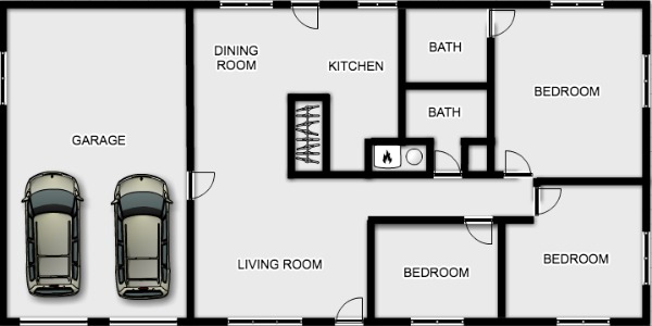
I spent some time last week mocking up our current layout (I used Floorplanner) and it was strangely satisfying. I love a bird’s eye view! I thought it might be a cool thing to share here for reference. Maybe it helps you piece together some of my IG photos so you can see how the spaces relate to one another. Or maybe I’ll actually get around to sharing some projects (fingers crossed!) and this can serve as a map so to speak. I’ll warn you. It’s…unique.

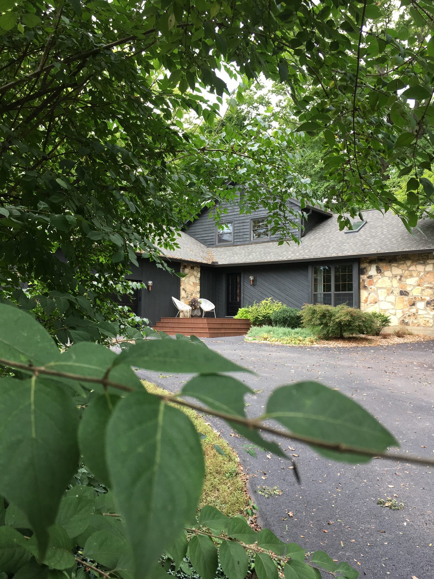
Built in 1979, the house is a living example of 70s contemporary architecture. Common features of this style include vaulted ceilings in public spaces, multiple levels, wide staircases, loft areas, floor-to-ceiling stone fireplaces and angled wood siding. Our home has them all! Originally, this type of architecture was designed to work on challenging, often sloped and wooded, plots. (Think Sea Ranch in California.)
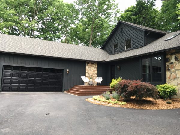
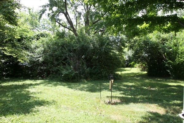
Our own home is perched on a small hill nestled in the woods. It sits back off a cul-de-sac and feels really private. Even though the lot is larger than our previous residence (we went from roughly a half-acre to one acre), there’s very little yard. We actually have less grass to mow here; it’s mostly woods. A small stream trickles through the front. It’s quiet and there’s a lot of wildlife. In fact, the day we first toured the house nine deer traipsed through the woods! The lot and the way the house is situated on it is what ultimately sold us on moving.
Now that you have a better grasp of how the house sits on the landscape, let’s talk floor plan. The house is a 4 bed / 2 bath and is technically two stories, but the second story doesn’t span the entirety of the first floor. The total living space is ~2,300 sq ft. Yes, that’s ~600-700 sq ft more than our previous home. Most of the additional square footage comes from a fourth bedroom, a small loft area and separate kitchen / living areas. Before I catch flak for touting smaller living then buying a bigger house, please know that if it were up to me only I’d live in a tiny house tomorrow. But the people I love and live with don’t exactly feel the same way. Also, if a smaller house with similar features were on this lot, we probably would have pulled the trigger on it, too. It’s the lot and location that ambushed us. That being said, I’ll be the first to admit that we use every square inch of this place. So, the main floor…
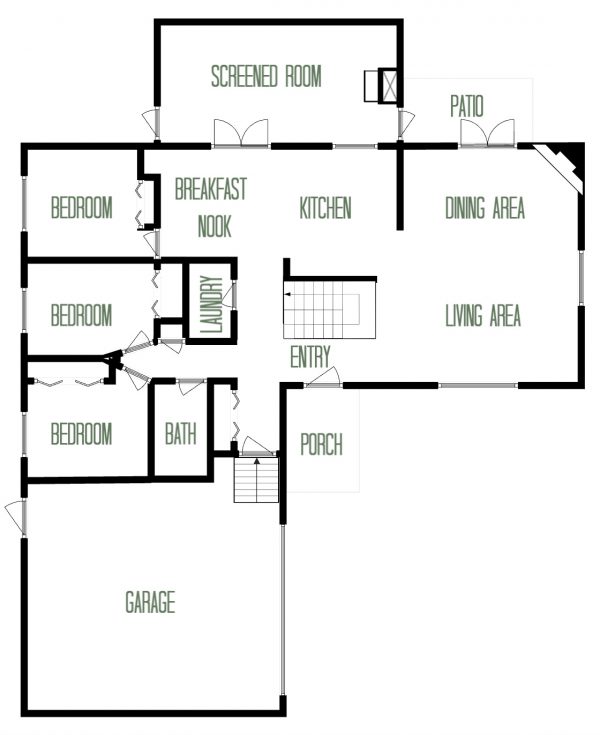
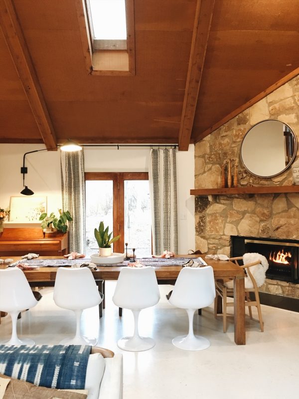
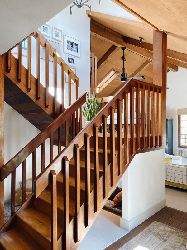
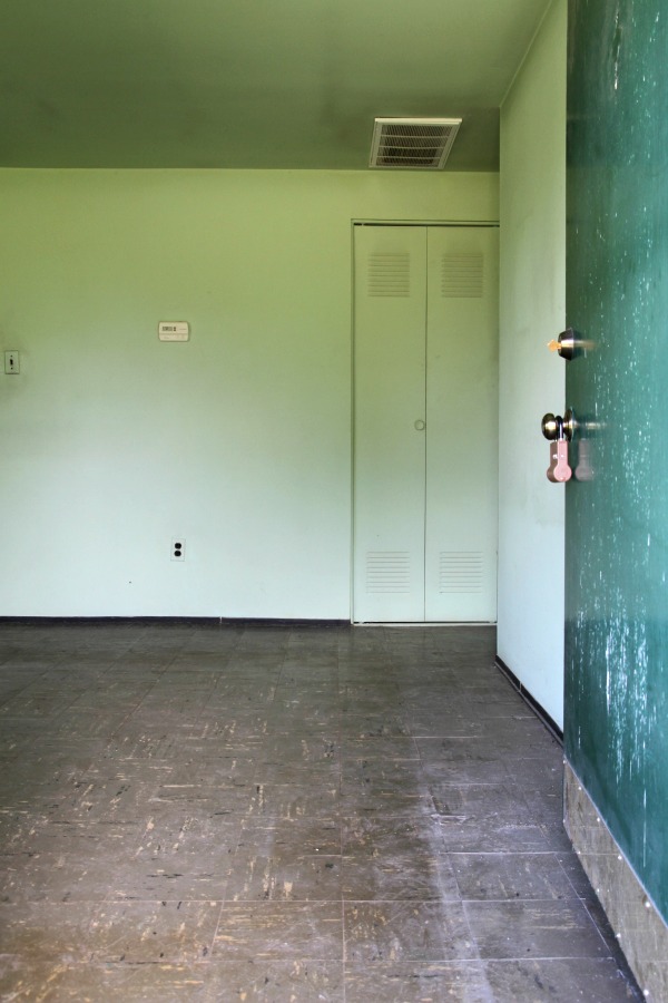
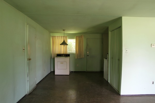
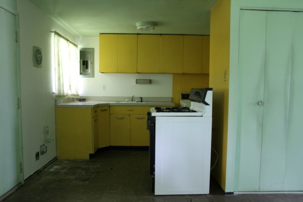
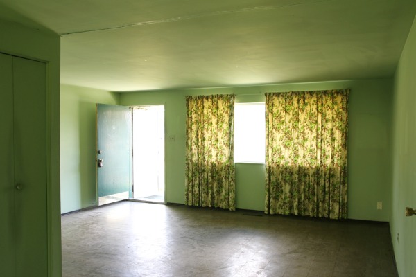
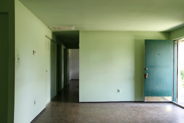
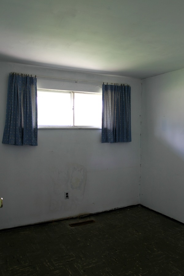
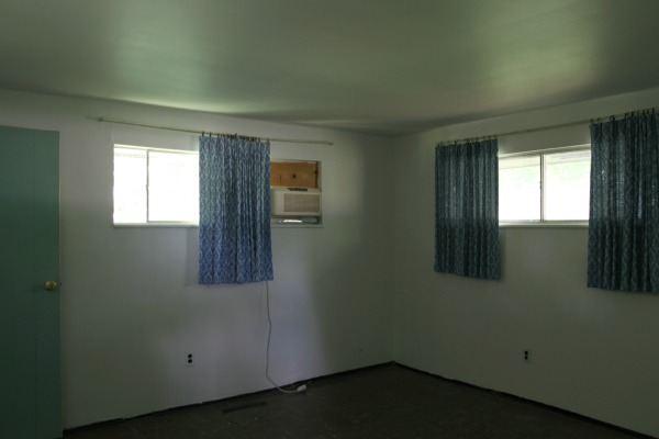
The sketch above isn’t exactly to scale, but it’s pretty darn close. The whole house is centered around an open, winding staircase featuring a landing that overlooks the living and dining areas. Not shown in the above sketch is a step down into the living / dining area from the entry and kitchen. It’s just one step but, along with vaulted ceilings and skylights, it makes the space feel incredibly open. The kitchen isn’t huge (read more about it here) but does include a small breakfast nook which we use regularly. Inspired by an Airbnb we stayed at in Connecticut, we added a screened room / porch off the kitchen. It’s our favorite spot to hang with neighbor friends when the weather…and non-pandemic conditions…allow. The laundry room is teeny and houses a furnace, water heater, water softener, utility sink and litter box along with the washer and dryer. It’s a tight space that could really work better. However, I do like having a designated laundry area behind a closed door. We use the full bathroom on the main floor as a kid / guest bath. (Two baths is our sweet spot! Couldn’t easily share one; don’t want to clean any more than two.) Three bedrooms round out the main floor.
Please note: the screened porch and garage are not included in the total square footage as these spaces are not temperature regulated.
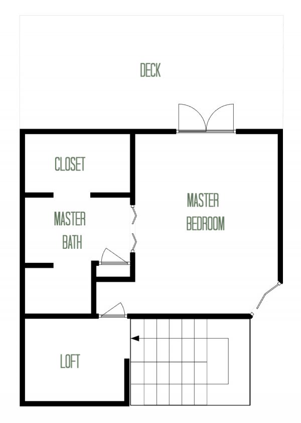
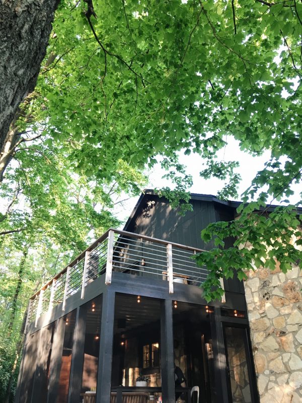
The second story sits atop the kitchen, breakfast nook and laundry (remember, the living / dining area has vaulted ceilings so no second story there) and consists of a small loft and master suite. Once again, this isn’t exactly to scale but hopefully you get the idea. We weren’t really sure what to do with the loft area, but it’s organically grown into a music nook / library / home office. We’re just letting it be what we need it to be instead of trying to give it a specific look or purpose. The master bedroom is just big enough for a queen bed, nightstands and a small dresser but lives larger thanks to doors that open up to a deck (basically the screened porch’s roof). An awkwardly placed bifold door reveals a Juliet balcony overlooking the living area below. It’s both scary and cool. We haven’t quite decided if it stays or goes, so it stays for now. (That’s always been one of our mottos: When in doubt, live with it a while.) The ensuite bathroom and closet are decently sized but inherently dark. There are no windows. In my opinion, windowless bathrooms are the greatest downfall of the floor plan. A toilet and bathtub occupy the small space not labeled in the master bathroom.
Never in a million years could I have dreamed up this floor plan, but it totally works for us. The circular layout, while somewhat confusing to visitors (“How do I get to the bathroom again?!”), is like a roundabout keeping foot traffic flowing. Kids and cats constantly going round and round, haha! The ratio of open public spaces to smaller private spots feels just right. The nook under the stairs is the coziest! Steve and I like having our bedroom upstairs, separate from life’s daily happenings on the main floor. In our previous home, we never wished for more room but sometimes more rooms, if that makes any sense. To us, it’s obvious that the builder thoughtfully designed the house to fit the lot. There isn’t another house just like it in our neighborhood.
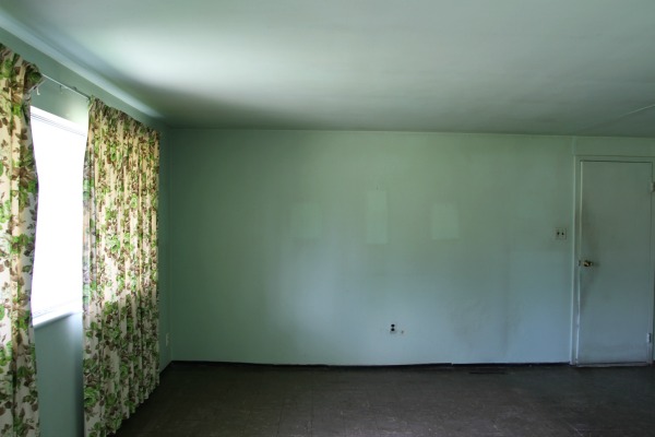
We’ve already made some tweaks to the original brown-on-brown-on-brown color scheme, and we have plans for more changes to lighten darker spaces (goodbye kitchen and bathroom soffits!) and improve function in the utilitarian rooms. (I’m side-eyeing you, kitchen and laundry.) However, there are NO PLANS to knock down any walls or move any doorways. We really don’t want to make this house something it isn’t. It’s a quirky, cool product of the 70s that is well suited to a quiet life in the woods. Basically, it’s my spirit house.
images: Dana Miller for House*Tweaking


family life, inspiration, interior design, renovation