A quick backstory: Lowe’s invited me to their headquarters a few months ago. I’ve never really been a fan of blogger conventions / events. I guess that’s the introvert in me. But I was suffering from a major case of cabin fever and Steve was encouraging me to go so I accepted the invite. I got a behind-the-scenes peek at the company’s thought process and was asked to give honest feedback on everything from products to advertising to store layouts. I was nothing but honest. Maybe even a little brutal? Let’s just say I didn’t hold back. But they took it all in stride, asking more questions. They really want to be better – even different – at what they do.
On the last day of my visit, I was paired with another blogger and we were given creative freedom to create a room of our choice using Lowe’s products. We designed a bathroom and it was so much fun! I really appreciated the fact that we were not pressured to create a certain look. Honestly, that bathroom was a space I would want in my own house. Before I left to return home, they told me to contact them if I was ever in need of help with a project. That offer came to mind when I started making plans for the studio so I reached out. I can’t thank Lowe’s enough for the drywall and paint. And they didn’t ask me to say that either. In fact, they didn’t ask me to say anything.
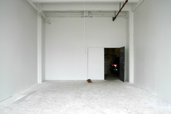
Remember what the studio looked like a month ago? It’s well on its way to becoming a blank canvas.
Steve and I briefly discussed hanging new drywall and painting the room ourselves but, when we looked at our busy calendar, considered the scope of the project (the ceiling is 18′ high!) and couldn’t come up with a good solution for childcare, I decided to hire out. As DIYers, that was a hard pill to swallow. But since I’m renting the space, time is money. It helped that Lowe’s stepped in to cover the cost of materials. For that, I am so grateful.
One of the best things about this space is that it doesn’t have to be perfect. We aren’t going to be living here, just making messes and being creative. Instead of ripping out the original drywall, the drywall guys simply hung ½” drywall panels over the existing walls. This kept demo, waste and cost to a minimum. They ran into an issue with the studs…or lack thereof. The “studs” are aluminum and not spaced properly so there was some guesswork involved. The room is located in an old warehouse so it isn’t surprising that there are dubious things going on behind the walls. The walls aren’t going to fall down or anything like that, but it does make hanging things a little tedious. It took a team of three guys one week to hang, tape, mud and sand the walls. (It probably would have taken Steve and me all summer.) It isn’t the most impeccable finish work I’ve seen but it will do.
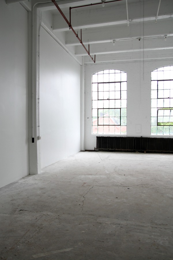
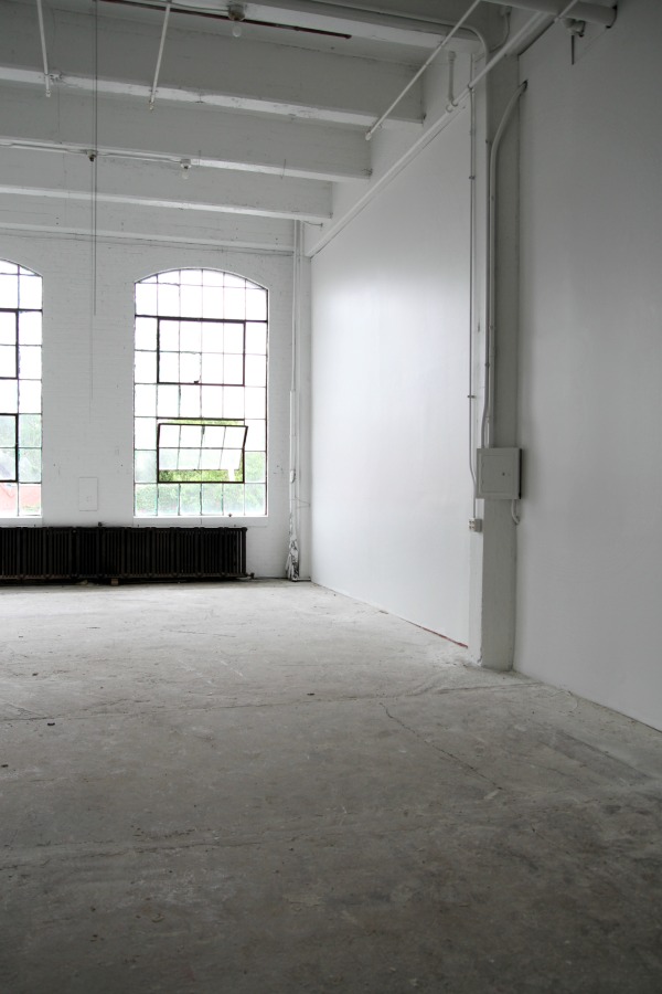
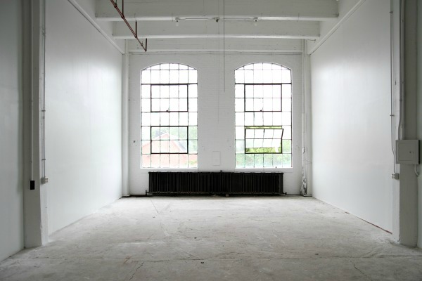
A painter sprayed the walls and ceiling. We went with Kilz latex primer, followed by two coats of HGTV Home by Sherwin-Williams primer + paint in one. The paint color is pure white (SW 7005). Using two different primers might have been overkill but there was quite a bit of staining on the ceiling and brick (window) wall that had to be blocked. Per code, the sprinkler system remains red. The exposed conduit, various pipes and old fuse boxes are now all white and not nearly as noticeable. White paint is magical!
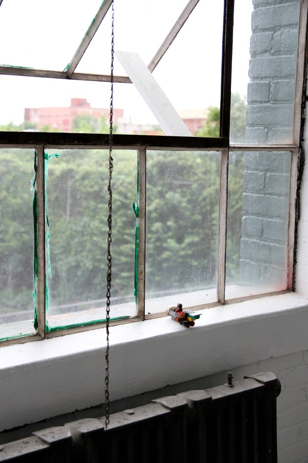
From afar, the metal window frames look black but, in reality, they’re mostly corroded. I will probably end up painting them (black or white?) but I don’t mind them as-is for now. Cleaning the dirty panes is a higher priority, I think. The green paint is on the outside of the windows. All of the windows at the warehouse are green on the exterior.
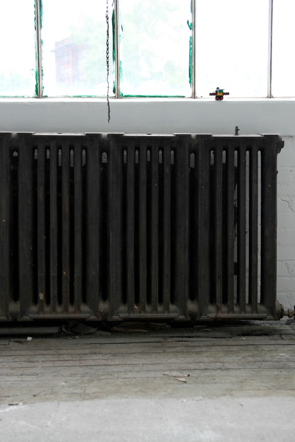
I’m going to paint the radiator white…after I clean it. I don’t think it has ever been cleaned. Ever. It looks like it’s covered in soot but I’m assuming it’s just charred dust and dirt. As much as I love the look of painted white floors in a studio space, they aren’t practical here. The space is accessed via a loading dock so grime is constantly being tracked in. The concrete is in poor condition so I think painting the floors a dirty gray is the way to go. The concrete gives way to wood right in front of the radiator. (Not sure what that’s all about?) Some of the boards need replaced.
I took these photos several days ago and the space is already looking so much better. I’ve spent all of my spare chunks of time at the studio cleaning this week. It’s been difficult finding the time with end-of-school activities taking top priority, but I did manage to log 5 hours of quality time with my shop-vac the other day. Between the original gritty condition of the space and the new layers of drywall dust, it was pretty gross. Today Everett and Mabrey “helped” me scrub down the radiator. We had to change our clothes when we got home.
The shell of the room is coming along! I took precise measurements and drew up a floor plan today so I can start space planning. The landlord claims the room is 1,000 square feet but it’s closer to 870. I’m more comfortable with that number. I’m excited to put my spin on the space and try some new things that aren’t necessarily practical, or even possible, in my own home.
images: Dana Miller for House*Tweaking


inspiration, renovation