
Last year my friends, James and Kristina, graciously allowed me to share the renovation of their midcentury modern family home. (You can see it here and here.) They recently remodeled their master bathroom and, when I saw the results, I just had to share it too. Keep reading to see the transformation!
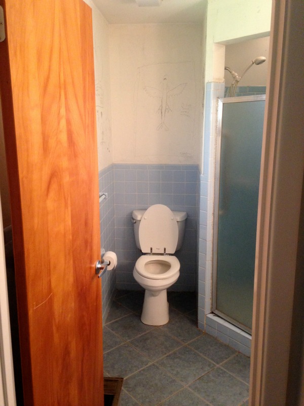
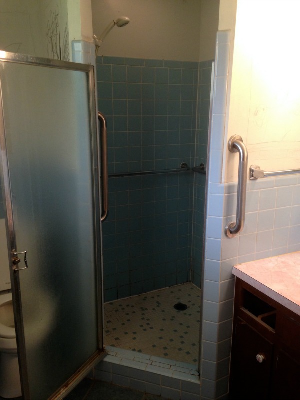
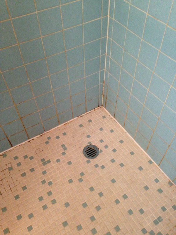
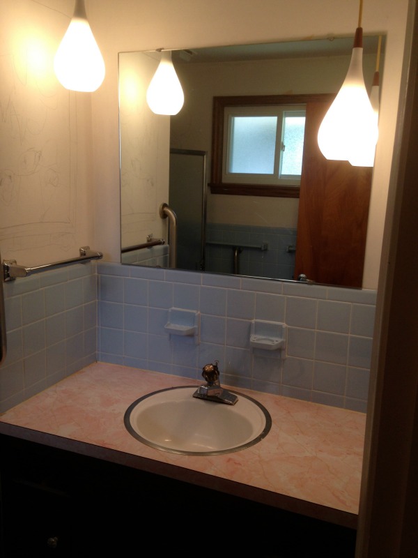
The bathroom is en-suite to the master bedroom and, even though it doesn’t boast a tub, the homeowners consider it their master bathroom. The original finishes included a mix of mismatched blue floor & wall tile. A boxy brown vanity supported a pink laminate countertop and a teeny oval sink. The corner shower stall was dark and dank. Just before demo, the couple let their kids draw on the walls for fun.

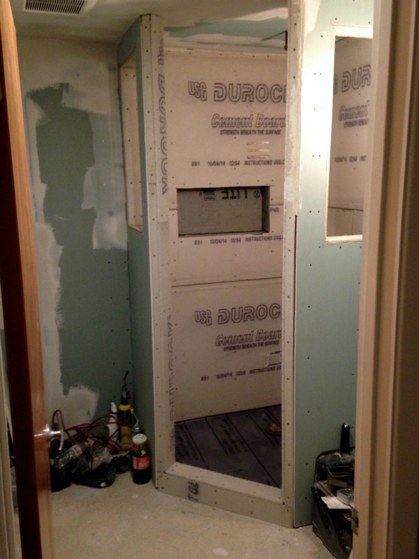
By tackling all of the work themselves, the couple was able to completely revamp the space for <$5,000. To save money they kept the room’s original layout but chose modern materials that both brightened and warmed up the space. They discovered mold in a shower wall which was mostly remedied with bleach and a mold-inhibiting spray. Still, some framing had to be replaced. To bring more natural light into the shower, the homeowners devised a plan to add sidelight windows on either side of the stall.
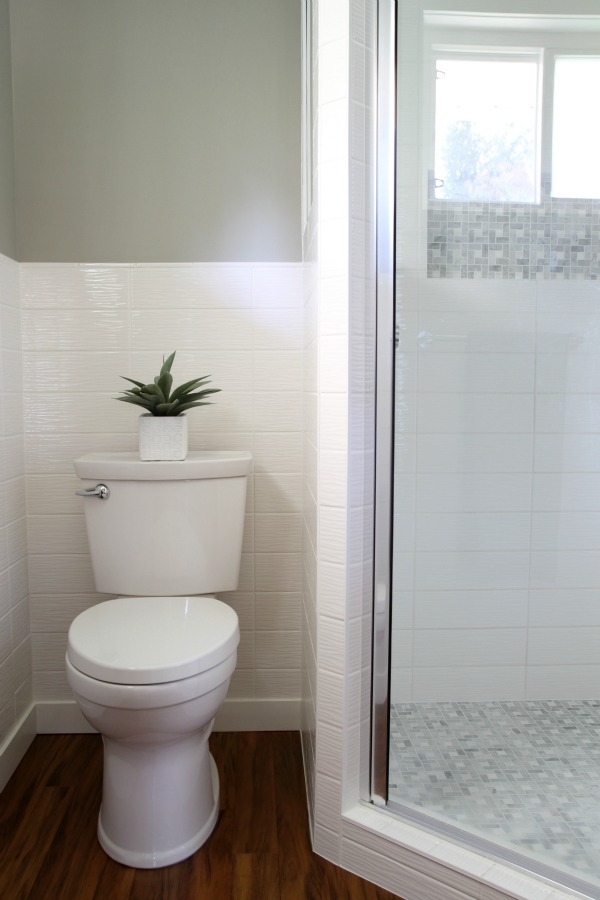
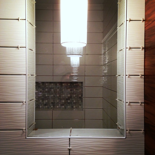
The couple was aiming for a midcentury spa vibe that felt warm and natural. Sticking to a palette of white, gray and wood was key. Material selections were based on design and budget. Wavy wall tiles in a high gloss finish catch light from a south-facing window and bounce it around the small room. The rippled texture lends an organic vibe while the horizontally stacked pattern feels modern.
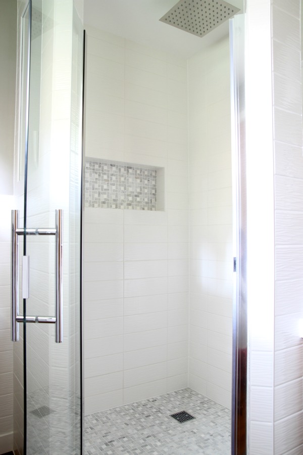

A frameless glass door and sidelights allow light to flow freely into the once dark shower. A wall niche for toiletries and an overhead rain shower head were space-saving measures that also feel luxurious. Marble mosaic was used in the shower niche and on the shower floor for contrast. Using the marble sparingly was an intentional, budget-friendly choice.
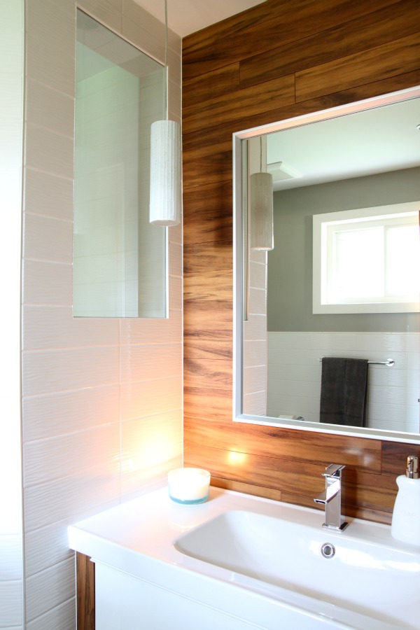
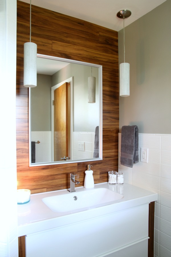
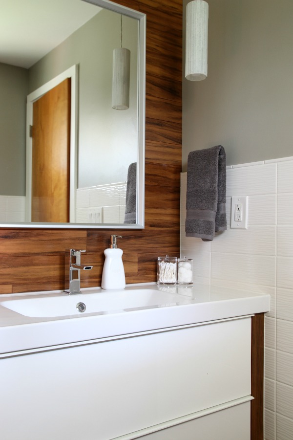
Running the tiger wood flooring onto the vanity wall is a defining design element that punctuates the sink area and brings added warmth to the nook. A pair of cylindrical glass mosaic pendants flank the mirror.

A floating Ikea vanity frees up visual and floor space, providing the perfect spot for stashing slippers and a scale. The vanity is somewhat of an Ikea hack. The nook is 45″ wide and the off-the-shelf vanity is slightly narrower at 39″ wide. James improvised and ripped down leftover floor boards to stand in as filler pieces on either side of the vanity.
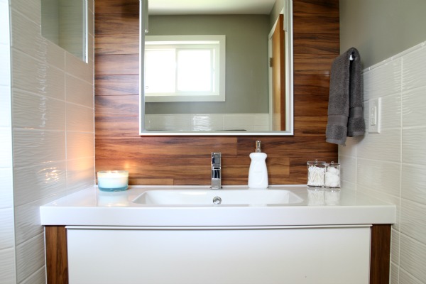
Likewise, the 47″ wide Ikea sink top had to be modified to fit the space. Using a grinder + a spray bottle filled with water, James cut 1″ off each side for a custom fit.
Resources of note:
wall paint – granite boulder, Behr Ultra (Home Depot)
trim paint – satin white, Behr Ultra (Home Depot)
wood flooring – ½” tiger wood bamboo (discontinued), Build Direct
wall tile – Allen + Roth wavecrest white gloss 4″ x 12″ ceramic tile, Lowe’s
accent tile – anatolia carrera marble mosaic, Lowe’s
shower head – 12″ Hudson Reed, Amazon
shower handle – Delta, Amazon
shower door – Coastal Shower Doors, Amazon
inserts for sidelights – ¼” tempered glass from local glass shop
toilet – American Standard cadet 4, Home Depot
toilet paper holder – Amazon
towel bars – Amazon
pendants – Lamps Plus
mirror – SKOGSVÄG, Ikea
vanity – GODMORGON, Ikea
sink – ODENSVIK, Ikea
sink faucet – Moen, Amazon
accessories – Marshalls
Thanks again, James and Kristina, for sharing your home with me and the internet!
I have many favorite things about this bathroom starting with the color palette. I love the tile choices mixed with the tiger wood on the floor and sink wall. The sidelights in the shower are so clever! I know the tiger wood filler on the vanity was primarily a means to an end but I love the result. It’s a detail that instantly de-Ikeafies (yep, I’m making up words) the floating cabinet and gives it a high-end look. Overall, the new bathroom design is purposefully spa-like but it doesn’t stray too far from the rest of the midcentury home’s decor. That’s not always easy to pull off!
What is your favorite part? Can you even believe this is the same bathroom?!
images: Dana Miller for House*Tweaking
When I started this blog my family was living in a builder spec home. The finishes were cheap and I was doing my best to put my stamp on things. I turned to the internet for inspiration but was disappointed in what I found. Most looks weren’t achievable in our house. We had nondescript carpet and vinyl flooring – not hardwoods. There were no particularly alluring architectural features. We also had practical things like ceiling fans and light-filtering window shades. Tweaking that house taught us many things. Eventually, we came to value quality over quantity which prompted our downsizing adventure. But it also taught us that you don’t have to wait until bigger, future projects (i.e., installing new flooring) are completed to start making little changes that better reflect your preferred aesthetic.
“Nothing you do for your home is ever wasted.” – Maxwell Gillingham-Ryan for Apartment Therapy
We never did install new flooring in our previous home. But we did paint the walls & kitchen cabinets, install new countertops & a backsplash, experiment with furnishings and hang curtains & artwork. By the time we moved, the space definitely felt more like us than it had when we moved in.
All that to say, you don’t have to wait until you can do everything to do something.
And that’s what this makeover is all about. My clients moved into their home less than six months ago. They would love to upgrade the flooring, redo the kitchen, install statement light fixtures, fully furnish each room and improve the bathrooms but, as with most newly acquired houses, those things just aren’t in the budget right now. Instead, they’re tackling smaller projects as time and money allow, injecting their sense of style as they go. So far, they’ve painted nearly every room in the house and I recently helped them revamp the master bedroom. (You can read about my plans for the space and see a mood board here.) It’s a real room with carpet, blinds, a ceiling fan and even a TV. I hope it inspires you to do something.
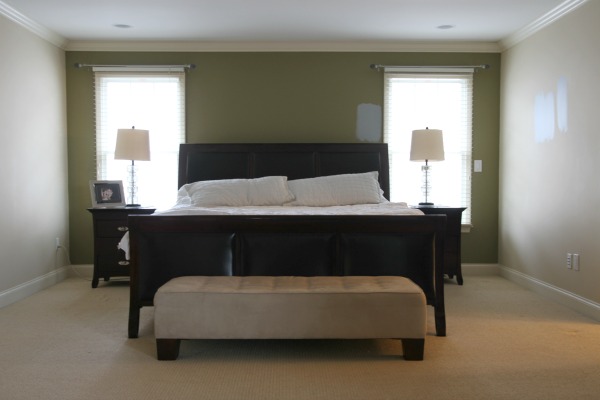
BEFORE:
AFTER:
BEFORE:
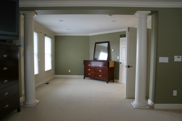
AFTER:
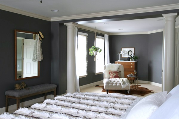
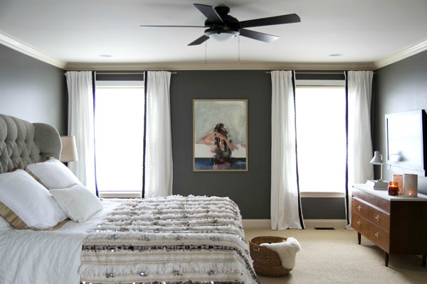
We made a lot of changes but, in my opinion, rotating the bed, painting the walls a deep charcoal and bringing in mismatched furniture were the game-changers.
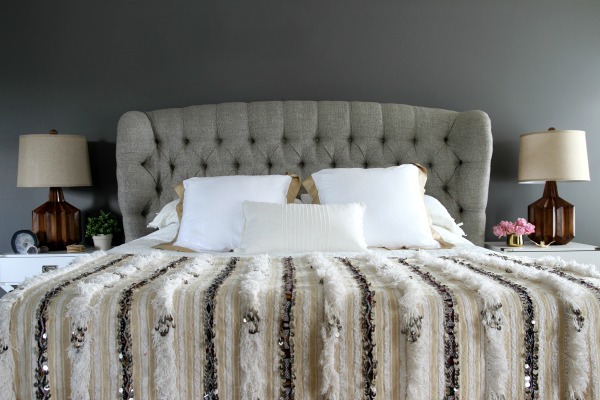
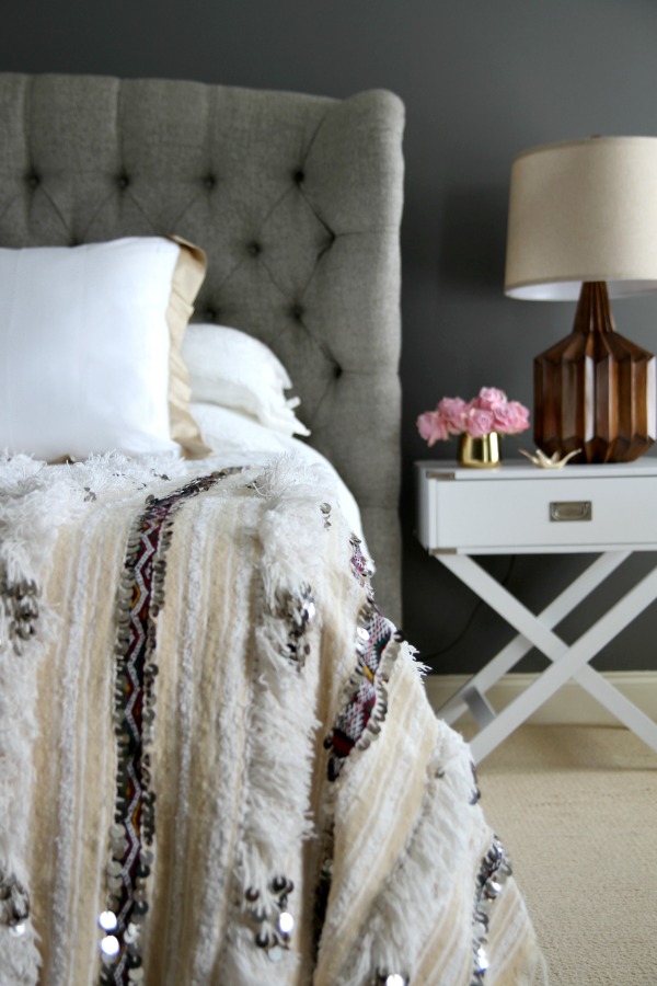
Relocating the bed to a blank wall makes it a natural focal point and lets more light pour in through the windows. The tufted headboard makes a grand statement. I love how the sides turn in for an intimate effect. So cozy!
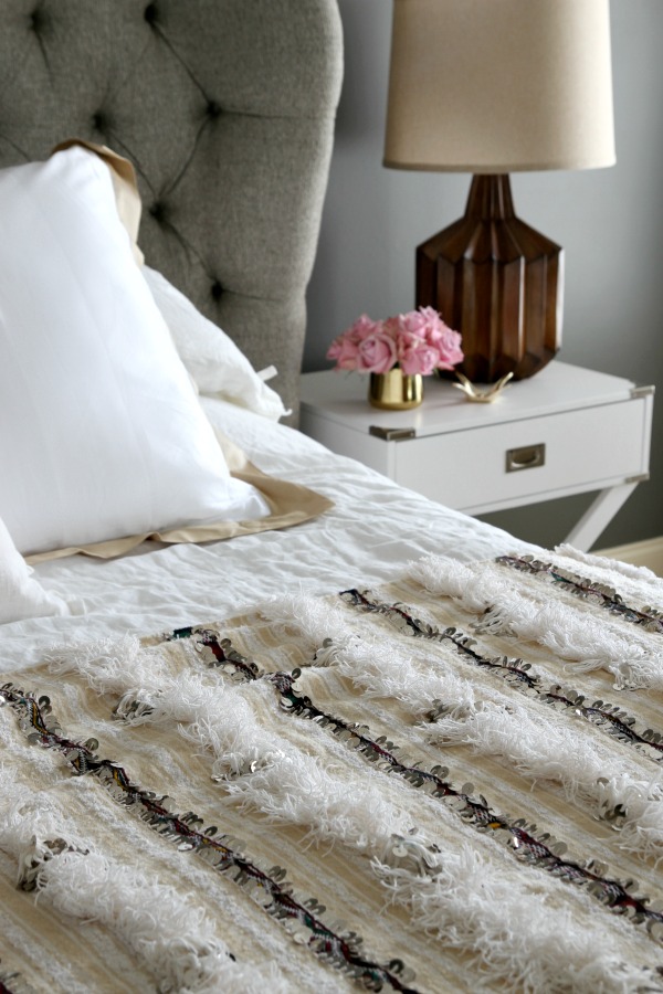
My client’s style is decidedly more luxurious than my own. When she requested sequins, I cringed a little. But this Moroccan wedding blanket was the perfect solution. It jingles ever so lightly! I wanted to take it home with me. I searched high and low for a vintage one that was large enough to fit the king bed but not a bazillion dollars. I kept the rest of the bedding simple with a linen duvet and lumbar pillow. The bordered euro shams are a nice detail and tie in to the khaki stripes on the Moroccan blanket.
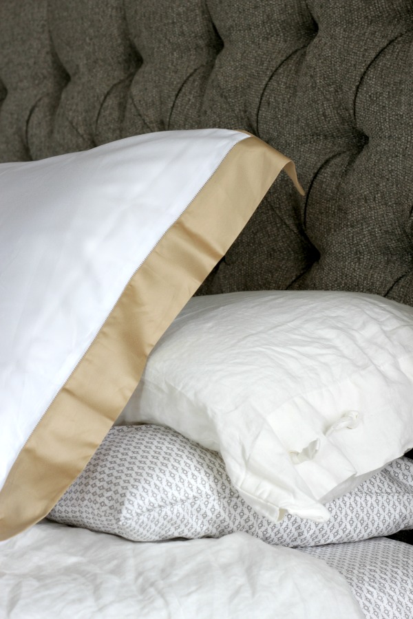
Patterned sheets are a fun surprise when the duvet is pulled back.
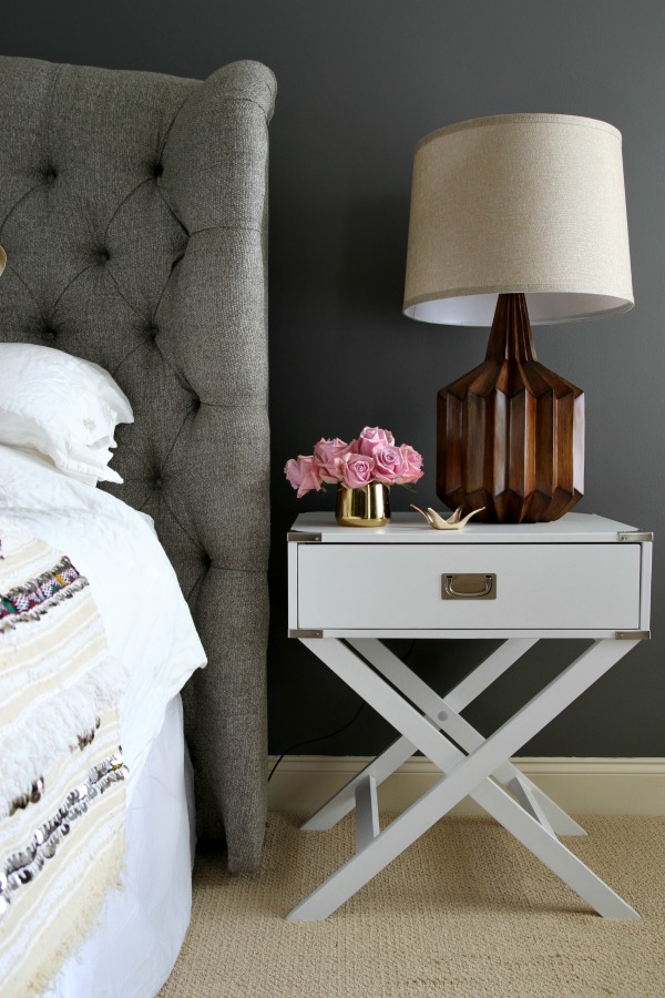
X-based campaign-style nightstands pop against the moody walls. The geometric lines contrast with the headboard’s curves. I LOVE the lamps. They’re oversized to match the scale of the headboard. Anything smaller would have been dwarfed. The wood bases warm up the white nightstands and bedding.
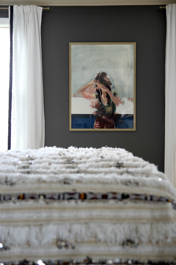
I turned to one of my favorite artists, Clare Elsaesser, to fill the void between the windows. I’ve always loved her work. The rich color combinations, tangled poses and fluid brush strokes create a dream-like quality making her pieces ideal for a bedroom. I framed the large print in a poster frame spray painted gold to match the curtain rods (also spray painted gold). At the eleventh hour, I decided to add black ribbon trim to the leading edges of the curtains for a little drama. It was more work but not expensive and totally worth it.
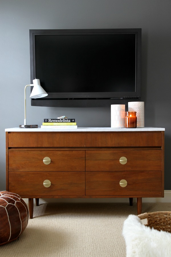
I think a TV in the bedroom is a personal choice and my clients choose to have one in theirs. To make it less conspicuous, we mounted it on the wall above one of the vintage dressers I rehabbed. (The dark walls go a long way in hiding the TV, too.) An accordion-like bracket allows the screen to be angled toward the bed for easier viewing.
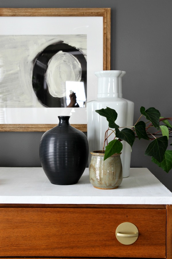
I was the teensiest bit apprehensive about the dressers. I absolutely LOVE how they turned out and knew they would look great in the space. However, when I met with my client initially, she told me she didn’t like gold and preferred “rustic” furniture pieces. The minute she saw them, she was sold – on the gold and the midcentury style. I was so glad because the clean lines and warm wood tones were very much needed in the space. I made her a believer! (Her husband loves them, too, but I knew he would.)
The feather finish tops were a hit, too.
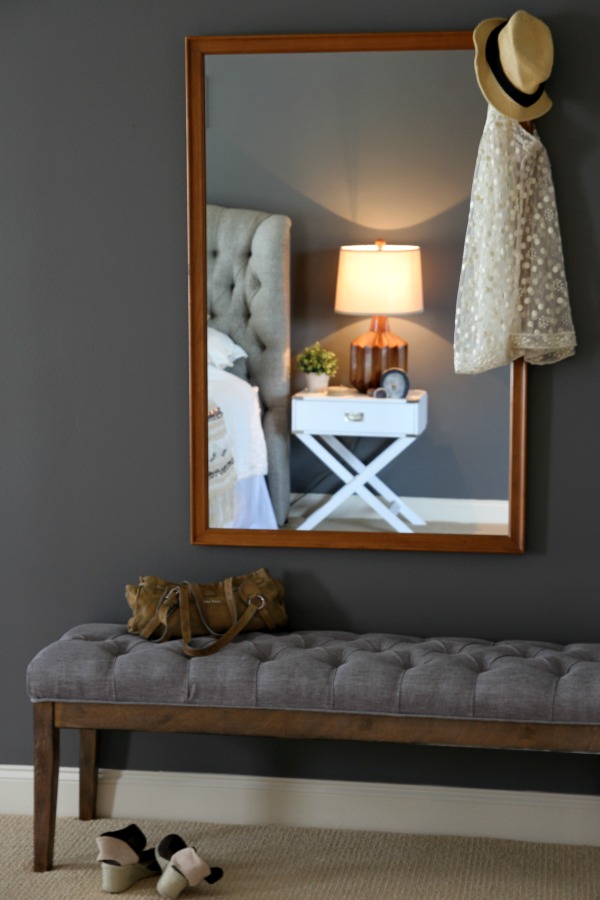
I brought in a bench and mirror for easy dressing and quick once-overs. (A hallway leading to his and hers closets is located just to the left of the bench.) The mirror actually came with the dresser I used in my boys’ room. I had no use for it but hung on to it because it’s a solid piece. It finally found a home! At night, the Moroccan blanket can be folded up and placed on the bench.
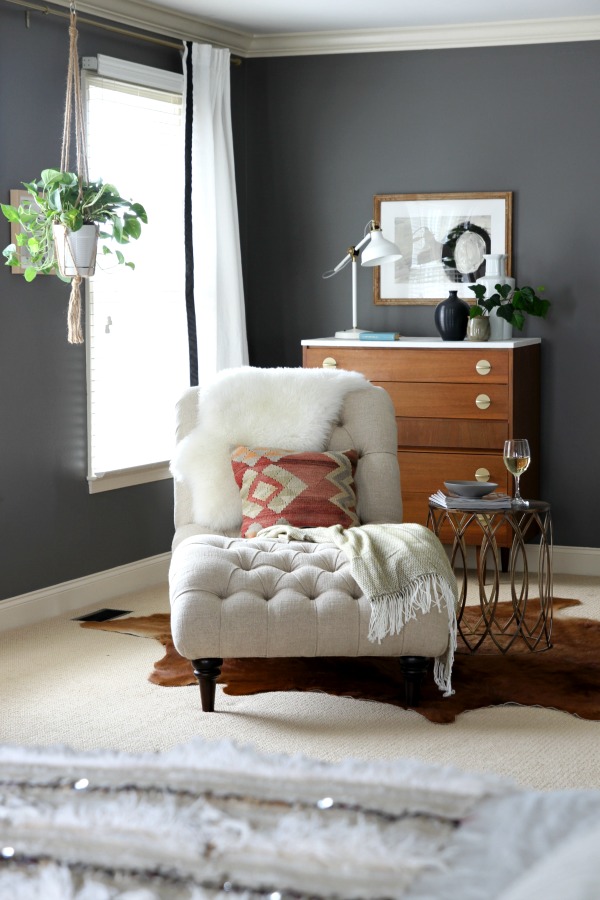
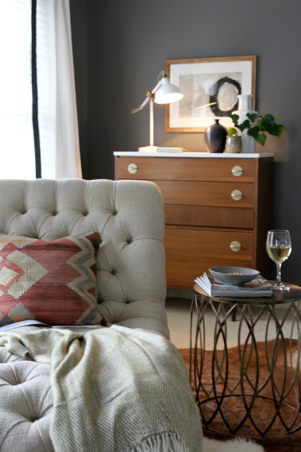
My client had her heart set on a chaise for the adjacent sitting area. She imagined it as a quiet space for lounging with a book and / or a glass of wine.
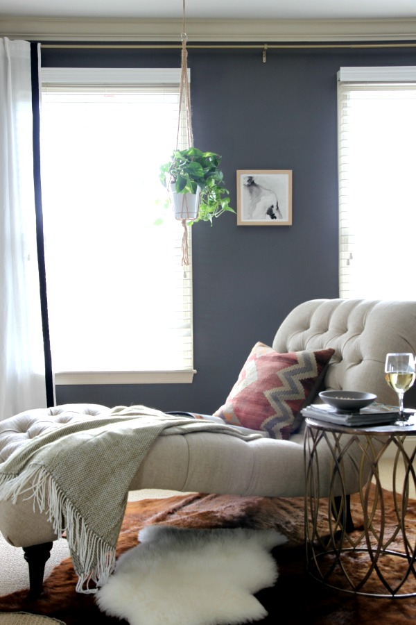
A metal accent table picks up on other gold details in the room and provides a surface for reading material and a drink. Layered textiles create a relaxed vibe. The kilim pillow repeats the color scheme of the artwork in the sleeping area. The hanging planter fills vertical space and adds life to the vignette. We treated the two smaller windows as one large one (one curtain rod, two curtain panels) to make the space feel lighter and brighter.

I paired the other dresser with black and white abstract art to give the sitting area a modern edge.
The best part? My clients absolutely love the room. I can’t tell you how good it feels to witness people go from detesting a living space to not wanting to leave it. I’m so grateful they allowed me to put my spin on things. Not everyone is willing to go dark or try things outside of their comfort zone, but they were game. Thanks Maggie & Jeremy!
Resources of note:
wall paint – Benjamin Moore kendall charcoal, color-matched in Valspar Reserve
ceiling fan – Amazon
headboard – Mariah headboard in taft pewter, Arhaus*
Moroccan wedding blanket – etsy
linen duvet, lumbar pillow – Ikea
euro shams – Ralph Lauren in polished bronze, Macy’s
sheets – Target
nightstands – Overstock
wood lamps – Lamps Plus
ring holder – Target
curtain rods – Amazon (spray painted gold with Rustoleum Universal pure gold)
curtains – Ikea
black ribbon trim – Amazon
large print – “Unclasped” by Clare Elsaesser, etsy
poster frame – Amazon (spray painted gold with Rustoleum Universal pure gold)
dressers – vintage, DIY
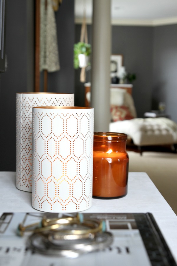
pierced hurricane candleholders – Target
woven basket – Target
bench – Overstock
mirror – vintage
chaise – Audrey chaise in tumble natural, Arhaus*
black and white abstract art & wood frames – Minted*
jute plant hanger – Amazon
olive throw – Overstock
kilim pillow – etsy
metal side table – Urban Outfitters
hide & sheepskin rugs – Ikea
task lamp – Ikea
ivy planter – thrifted
*Denotes items provided specifically for this project. This is NOT a sponsored post but I would like to thank Arhaus and Minted for providing the items listed above. I am grateful to be in a unique position to pass along quality products to my clients to help stretch their budgets. You can see more pictures of this space and read my tips for creating a beautiful bedroom over on Arhaus’s blog, Greenhaus.
images: Dana Miller for House*Tweaking


budget decor, DIY, inspiration, interior design, renovation