Once a month, I like to share an inspiring paint color with you. Well, really, I’d like to repaint my walls once a month just because there are so many great paint colors out there to try…but that’s not realistic now, is it? So, instead, I’ll stick with sanity and simply talk about the colors of my painted rainbow here. This month I’d like to introduce you to Ralph Lauren’s Winchester #NA64.

The virtual color swatch comes off pretty dark, but it seems that Winchester is a medium gray with greenish undertones in reality. I found this paint color inspiration by way of an Ohio home that was featured in Country Living. {The house tour has been in my inspiration folder for quite some time.} The homeowner attests to Winchester’s ability to change throughout the day and take on different hues in different rooms. {Which sounds a lot like our Valspar Bonsai that can look gray, green, muddy, or sandy depending on the light.} Take a look at how the greeny-gray paint serves as a neutral backdrop for pops of color in this fab mudroom.
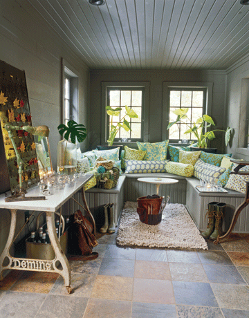
Totally fresh and grown up at the same time.
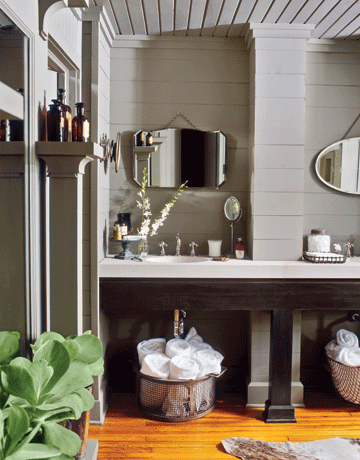
Or go sophisticated by pairing Winchester with contrasting espresso and white accents as seen in the bathroom above. Touches of natural wood, live greenery, and reflective surfaces keep it from feeling bland. Since Winchester is a medium-toned gray, remember that it will look quite different in rooms that don’t receive a flood of natural light. Both the mudroom and bathroom above appear to be drenched in natural light. Still, Winchester would look pretty darn cozy in a den.
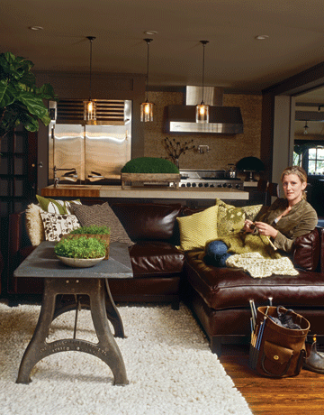
This open concept kitchen/family room sports a few Winchester painted elements. Notice the painted built-in surrounding the refrigerator and the architectural detail just right of the hood. This picture is probably more telling of what this medium gray color would look like in a room where the walls aren’t flooded in natural light. Isn’t it downright homey and handsome? I tend to lean towards light and airy rooms for inspiration but I’ve always been drawn to this somewhat dark and comfy great room. It works because Winchester is used sparingly {you don’t see one huge wall painted in it} alongside shiny light-reflecting stainless steel appliances, a light backsplash and countertops, textural pops of white {rug, pillows}, and eye-popping green accessories {plants, pillows}. That’s one no-fail design mix!
In a boy’s bedroom, I like the idea of mixing Winchester with yellow, white, light gray, and turquoise accents. It could definitely span the life of a boy from infant to teenager.

Winchester is gender neutral. I could totally see it in a girl’s room, too. Make it light and feminine with lots of white and sand and pops of pinky coral.

Taking cues from the Ohio house tour above, try Winchester as a backdrop to olive, bright gold, and creamy accents. Just remember to add in some shiny surfaces like glass, mirrors, or metal to avoid a dark, heavy feeling.

Winchester has a way of cozying up the un-coziest of spaces. Who knows? Maybe I’ll stray away from white, white, white in our next home and go the warm route.
To see more of the warm, industrial house seen above check out this Country Living house tour.
images: 1) Ralph Lauren 2-4) Don Freeman 5-7) Ralph Lauren paint collages by Dana Miller
A kind House*Tweaking reader, Lisa, emailed me a few weeks ago about her sunroom. Here are some pictures she attached in her email…
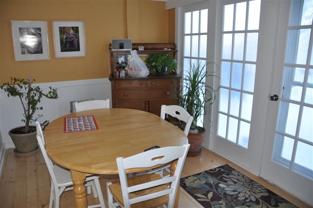
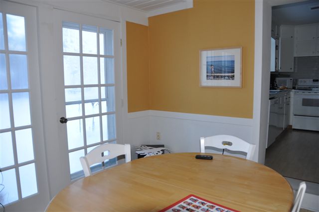
Lisa’s sunroom is located right off her kitchen and opens up into the backyard. It serves as a dining room, craft area and somewhat of a mudroom. {The hutch holds art and office supplies.} Lisa had already decided to paint over the bright yellow walls with Valspar’s {Lowe’s} Bonsai. She also knew the honey stain of the dining table wasn’t working and that it would look more polished in a darker, richer stain. To provide more seating and allow for better traffic flow, Lisa plans to build a corner bench seat in the left-hand corner of the first picture above. Lisa asked for advice on how to incorporate her favorite color, turquoise, into the room along with her kids’ artwork and a bird or branch or two…she loves birds and branches. Like anyone, she was on a budget and looking to tweak her bold sunroom into something a little more clean, simple, and fresh. Here’s the mood board I came up with for her…

1 – To go along with the Bonsai paint color for the walls, I suggested that Lisa sand, prime and then paint her dining chairs in Sherwin William’s Meander Blue. This grayed-down turquoise hue will add a pop of color and contrast with the darker stained table {more on that in #8}.
2 – Lisa didn’t specifically mention anything about a light fixture, but pendant lights are a great way to define a dining space. I chose this IKEA one because of the texture, lighter wood tone and simplicity…and price. (My sister owns the table lamp version of this light and says it casts pretty designs on her walls/ceiling in evening light.) This IKEA Böja pendant could be hardwired into the current ceiling light box and then swagged over to the center of the dining table once the table is moved closer to the corner. Just use a ceiling hook to secure and swag the wire.
3 – I suggested grabbing up a trio of IKEA’s square RIBBA frames in white to showcase Lisa’s kids’ art in style. (Displays look better when done in 3’s.) Hung along the wall in the first image above the chair rail and spaced closely, these frames would house artwork that could be changed up quickly and easily whenever Lisa’s heart desires. Keeping the spacing between the frames tight – no more than 4 inches apart – gives them the feeling of one display versus 3 disconnected frames.
4 – This inexpensive geometric door mat would be a good spot for wiping shoes when placed in front of the doors.
5 – I found this bubble glass bottle/vase and thought it would look darling on the dining table paired with some branches…either real or faux.
6 – The capiz metal branch wall art just might be my favorite thing in this mood board. I have shown it turned on its side for a more natural effect. I would hang this on the wall opposite the french doors. As far as placement, I’d hang it so that when standing by the french doors directly across from where the dining table will be {once bench seating is installed}, the pendant light doesn’t hang directly in front of it…some overlap is good. That means moving the branch art a little further down the wall towards the kitchen. Being across from all those doors, this wall art will reflect the light and sparkle. To save money, Lisa could totally DIY something similar out of real branches and glue little mirrors or crystals to them for the same effect!
7 – I threw in a couple of decorative pillows for the future bench seating. Guess what? They’re from Etsy. See the Moroccan inspired one here and the coffee sack one here.
8 – I agree that sanding down and staining the yellow-ish table a darker tone would fit better into Lisa’s desired color scheme of gray, white and turquoise. It would be a lot of work/mess but very much worth it. A walnut stain would go with the hutch but they wouldn’t have to match perfectly. This is just a picture of a table in a color of stain that I think would look nice in Lisa’s sunroom. No need to buy a new table. The corner bench seating would look nice in white to blend in with the wainscoting and take up less space visually. For added storage, the bench seating could be open underneath for shoe baskets or the top could be hinged to open up and hide seasonal apparel – coats, hats, gloves, scarves, beach towels, etc.
9 – Finally…the hutch vignette. Moving the hutch over to the short wall near the kitchen, would balance out the room. {Remember, the dining table and new bench seating will be in the corner diagonally opposite this wall.} Say it isn’t so, but the hutch is great the way it is! {I know. Who’da thought I’d say don’t paint it?} The wood tone will lend warmth to the light room. I would just declutter the top and add some decorative storage boxes in white to disguise messes. I found these at Target. I think Lisa could scout out a bird figurine from a thrift store and spray paint it turquoise. She said she likes birds, so I wanted to incorporate one. {Even though I’m deathly afraid of them. Weird? Yes.} Lastly, a nice white oval mirror hung horizontally above the hutch would really lighten up that little corner. I told Lisa to look for a mirror in the right size, shape and price range that could be painted white if need be.
So, that’s how I virtually tweaked Lisa’s sunroom. I’m happy to say that Lisa has painted her room Bonsai and it looks 100% better already! Not that it was that bad to begin with. Did you notice those light-drenching doors OR the wood floors OR the wainscoting OR the bead board ceiling? So much potential! It’s amazing what a little paint, some decluttering and a few accessories can do. Really. I can’t wait to see what it looks like when it’s finished. Thanks, Lisa, for letting me play with your room!
images: 1 & 2) Lisa’s befores 3) Polyvore collage created by Dana Miller using images linked within














DIY, inspiration