Probably the most frequent question I get is “what color is your (insert inanimate object here)?” I always try to respond back in the comments section where the question originates but, ultimately, I realize that’s not a quick and easy way to get information on paint colors used in my home. So, I’m sharing my paint colors with you in a full post today.
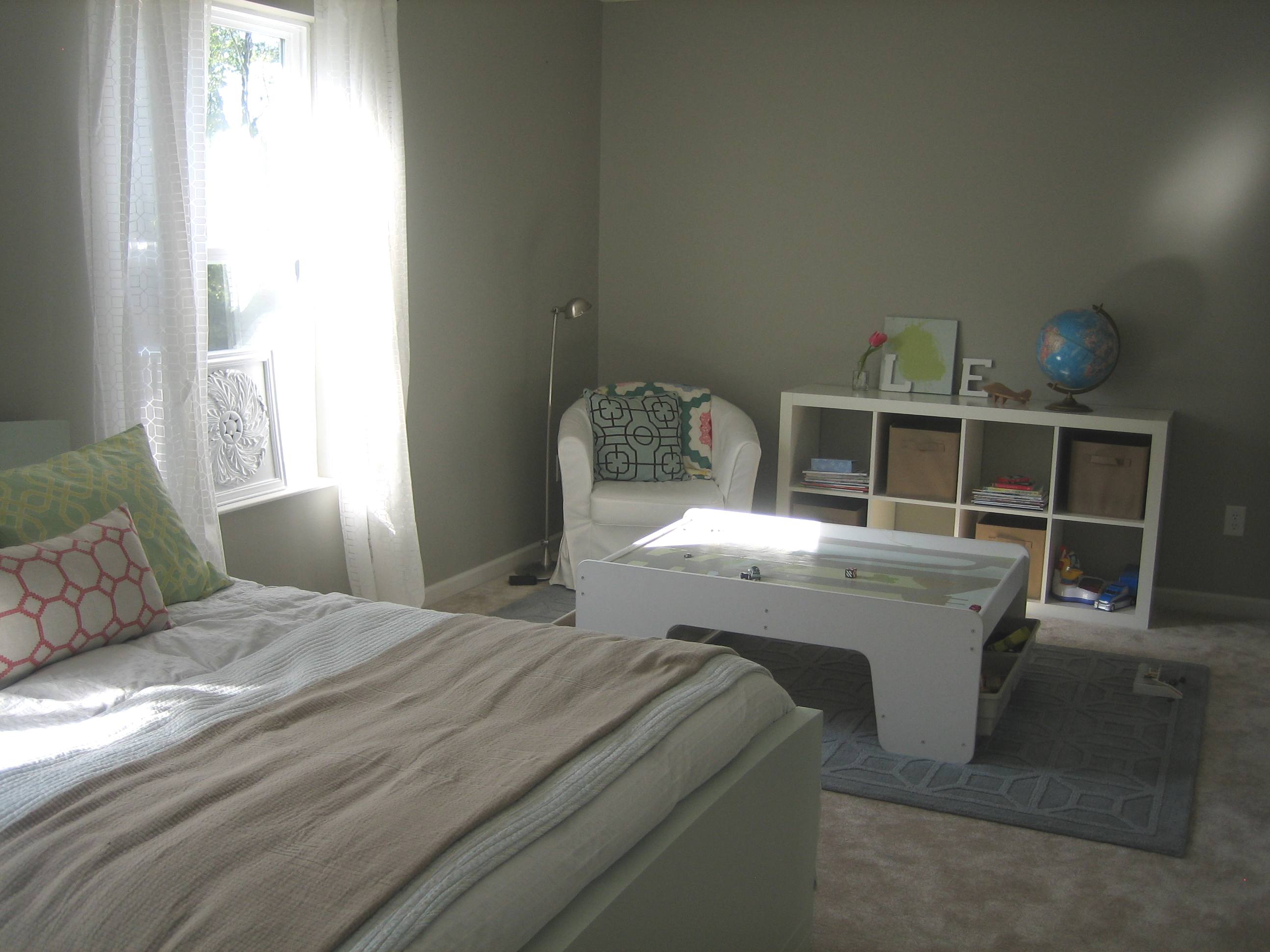
The majority of our home is painted in Valspar (Lowe’s) Bonsai. It’s a light, airy gray that changes throughout the day. In the afternoon it takes on a greener hue and at night a taupe-y hue. It’s the color of our main living space: family room, kitchen, dining area and sunroom. It’s the color of our 2-story foyer and bedrooms also.


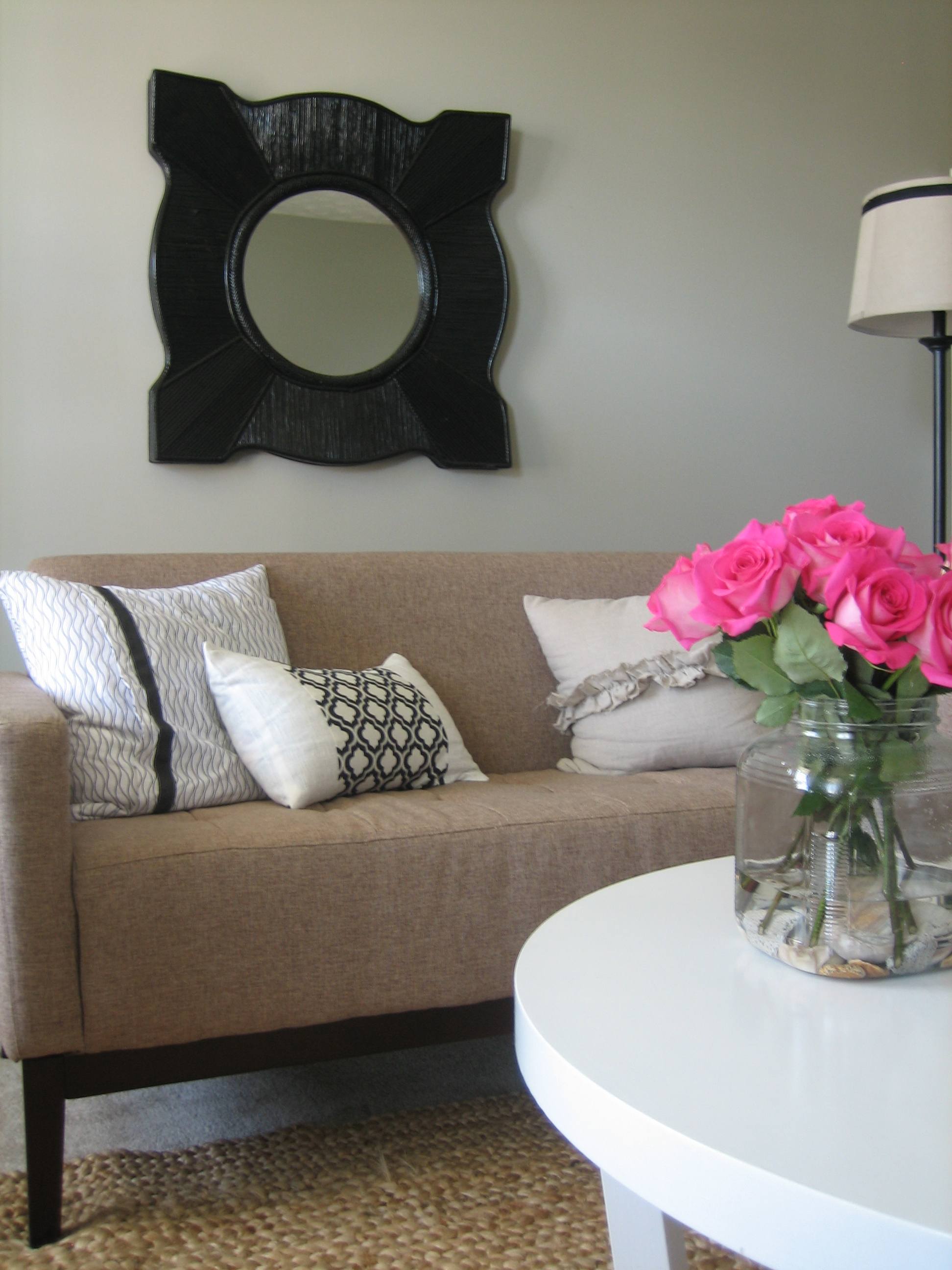
3 of the 4 walls in our multi-tasking living room are painted Dry Riverbed also available from Lowe’s. It’s a darker, muddier gray than the Bonsai.

Our powder room is painted one shade darker than Bonsai…Lowe’s Magic Spell.

The 2 lighter stripes on the TV wall in our family room are Lowe’s Wet Dock. The other ‘stripes’ are actually just the same wall color as the rest of the family room, Bonsai.

The mini-mudroom and laundry room are Glidden’s (Home Depot) Gentle Tide. It’s a gray-blue-aqua that looks great in small rooms…the color of a perfect sky.


As I mentioned, the foyer wall is Bonsai (I tell you, it’s everywhere here!) and the cherry blossom art is Valspar (Lowe’s) Elkhorn Cactus.

All wall paint finishes are done in eggshell. It’s a nice matte (gloss can enhance imperfections) but easily wipeable. The exception to this in our home are our kitchen cabinets and island that we painted. They are Sherwin William’s Greek Villa painted in a semi-gloss for added wipeability (not a word, I know). It’s a nice, clean white but not too stark.

So, there you have it. A little run-down of the major paint colors used in our home. I try to stick to grays and taupes. When I’m feeling a little risky, I’ll pick an actual *color* but in a muted and grayed-down tone…like Gentle Tide. It’s not that bold colors are wrong, it’s just what I like to live with.


budget decor, DIY, inspiration