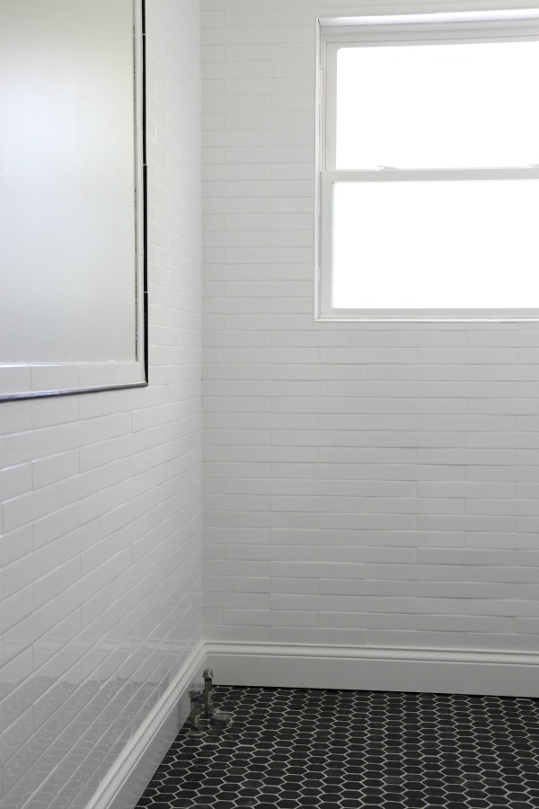
Staying true to the “slow and steady wins the race” motto, we’ve been plugging away at the hallway bathroom when time allows. All the grout has been sealed. Baseboards have been installed, painted and caulked. The walls are painted, too. I’ve been doing this for a while now but the effect of finishing touches (like baseboards and paint) never ceases to amaze me. All of a sudden a project feels like a room!
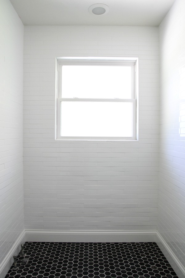
We had to order additional base molding to match the baseboards in the rest of the house. We had a small section leftover from the whole house renovation but were ~20′ short. The baseboards in the rest of the house are painted Benjamin Moore white dove but when I held a swatch up to the subway tile in the bathroom, it was too creamy. I ended up painting the baseboards in Benjamin Moore super white. It’s a great match but I’d be lying if I said having a different white in the bathroom doesn’t make me the slightest bit twitchy. The tile is a very cool white with bluish undertones and the room itself is north-facing so the light in here isn’t as warm as in other areas of the house. But it’s all good. I think repeating black and wood accents in the bathroom will help to tie it in with the rest of the house.
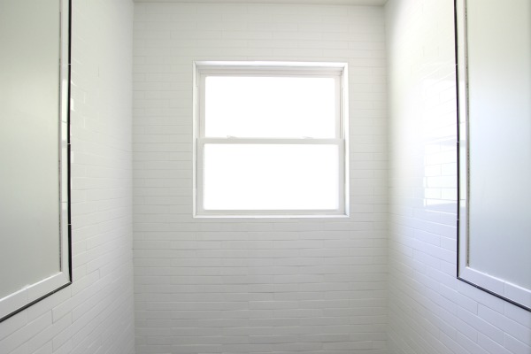
Steve and I had assumed I would paint the walls Benjamin Moore tapestry beige to match the hallway and main living space. But when I painted a swatch on the bathroom wall, it looked so wrong (i.e. dirty) in the context of the bathroom. That’s when I made the executive decision to stop worrying about “matching” the bathroom to the rest of the house. Instead, I focused on selecting a paint color that suits the room and its cool light.
I considered painting the whole room out in BM super white but, (I think I’ve mentioned this before) as much as I like looking at white rooms online, they don’t feel right in real life…at least not in this house. The super white looked, well, super white. So stark, so cold. I kept looking and searched hundreds of paint colors and finally landed on Ace Paint lost spur. (The color number is D35-2. Ace Hardware should have an Ace Paint color deck at the paint counter. If it’s not on display, ask for it. My local store doesn’t have it on display.) I had it mixed in Clark + Kensington primer + paint in one. This is my go-to brand ever since I painted the mudroom walls black. I’ve used it in the boys’ room and on the brick fireplace and TV surround. The coverage is great. (Not sponsored, just sharing.)
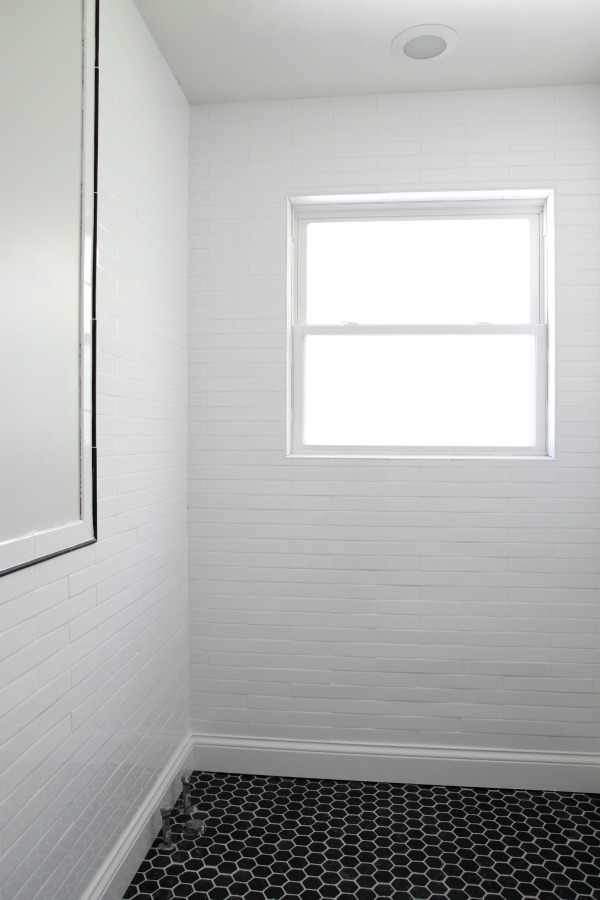
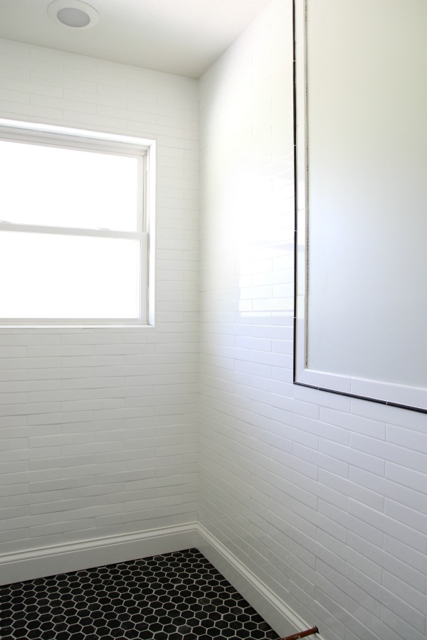
I love the color. It’s a subtle green-gray with some blue in it. It’s one of those colors that looks different every thirty minutes. Sometimes it’s white, sometimes gray, sometimes green, sometimes blue. Sometimes it’s warm, sometimes cool. I love chameleon colors like this – colors you can’t put your finger on. I like that it’s light but not an obvious match to the tile. Also, this room is so difficult to photograph. I wish you could see it in person. You really have to be in the room to get the full effect.
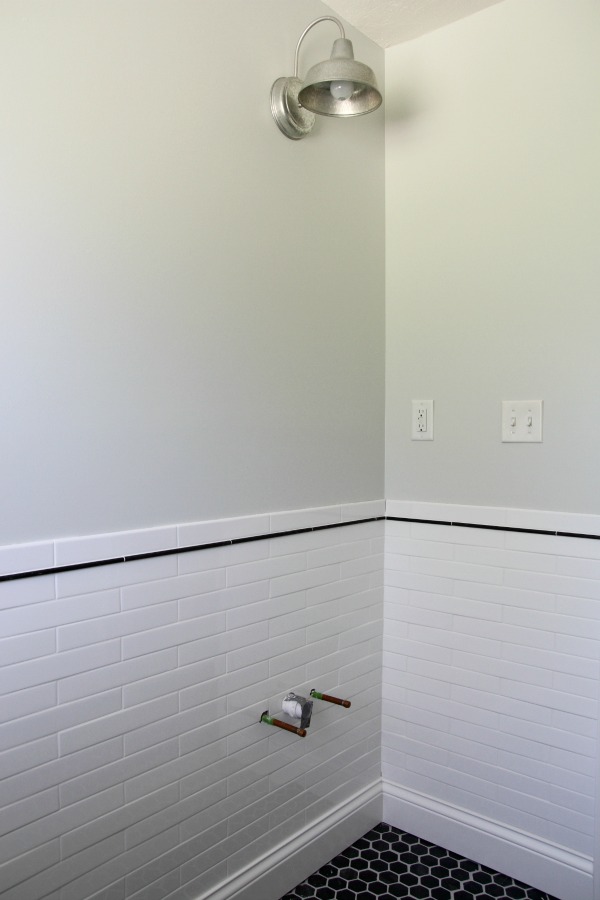
Steve and I installed the wall sconce last night. It’s the same light we have in the master bathroom. I’m itching to get the vanity in so I can start The Great Mirror Search. But, first, the tub.
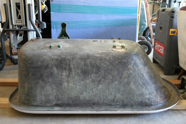
Here it is hanging out in the garage in all its one-legged, heavy cast iron glory. We recently cleaned out the garage (yep, this is the cleaned up version) to gain access to the tub. We hadn’t looked at it in years and were pleasantly surprised to discover the inside is in excellent condition. (The previous owners had it reglazed.) There was a lot of drama surrounding the acquisition of the tub. So much so, that I think we forgot about the condition. To be safe, I tested the interior and exterior for lead. The results were negative. I know it looks kinda shabby but I think it just needs a good cleaning and a few coats of primer and paint on the exterior.
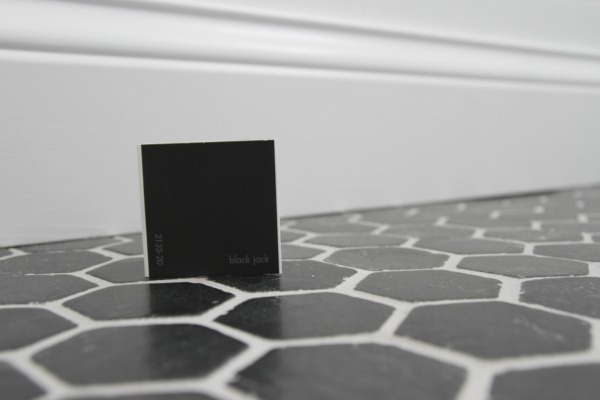
We’ve already agreed on a paint color for the exterior. It’s Benjamin Moore black jack. I’ll probably go with an oil-based paint in a satin finish for durability and ease of maintenance.
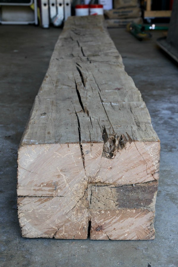
For weeks we’ve been scouring the internet for wood to attempt a DIY cradle base for the tub. We were looking for specific dimensions. The ideal beam turned up at a local reclaimed materials supplier this week. It set us back $40 and Steve hauled it home in his truck on Wednesday. After some deliberation, it looks like we’ll need to take it to a saw mill to have it cut. We don’t think the rough cut of a chainsaw is the look we’re going for. We don’t want perfection (it is a reclaimed beam after all) but we don’t want rustic either. We’re hoping to have it cut to size this weekend. Steve and I both predict that once the tub is in, things will roll pretty quickly. Let’s hope so!
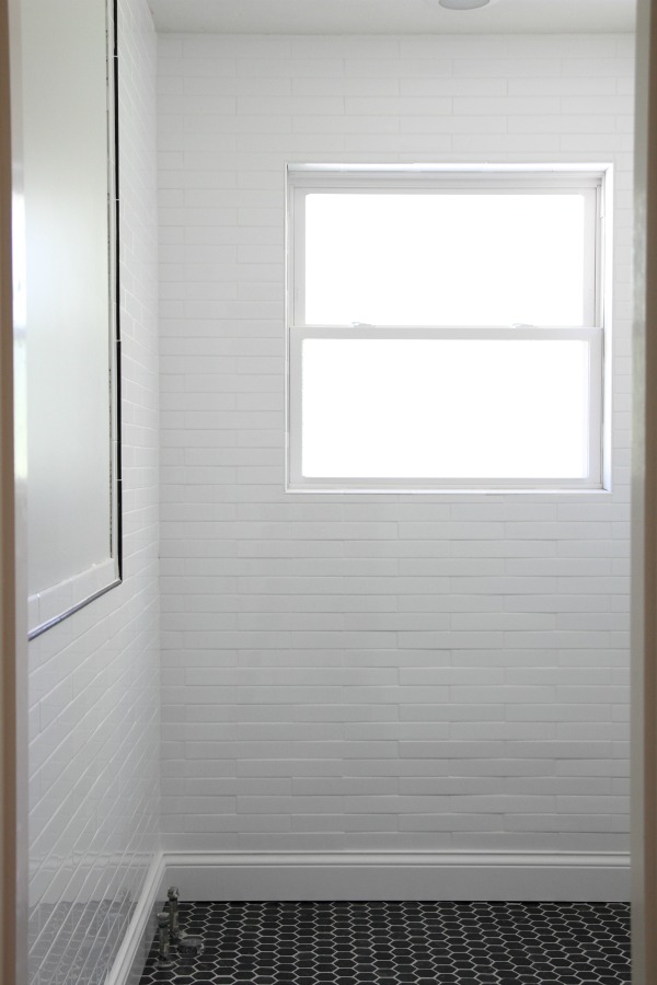
So that’s where things stand with the bathroom. We ran out of caulk and still need to caulk around the window and where the tile meets the drywall but that’s small potatoes. I swear. Gathering supplies is almost always the rate limiting step for us in any project.

In other news, Cheetah is my shadow and quite the camera lover. Such a photobomber! Is cat modeling a thing? If so, I’m signing her up for the next animal talent search.
images: Dana Miller for House*Tweaking
Hi Dana,
Paint color is my biggest home DIY nemesis. I’m inspired by your choices. I’ve noticed that the colors you used in your previous house were gray with green hues. Was there a design reason for having a green base in the paint colors? Even the dark accent wall that was in your master had green undertones.
I’ve also noticed that your new house doesn’t have the infamous green-based hues. It seems you’ve chosen warmer hues with subtle, lighter creams. I’m just curious, why? Is it the latest trend? What’s your strategy? – Angelina
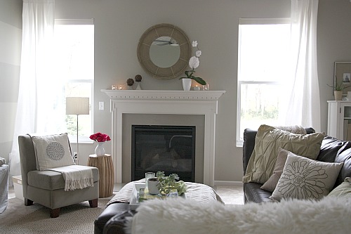
Well, Angelina, I have to say that choosing paint colors for our previous house was a quicker and easier process. It was a large home with tons of tall windows, plenty of natural light and high ceilings. Those attributes alone set the stage for nearly any paint color to work well. I chose Valspar {Lowe’s} bonsai for 95% of the house. Three walls in the formal living room were Valspar {Lowe’s} dry riverbed which is a muddy gray. The mini mudroom and laundry room were a soft blue-green. I had a dark accent wall behind my bed. My craft closet was a light lavender-pink. Quite the mix!
Looking back, other than most of the walls being a gray-green, I had no real strategy in regards to paint. And it totally showed. I chose colors that I liked without paying much attention to how they worked as a whole. It wasn’t as noticeable in the house because the different colors were somewhat far apart from one another but if I had laid out all those color swatches next to each other, I think I would have realized it was a strange color palette.
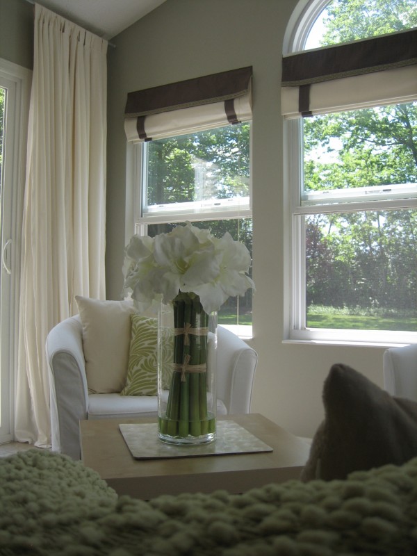
I was intimidated to repaint anything on a large scale. {That’s why the few other colors in the paint palette were painted in small rooms or only as accent walls.} The rooms were huge and pretty much all open to each other and there was a two-story foyer. We paid a professional to paint the entire house the gray-green color before we moved in. I wouldn’t have wanted to redo the work we had already paid for and, for the most part, I really liked the gray-green. I chose it because the house’s numerous windows had views to the outdoors which was mostly green trees and grass. The green undertones worked really well.
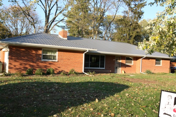
Our current house is very different from our previous house. It’s older, smaller, squattier {technical term}. There aren’t as many windows and the ones we do have are smaller than what was in our previous house. We also have a deep overhang blocking some direct sunlight. And the house feels different to me too. From day one, it’s felt very masculine.

Many of the paint colors I originally chose for this house aren’t jiving with the masculine feel I get from it. It’s taken me several months to realize that. Also, paint colors look totally different in this house than in a house that is blessed with natural light aplenty. Thankfully, paint is an easy fix here because the rooms are smaller. So far, I’ve repainted Mabrey’s room, the boys’ shared bedroom and the mudroom {several times!}. I’ll be repainting the master bedroom and bathroom soon. Gradually, I’m building a paint palette that feels masculine and cozy just like the house itself.
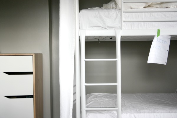
What I’m getting at is my previous and current homes have different palettes because they are two completely different houses. It’s not my intention to follow any trends – although I’m seeing moody colors everywhere right now! I’m trying to choose colors I’m drawn to that also happen to work well in this house. I’m more conscious of the overall palette too. It’s been complete trial and error but a great color palette is evolving. Take a look…
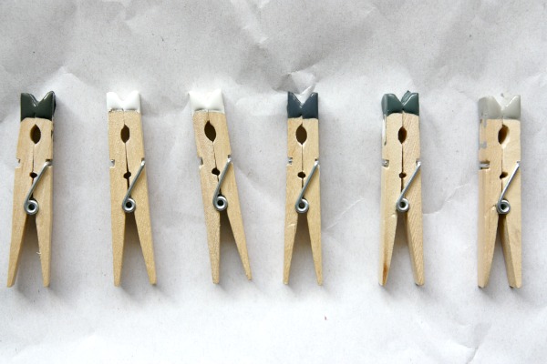
Laying out all the colors together like this helps me to see the bigger picture and to see how the colors in different rooms relate to one another. I even went as far as to lay them out in the order that I normally see them upon entering the house. Nerd. {By the way, I stole the paint-dipped clothespin idea from Emma. She’s a genius.} Whites, grays, blacks and deep blues are giving my house a very cozy masculine look. I’m loving the way they all look together too.
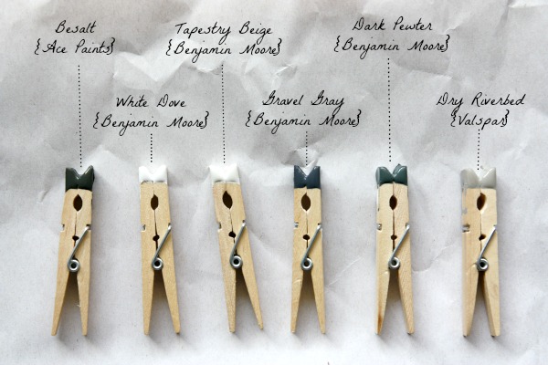
Here, I’ve labeled them for you. As you can see, there are a range of light and dark colors. In rooms where the walls are dark, I use a lot of white to lighten them up. In rooms where the walls are light, I use dark items to ground them. I love contrast. FYI – The gravel gray will be going on the outside of the clawfoot tub in the kid/guest bath.
The palette isn’t complete. I’ll be painting our bedroom Benjamin Moore’s anchor gray but I don’t have it on hand. Maybe a paint palette update is in order when I do get it?
I hope that gives you a better insight into why you see a different color palette evolving in my current house. In my opinion, choosing a paint color palette for a home is just like anything else house-related. It takes time and a little trial and error. What looks good in someone else’s house may not be the best choice for yours. For example, I adore all white California rooms but, come to find out, they don’t work well in my midwestern house. Try looking to your wardrobe for inspiration. My current palette is very indicative of my wardrobe. Mostly neutral basics with pops of color and pattern in accessories. Thanks for the question Angelina!
What about you? How do choose color palettes for your house? What palettes are you drawn to? Do you have a great method {like Emma’s paint-dipped clothespins} for seeing the bigger picture?
images: Dana Miller for House*Tweaking













budget decor, DIY, interior design, renovation