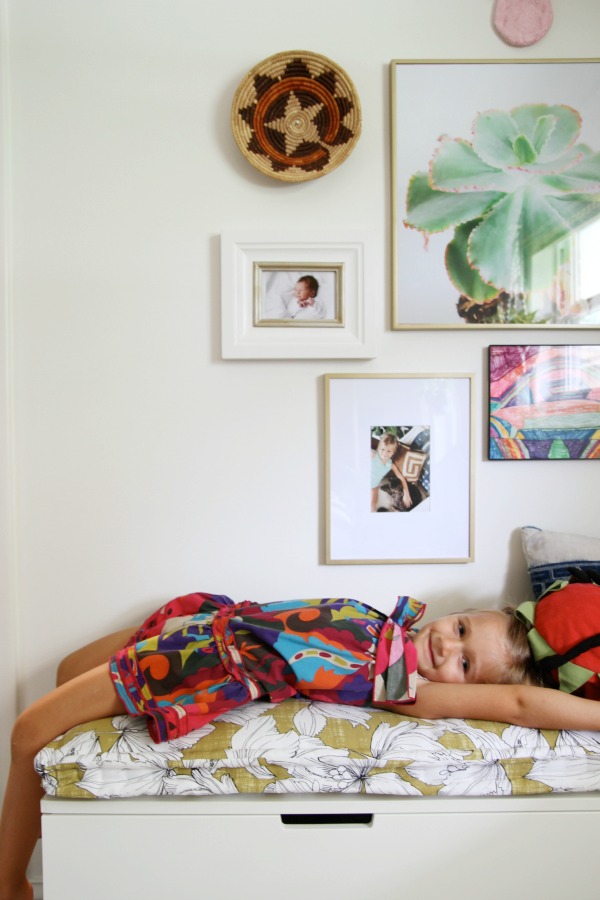
Mabrey’s big girl room is finished! I’m sorry to have kept you waiting for so long, but this project took place in real time amid real life which means it took forever. I’ll be sharing a series of posts this week discussing different aspects of the room because I feel like there’s too much for one post. Actually, that’s how I tackled the room…by breaking it up into smaller, easily digestible projects. Last month I shared how we customized a plain Jane trundle bed. Today I want to talk walls. I promise pretty pictures are coming soon, but this post includes a bunch of grainy, in-progress, iPhone photos. Brace yourself!
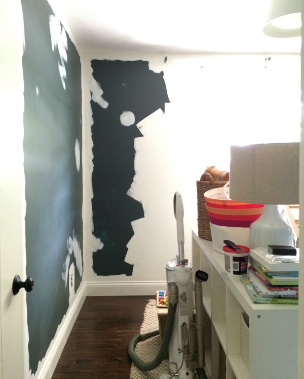
The nursery walls were a deep charcoal with blue-green undertones. I absolutely love the color and am keeping it in my back pocket for future reference, but it was time to brighten up the room to reflect Mabrey’s, ahem, vibrant personality. (No joke, I just overheard her telling Everett, “That’s what you get. Don’t mess with me!” #strongwilled) I removed everything from the walls, patched holes and sanded them smooth in preparation for paint.
I’d be lying if I said I wasn’t the teensiest bit concerned about painting a light color (Benjamin Moore white dove OC-17) over such a dark color (Benjamin Moore dark pewter 2122-10). I consulted with my local Benjamin Moore sales rep, and he assured me that the self-priming Natura line was the way to go. I was prepared to roll on three or four coats to get full coverage, but it only took two coats and a little touch-up. Yay for projects that take less time than anticipated! It also helped that the trim was already painted Benjamin Moore white dove, so I didn’t have to tape it off. Even though the walls are an eggshell finish and the trim is semi-gloss, stray brush marks aren’t noticeable. I painted three of the four walls. I left one wall dark thinking it would be a good backdrop for Stikwood, but that idea didn’t really pan out. (More on that in a minute.)
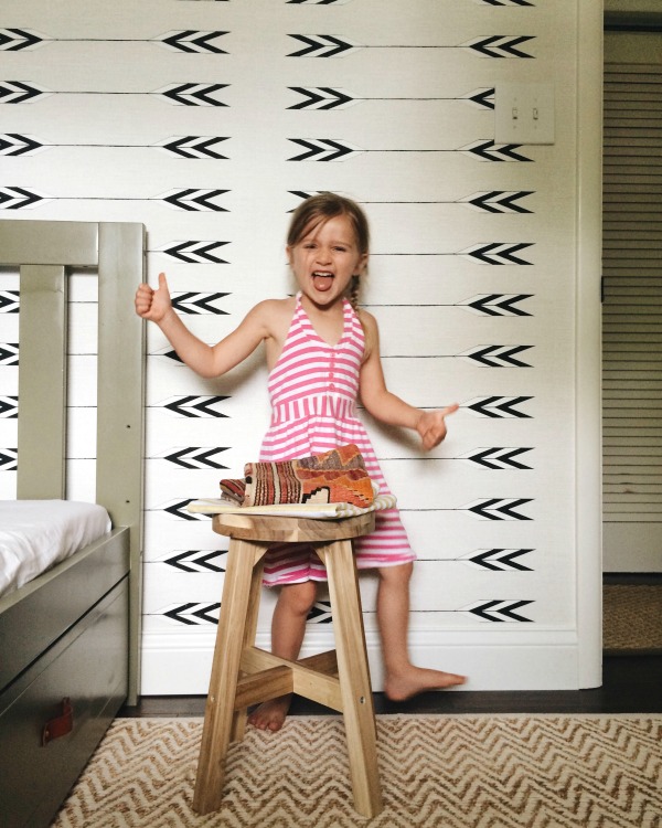
After the walls were painted I had the wall behind the headboard wallpapered in Cavern Home’s tapestry wallpaper in zuni. Yes, I paid someone $125 to install the wallpaper. It was some of the best money I’ve ever spent. I’ve successfully hung wallpaper by myself in the past, but this paper was a little different. For one thing the wallpaper was not pre-pasted, so I would’ve had to invest in adhesive anyway. Second, the edges were untrimmed meaning someone other than the manufacturer (preferably a professional installer) needed to trim them prior to installation. The process can be a little tricky if you aren’t familiar with it. I wasn’t willing to wing it for fear of botching the entire project. So I found a local professional installer via the Wallcovering Installers Association. I called three or four installers before I found one that would take on such a miniscule project. He stopped by one Saturday morning and, in less than hour, the wallpaper was up. I couldn’t write that $125 check fast enough. So. worth. the. money.
The lesson? If you’re considering “untrimmed” wallpaper, be prepared to hire out the installation.

We planked the fourth wall in Stikwood’s vertical caramelized bamboo. It’s the same wall treatment we used on the bunk wall in the boys’ room. (You can read more about that project here.) This is where the dark wall (the one I didn’t paint white) became problematic. The wall isn’t perfectly flat (thank you old houses) so no matter how hard we tried, a few gaps showed up between some of the planks. The dark background accentuates the gaps. Luckily, they aren’t noticeable on the finished wall. They’re one of those things that really only bother Steve and me because we’re the ones who hung the planks. Still, if I had to do it all over again knowing what I know now, I would have taken the time to paint the wall white. Live and learn.
I think that covers all four walls. (Corny pun, so sorry.) Normally, I wouldn’t use three different wall treatments in such a small space, but I like breaking all the rules in children’s rooms. Mabrey’s room isn’t even 10′ x 10′, so I feel like the walls are one dimension I can have fun with without taking up precious floor space. I spent very little on actual furniture pieces, so there was more room in the budget for wall coverings. And since I only used wall coverings on two of the four walls, the splurges were relatively affordable.
Do you have any unique wall coverings in your home? I’ve always loved the idea of a simple kitchen set against planked walls, either rustic or painted. Something similar to this, this or this or this.
images: Dana Miller for House*Tweaking
The 2017 IKEA catalog is out! Have you had a chance to pore over it yet? Each year I share my takeaways and this year is no different. I received my copy last week and finally had a chance to look it over. I made a list of the items and ideas that caught my eye. I thought I would share them with you today. In an effort to avoid ruining the novelty for others, I won’t be sharing photos of each item. I’d love for you to experience the catalog on your own then refer to my list if you feel inclined. If you don’t have a catalog in your hands, you can view it online here. (I’ve linked to most items within the post, but this narrative is really meant to accompany the catalog as some items and ideas aren’t listed online.) Let’s get started!
pg. 10, 11, 196 The NORRARYD dining chair is a modern take on the traditional Windsor chair. I love the scale. (The back isn’t too high.) It comes in three versatile colors: black, white and red.
pg. 24, 25 I love the DIY coffee table idea! The open storage and lower profile make it ideal for smaller and/or open concept spaces. You could stash books, games and toys in the base. I’d love it even more if the crates were reclaimed or vintage. I would get creative with the top. What about butcher block, painted plywood, remnant marble or feather-finish laminate?
pg. 30, 177 You can’t go wrong with a big, inexpensive stockpot like the VARDAGEN.
pg. 56-57 I need to see them in person, but I feel like the TORHAMN cabinet fronts could work well in the right context. (In a modern farmhouse with lots of white? I don’t particularly like how they’re styled in the catalog.) The wood grain might get a little busy, so I’d be inclined to use white open shelving in lieu of upper cabinets. There are a few more new cabinet front styles listed online, but I still think IKEA is missing a huge opportunity by not offering unfinished, paintable options and timeless, classic designs like true shaker fronts.
pg. 66-67, 184 All the heart eyes for an organized pantry, especially the steel IVAR drawers and mini fridge.
pg. 82-83, 252 The transitional style of the MALSJÖ cabinet is so handsome. The recessed brass pulls are my favorite detail making this piece one of my top picks for 2017. I’d use it as a mini home library to corral books and albums or in a dining space to hold serveware, barware and alcohol.
pg. 88, 229 When I designed a nursery for my eldest (twelve years ago!) I used a PÖANG chair instead of a rocker and it worked great. I love the leather upholstery option.
pg. 108-109, 272 I’m all over those shapely FLÅDIS baskets.
pg. 116, 302 The FLISAT children’s series features practical storage in natural wood tones. Mabrey has the wall storage (not shown in the catalog, see it online) in her room.
pg. 124-125, 238 I spy flatwoven rugs made with jute, wool and sisal. They’re great for adding natural texture to any space. Priced affordably, they’re sure to be bestsellers.
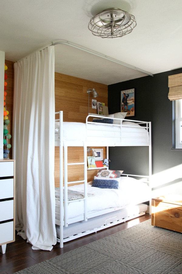
pg. 129 Many of you have asked about the curved ceiling track I used for the boys’ bunk bed enclosure. It was discontinued but it looks like IKEA has improved the design. The new VIDGA series hugs closer to the ceiling and is white to blend in with most ceilings. (The older version sat a few inches off the ceiling and was silver.) A corner track is available to create enclosures and room dividers.
pg. 173 It isn’t new, but the BITTERGURKA plant pot is too cute not to mention. The small scale makes it perfect for growing herbs in the kitchen during cooler months.
pg. 190 I’ve always loved the classic and inexpensive kitchen linens at IKEA. The new VARDAGEN napkins and tablecloth are wonderful additions to the line. I’d use them for everything from everyday family meals to summer picnics to Thanksgiving dinner. So versatile!
pg. 207, 255, 273 I’m drawn to the muted colors and metal detailing of the FJÄLLA boxes. I like them paired with the fabric-covered KVARNVIK boxes for contrast.
pg. 221 The NOCKEBY sectional is good-looking and I like the practicality of a washable cover, but I need to give it a sit in person to determine how comfortable it is. The light beige and light gray upholstery options look promising.
pg. 248 The STILLHET tealight holders are so pretty.
pg. 319 The SLADDA bike is perfect for urban life and sleepy coastal towns. I love all the adorable accessories!
That’s my list. Truthfully, this year’s catalog isn’t my favorite. The staged rooms read a little too catalog, and some of the new things I’m normally excited to see (i.e., large furniture pieces, bedding, pillow covers, lighting, cabinet fronts, etc.) just weren’t there for me. (Although, I’m curious to see the EKBACKEN concrete lookalike laminate countertop in person.) Fortunately, many of my favorites are still available: STOCKHOLM sofa, MÖRBYLÅNGA dining table, the HEKTAR and SINNERLIG pendants, LAXARBY fronts…to name a few. I did appreciate the personal and behind-the-scenes stories woven throughout the catalog. I think it would be great if IKEA could somehow give the catalog more of a lived-in, lifestyle vibe. Maybe shoot even more in actual homes? I get the best ideas when IKEA products are mixed with vintage or bespoke items and shot within a real life scene. I enjoy catalogs that promote ideas alongside items. Just my two cents :)
I’d love to hear your thoughts on the newest IKEA catalog. Any favorite pieces?
images: Dana Miller for House*Tweaking


budget decor, DIY, inspiration, kid-friendly