Erin’s dining area and media room are adjacent to her long, narrow living room. The living room is visually separated from the rest of the open space by small half walls accented with columns.
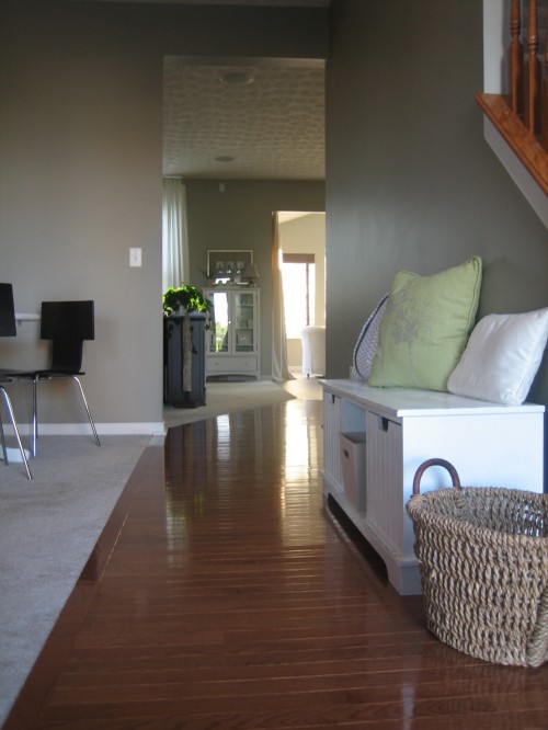
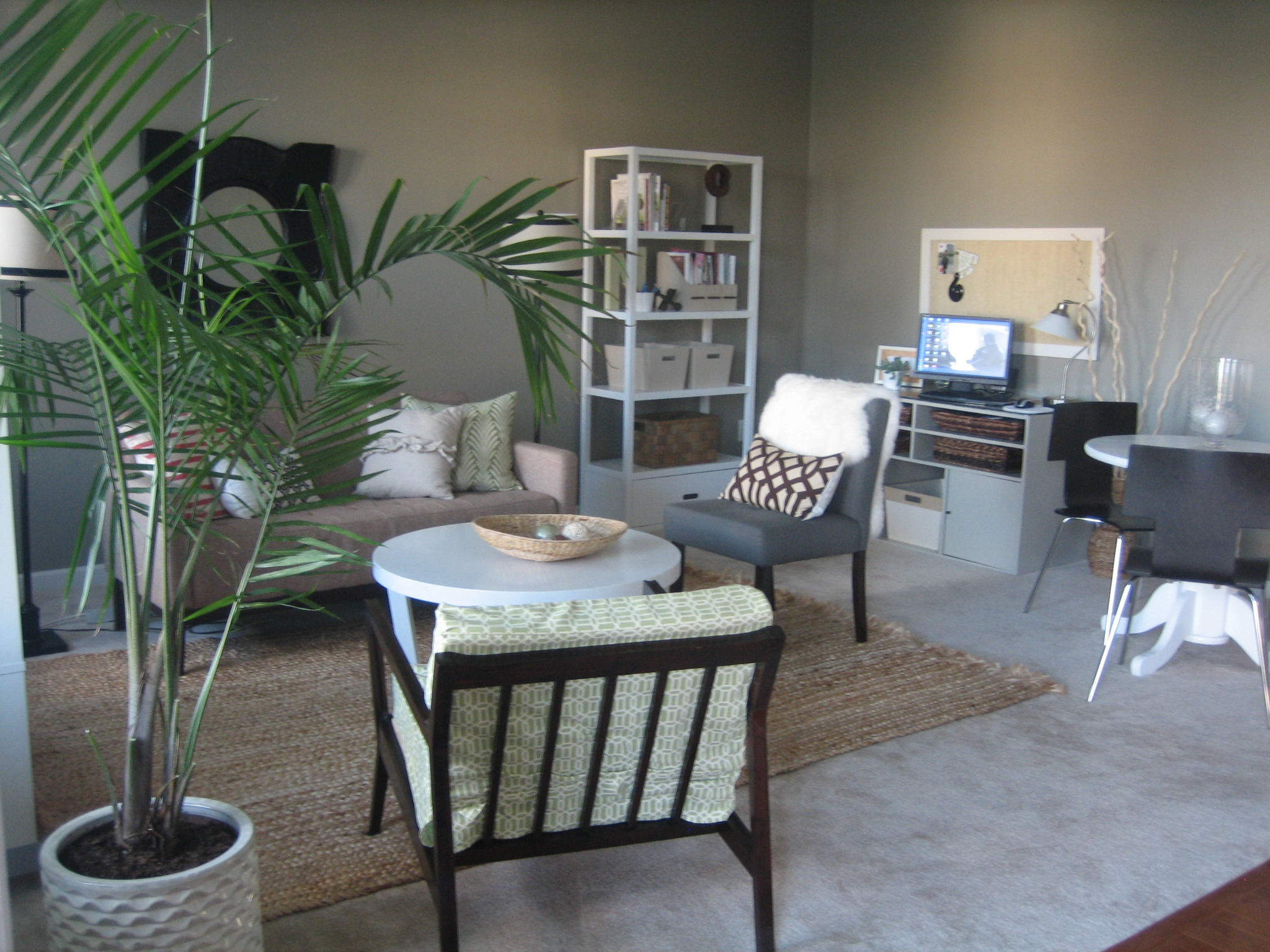
BEFORE


On the living room side of the half walls, there are built-ins. At the opposite {far} end of the living room is a small bump out encased in windows. And in case you missed it, the focal point of the room is a large fireplace with a high mantel flanked on either side by built-ins. The living room is already painted Benjamin Moore’s Puritan Gray and Erin likes it as-is. Here is the mid-modern mood board I created for Erin’s living room…

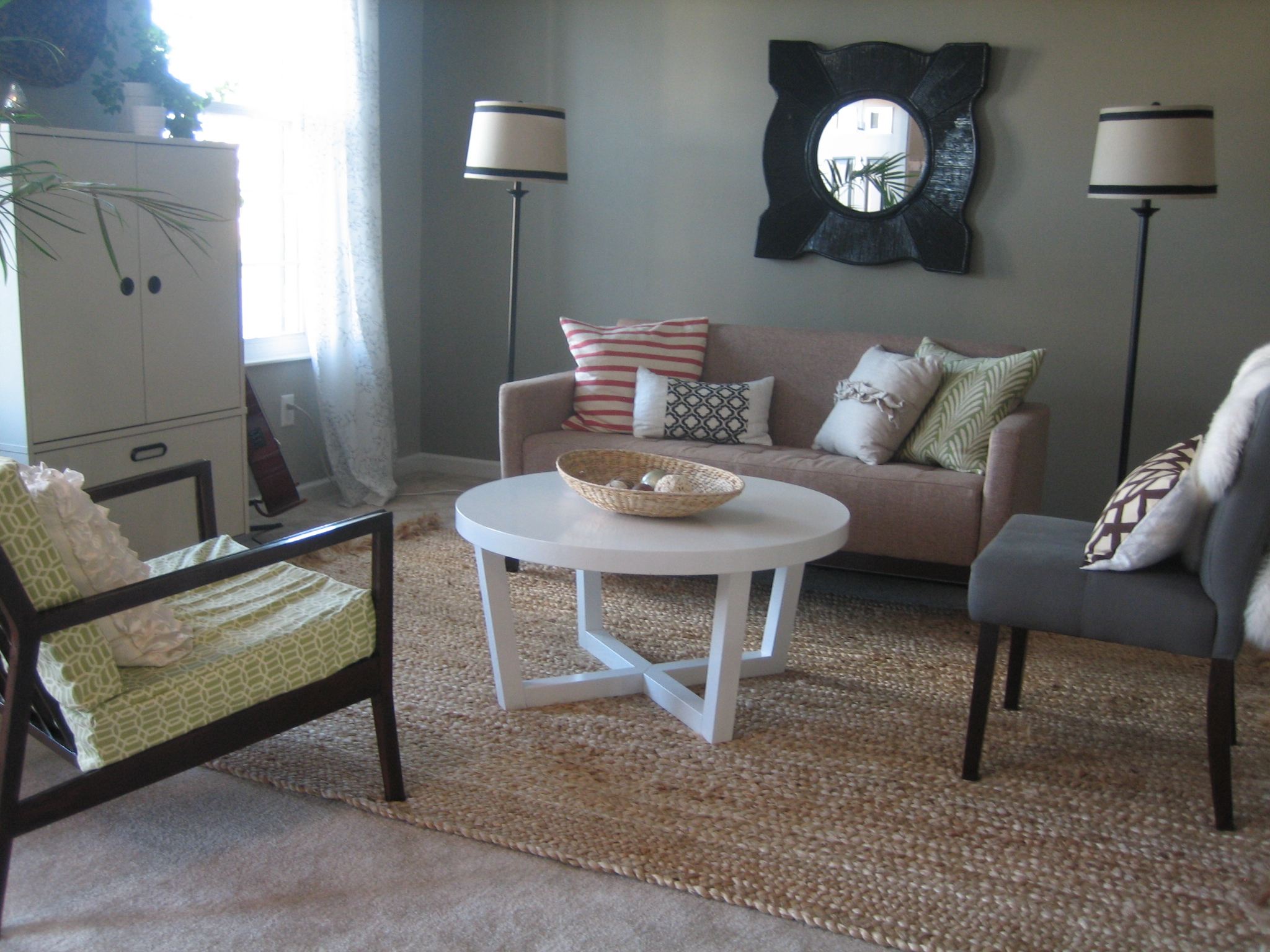
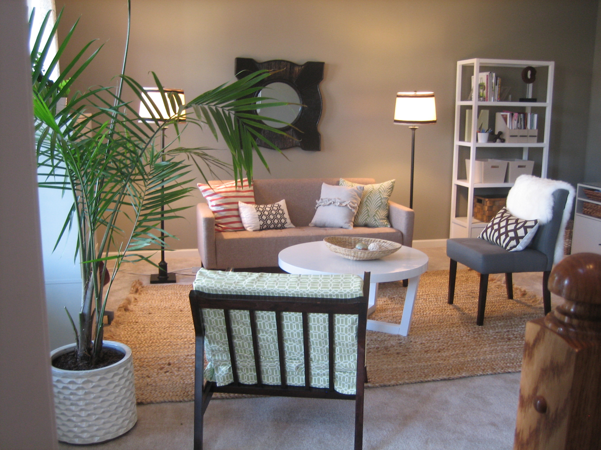
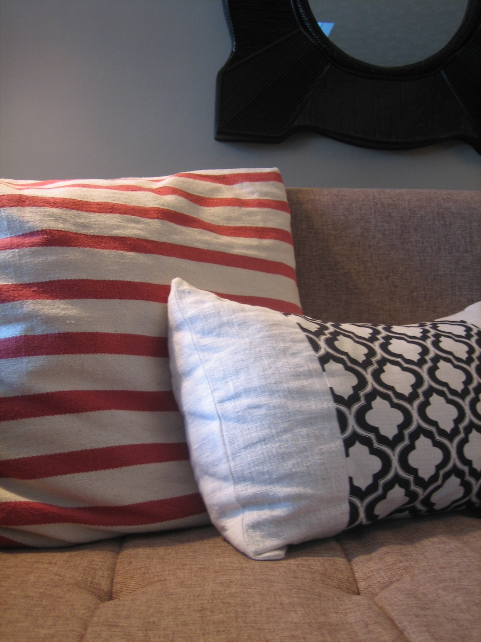
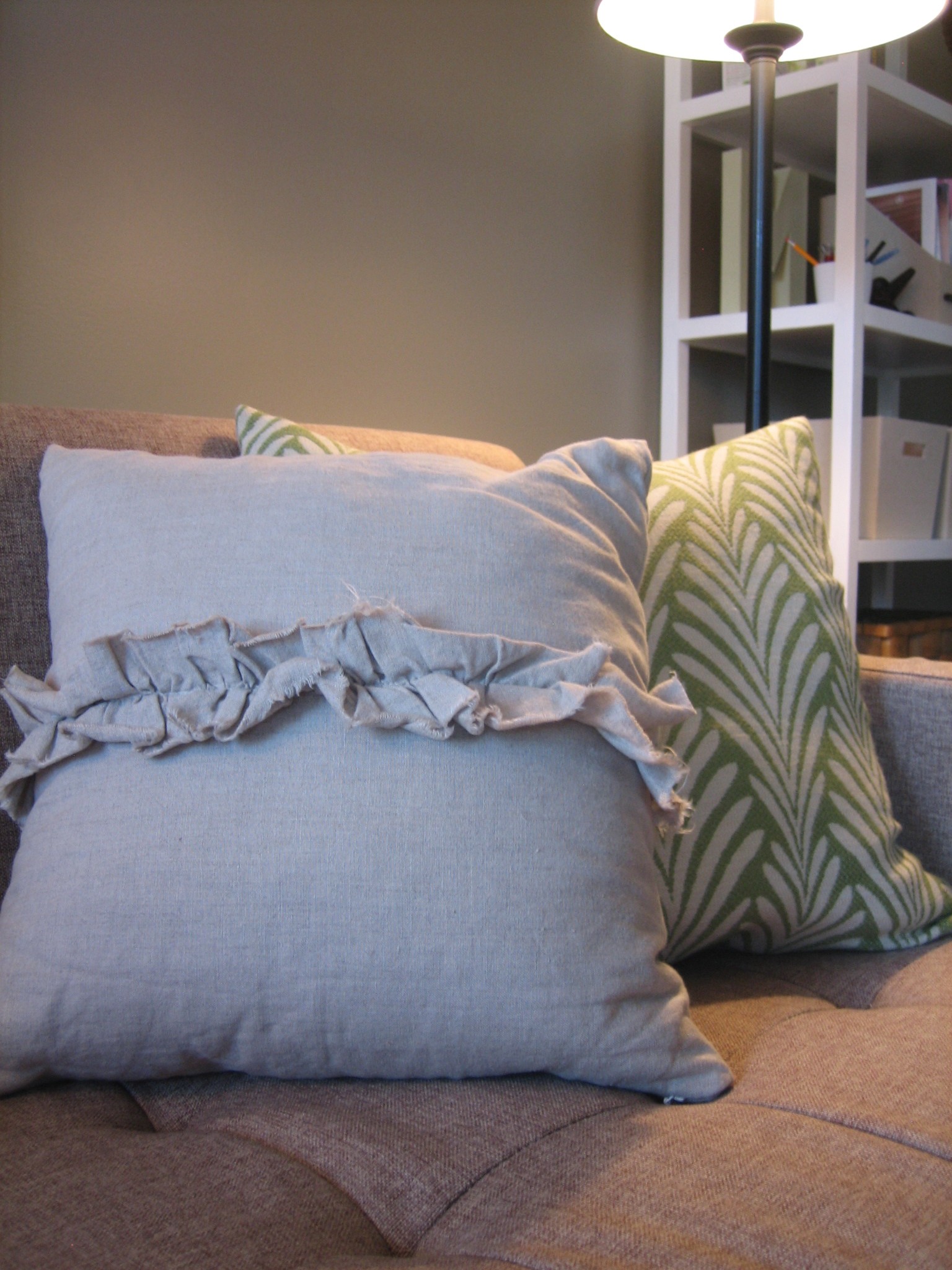
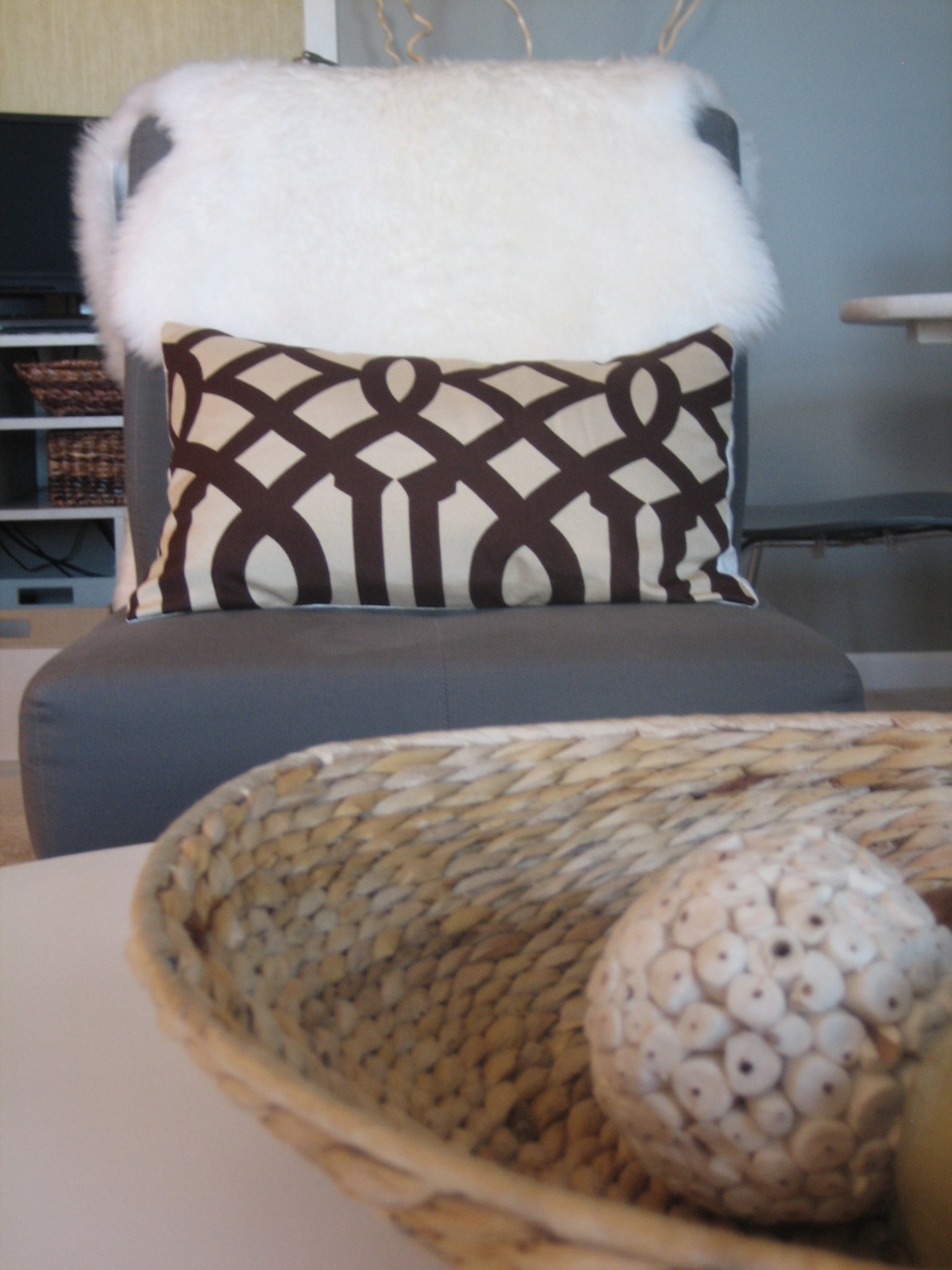
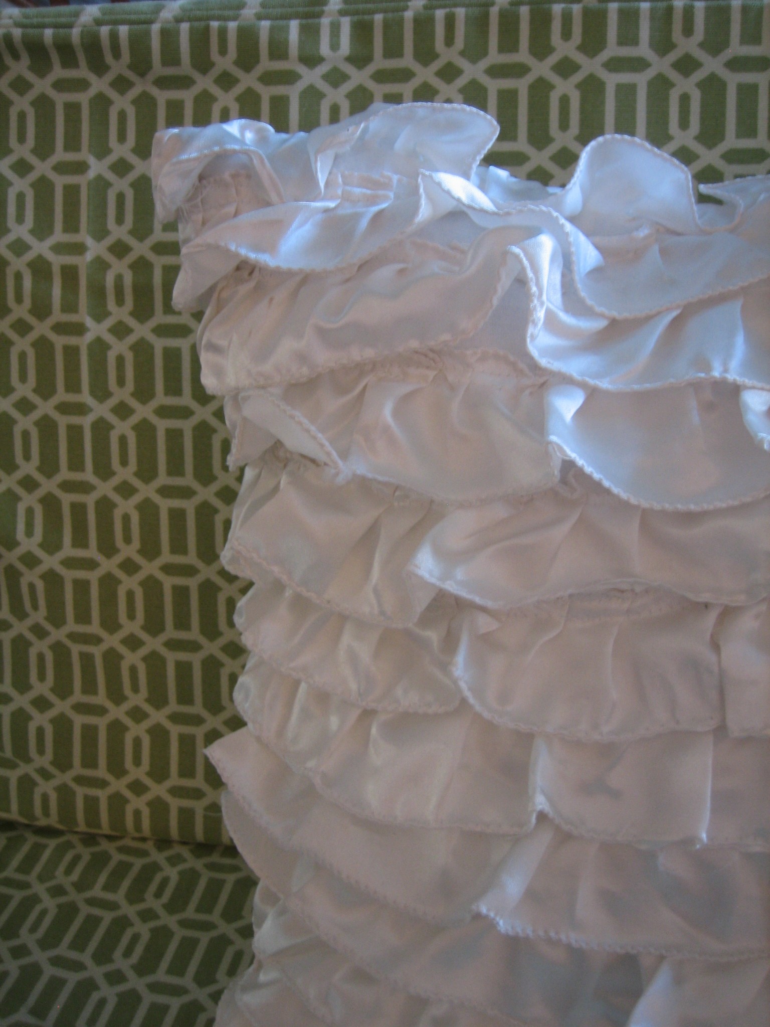
1 – With the walls a medium gray, I’d add a light neutral sofa placed along the wall opposite the large mantel and fireplace. Flanking the sofa with 2 of these rolling walnut modern cube-like end tables will balance out the sofa. I love these somewhat dressy steel table lamps to top off each end table. Placing this woven coffee table in front of the sofa would add texture and curves. The one shown in the mood board is pricey, but IKEA sells woven ottomans that could easily be diy’d into tables just by adding some furniture legs to the bottom…for waaaaay cheaper. OR just stack 2 of them on top of each other to get a ‘table!’ On the wall behind the sofa, I like the idea of an eclectic photo/art collage similar to this. This round seagrass mirror would be a great centerpiece for the collage. Toss a few Etsy pillows on the sofa to keep the color scheme flowing into the living room: here, here, here and here.
2 – In the small bump out where 2 red side chairs now reside, I think a pair of these modern eames-like chairs would look darling. {They’re sold as a pair!} They mimic the shape, style and color of the curvy white chairs in the dining area. Angled in towards each other with a yellow garden stool in between, these retro-classic chairs would provide extra seating for entertaining. Also, I would remove the paper pendant light hanging in that area. Instead, I’d open the bamboo shades so that they only cover 1/3 of the height of the windows and add more of these printed West Elm curtain panels…hung high and wide to let in as much natural light as possible.
3 – Erin mentioned she’d like a place to read, so I chose this chaise in medium gray to place in front of the window to the right of the mantel/built-ins. I’d suggest angling it slightly out towards the coffee table. It shouldn’t be parallel to the mantel wall, but it shouldn’t stick so far out into the room that it impedes traffic either. Pair it with a simple floor light to invite reading. Once again, to keep things cohesive, I’d add the same curtains to the window in this reading corner. Erin already owns a light gray area rug that I think would work well to define the sofa seating area.
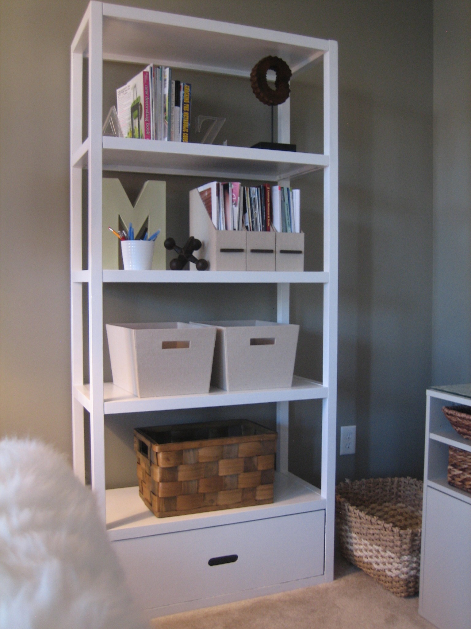
A few words on the mantel and built-ins: Erin mentioned her fiance’s aunt is an artist, so I purposefully left the space above the fireplace blank where said aunt’s artwork will go. I can also picture a wood or metal monogram letter hanging on the tiled surround of the fireplace just above the firebox. To avoid damage to the tile, the monogram could be hung with an adhesive 3M hook. As for all the built-in shelves, I recommend that Erin edit, edit, edit. Less is more. Incorporating objects that tie into the gray, white, yellow, and teal color scheme will keep it feeling cohesive. I’d encourage Erin to find images of inspiring, arranged shelves and to mimic them. Layering {for instance, overlapping a stack of books with a propped picture frame}, repetition, varying object height/texture, and empty space are all good characteristics of a well arranged bookcase.
So, that concludes the mood boards for Erin’s vintage condo. Are you able to see how the open space could work as separate zones and/or one larger multifunctional space? A cohesive color scheme, sensible layout, area rugs, and lots of light help to make an open space feel inviting. Many people are drawn to open floor plans nowadays but find them challenging to decorate. For more tips on how to approach wide open spaces click here. Thanks to Erin for allowing me to virtually tweak her place! And for allowing me to share her before images which, she would like everyone to know, were taken shortly after she and her fiance moved in. Can’t wait to see the afters!
Just in case you missed the rest of Erin’s mood boards, here are all three…


inspiration