...because home doesn't happen overnight.
05.03.12 / the new design

Monday was the launch of H*T’s new design and I was hoping that my post on the evolution of H*T would help you better understand why I chose to change H*T’s look. To me, it was the natural next step and something I’ve been wanting to do for a long time. The first time I tweaked H*T, I wrote a post about my thoughts on blog changes:

“I know when other blogs I read do some sprucing up, at first I’m apprehensive just because I’ve gotten used to seeing the same home page day after day. You know, that whole ‘if it ain’t broke don’t fix it’ saying. I’m always leery that somehow changing the appearance of the blog may change the content. In most cases though, after a few posts my inclinations are proven wrong and I happily discover that the changes really are positive. So, I know change is hard but I hope you’ll stick with me and see what comes next. It’s still the same old me…a suburban mom and wife with 2 rowdy boys, a Handy Hubby, a creative side, and a passion for home decor, design and DIY. Oh, and I like chocolate no bake cookies…fresh and gooey straight from the pot…eaten with a spoon so I can’t gauge how many actual cookies I’ve consumed.”

My thoughts then are my thoughts now. {Except we’ve added a baby girl to those two rowdy boys.} I know it’s probably felt a little strange coming here this week and not finding the same header and background. It’s been strange for me too. It’s like getting a new haircut. At first, the change is striking but after a week it feels like it’s always been that way. Soon, it will feel familiar. I hope you’ll hang around until then.

You all probably know your way around a blog but I thought I’d point out a few of the changes and talk about them in more detail. Care to take the tour?

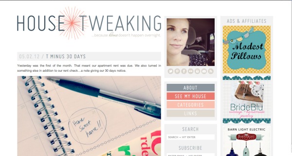
One big change is the header and it was probably the most difficult part of the redesign for me. I knew I wanted something simple and fresh with no frills. I played around with the idea of using a sketched house icon somewhere in the header but it felt too literal. I came up with an idea to switch out the asterisk in House*Tweaking for a sunburst and it felt more ‘me.’

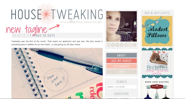
Another thing I’d been thinking of changing for some time was House*Tweaking’s tagline. If you’ll remember, it was ‘…a blog designated to tweaking all things house and home.‘ There were a few problems with it. First, it wasn’t grammatically correct. You wouldn’t believe the number of emails I’ve received over the years from readers – some obviously quite upset – about my unproper improper tagline. A correct version would have been ‘…a blog dedicated to…’ or ‘...a blog designated for…’ The other issue with the old tagline was that it was redundant. Of course a blog called ‘house tweaking’ would be about tweaking your house – duh! It was the tagline I had quickly typed into Blogger a few years ago that fateful night I brought H*T to life and somehow it stuck.

The new tagline ‘…because home doesn’t happen overnight‘ better sums up my take on making a house a home. {And, from what I can tell, it’s okay grammatically. If not, I’m sure I’ll hear about it!} Whether you’re renovating a fixer-upper or making simple upgrades to builder finishes, making your house reflect your style takes time. It doesn’t happen overnight nor should it. It’s a process and an ever-changing journey because real life gets thrown into the mix. And that’s what this blog is all about.

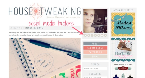
I really needed to update H*T’s social media buttons. I think before I just had Facebook, Twitter, Flickr, and RSS buttons. Now you can easily follow me on Pinterest and Instagram too. The mail button is a link to my contact page where you’ll find my email address…an email address that HH is pushing me to change. Hotmail is so 1998. I know, I know. But I have tons of different accounts set up with my email address that it would take me a full month just to switch everything over. I know some bloggers use one email account for bloggy purposes and another account for personal emails but I prefer to group it all together. Ah, maybe one day I’ll get around to switching things over to gmail or something but, for now, you can find me via hotmail.

Beneath the social media buttons are all the pages that used to be in the navigation bar. I updated each page, so if you get a chance to check them out you should. It’s not all the same old, same old. I plan on adding an Underdog house tour to the ‘see my house’ page once the house is tour-worthy.

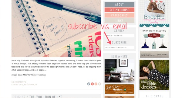
You can now subscribe to H*T via email if you like. Just type in your email address in the ‘subscribe’ box and you’re good to go. This feature was added due to popular demand.

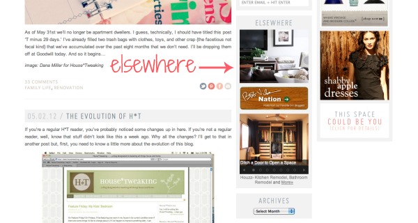
I also have links to credible mentions and my work elsewhere: Apartment Therapy house tour, Bob Vila Nation, and Houzz. I hope this section continues to grow.

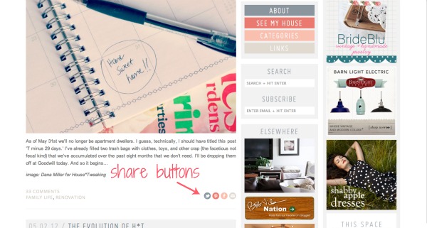
Share buttons are located at the end of each post if you ever find a post to be particularly inspiring and want to tell the world about it.

None of these features are anything ground-breaking in the blog world. I just thought that pointing them out and talking a little more about them would help you to get acquainted with the new look. I encourage you to click around and see what has changed.

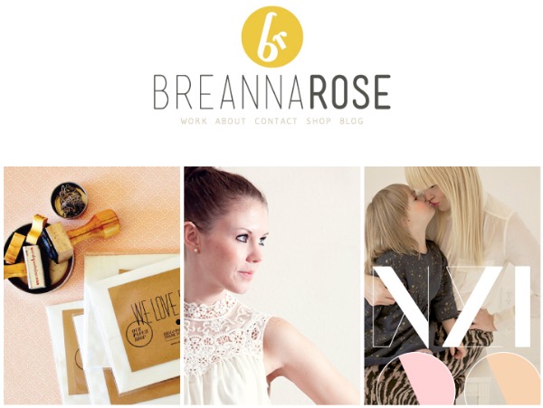
Speaking of the new look, it would have never been possible without the help of a graphic/web designer. I’ve taught myself some HTML coding over the past few years – enough to get by. But I’m by no means capable of overhauling an entire site. I worked with Breanna ‘Bre’ of Breanna Rose Design to bring a fresh, modern look to H*T and I can’t say enough about her. She was a gem to work with and worth every penny.

If you ever find yourself in need of a site {re}design, I’d highly recommend her. The girl knows her stuff and has a keen eye. She’s opened my eyes to a few aesthetic issues concerning H*T that I need to improve upon. For example, keeping all my images the same size for cohesion. {That’s why if you look through some of the archives you’ll find small and/or off-centered pictures. Sure, I could go back and edit all those posts but then I wouldn’t have time to sleep, feed my kids, shower, or write posts.} From here on out, it’s something I’m going to be aware of. Probably not perfect at {as I just realized I cropped all those screen shots above to the margins instead of to actual text/images…oops!…I’m learning!}, but aware of nonetheless. Hopefully, it will enhance your reading experience. Thanks, Bre!

One other major blog change that isn’t visible is H*T’s new host. Previously, H*T was hosted on BlueHost. H*T’s traffic has increased so much over the past year that the site was bogged down. I was having problems just writing up posts because my server was down frequently. I’d heard good things about Liquid Web from other bloggers and decided to switch hosts. So far, it’s been a good fit and I can always upgrade within Liquid Web if necessary.

That’s it, I think. Was that enough change for you in one post? Too much? Not enough? Oh well, I can’t please everyone. Welcome to the-new-and-improved-but-kinda-the-same-old House*Tweaking!

images: 1-7) Dana Miller for House*Tweaking 8) Breanna Rose

36 Comments

03.May.2012

wow, it looks very clean and fresh now! That will take some getting used to. I think eventually I will need to take the plunge into a professionally designed site, but I think I need to get my readership up first!!

Congrats on the makeover :)

03.May.2012

So excited to finally be an email subscriber! Love this blog :)

03.May.2012

I love the new, modern look! I think the color combo is awesome.

I think it looks great! (And how funny to see our closet on the Houzz icon in the sidebar!)

P.S. – Maybe it’s my browser, but on the comment fields it doesn’t actually say what info is supposed to go in what box. (Hopefully I guessed right!)

03.May.2012

Lauren – Thanks for the heads up! I’ll look into it.

03.May.2012

Just checked it out. It must be a browser issue. Coming up okay on my end: name, email, url. You guessed right!

03.May.2012

Love it. I adapt to change rather quickly. I’ll be sticking around for sure!

Love the redesign and love hearing these details. I enjoy bloggers explaining stuff like this and finding out good hosting sites and those people who do blog redesign (was is the going rate for small up to large blogs?). Maybe it’s my screen but the grey (which I love) is so faint I have to tilt my screen a lot to see the contrast and read it.

03.May.2012

it’s gorgeous and is very ‘you’ :) (you’re a brand!!)

03.May.2012

I made the switch from Hotmail to Gmail a year ago, and was happy to find that Gmail will import all messages sent to Hotmail. It made it so much easier because for each email that came through (that was clearly labeled that it came from my Hotmail account) I could go and fix those settings from that sender. One sender at a time, I slowly and easily switched almost everything over a few months. There are still an orphan email here and there that have shown up over the past year, but I think that’s how it goes – we have no idea how many places we type in our email!! All in all it couldn’t have been easier!

I am loving this new design. It’s very fresh and clean. And I love the coral sunburst! I’ve been following for awhile now so I can’t wait to see how you design the new house.

03.May.2012

I love your new design!

03.May.2012

Love it! So clean and fresh :) and just the right amount of femininity. I find the new look inspiring. It makes me want to freshen things up in my house.

I’m somewhat of a hotmail holdout for my personal email. I guess it’s an if it ain’t broke don’t fix it thing, and also a resistance to change and new technology. I get the same slightly embarrassed feeling when I give someone my email address as I do when I explain I don’t use a cell phone or text and I prefer to read books printed on paper rather than use a Kindle, etc. I guess I’m some sort of dinosaur despite my 31 years of age. :)

03.May.2012

Love it! Love your blog. Keep up the good work!

03.May.2012

It is easy to retrieve emails from other email accounts using Gmail too–my Gmail account retrieves emails from two other gmail accounts I had to set up for paypal purposes and also two school-related accounts that are other domains. Then, when you reply to the email you can even choose which email address to send the message as (but I always use my main gmail account). They make it easy. Something to keep in mind for the future! You know, when you have all that free time to relax :) Your new site is just perfect for your aesthetic.

03.May.2012

Loving the new design! Keep on tweaking!

03.May.2012

Talked with Bre and she remedied it…a coding issue beyond my scope. Now, the comment field prompts should show up in all browsers. Thanks for bringing it to my attention!

03.May.2012

Good to know! HH keeps telling me it’s no big deal to change my email but for some reason I just keep hanging on. Baby steps!

03.May.2012

Sounds fairly painless! Maybe I’ll give it go sooner than I thought…

03.May.2012

I had originally wanted to keep the coral color to a minimum but ended up liking it as more of a main color. I think having a girl during the design process may have had something to do with that. I’ve never been a ‘pink’ girl. I don’t even own any pink clothes for myself. But now that Mabrey’s a part of our family, it’s like I have permission to choose more feminine things.

I hope H*T’s male audience doesn’t mind clicking on coral-colored links! We tried to balance out the coral with the more masculine grays and blues.

03.May.2012

You would have to contact Bre directly to get an estimate. It really depends on what you need help with. She does everything from header designs to full-on branding. My project was somewhere in the middle. Bre has quite the portfolio and is very efficient and her rates reflect that.

Depending on the light, I tilt my screen as well to get a better view. But I’ve been doing this for years on all kinds of sites from blogs to online shopping stores. I actually had Bre darken it up from the original proposal but felt anything darker would be too heavy.

03.May.2012

I just started texting last year after receiving peer pressure to do so! I don’t think I’ll ever be able to read an e-book. The smell of the book, the feel of the paper under my fingertips, and the sound of the pages turning are part of the reading experience for me.

Hi! I’ve been reading House*Tweaking for a while and I’m not sure if I’ve ever commented… but I just had to tell you how lovely the redesign is. The layout is great and so are the colors– they all really seem to go with your aesthetic.

Looking forward to see what’s coming next. :)

I really like the new look. Simple and stylish.

We need to make a theme “updo” to our basic WP blog, but my wife suggests we start making money off of it before we sink any money into it.

I think the new design looks great! I am constantly tweaking the look of mine but, I’m like that with everything- always “in progress” around here! Thankfully, I don’t think either of my whole 2 readers notice or care much ;)

03.May.2012

Love the new look!

Hi Dana…I’m here by way of your bathroom before/after on Apartment Therapy. So glad I clicked over because so far I’m loving everything I’m reading and seeing. Congrats on the redesign..I’m your newest reader :) Can’t wait to see how the rest of your new house comes along!

03.May.2012

I love your blog! I found it one day when I googled, ‘how to glue ribbon on a lamp shade’! I was thrilled to find your blog & have been a faithful reader ever since. Thank you for sharing your stories. I am excited to read more!
ps. love the changes…

03.May.2012

Looks great! I love the subtlety behind the starburst – I hadn’t realized it replaced the asterisk until you said something. Also, love the tag line, I need to come up with a concise one for our blog. It is really hard to narrow down all your thoughts into something so succint, but you did a wonderful job.

04.May.2012

Dana, I am so enamored with the new look of your blog that I could care less about it looking familiar or the same as before. I know sometimes it’s hard for me to get use to the new look of some of my other favorite blogs when they do a redesign, but this time it’s different. For some reason I am just head over heals in love with this new look and just feel like clicking back to your site constantly for another look. I think the colors and the fresh, modern vibe are so perfect and would be exactly what I would want my own site to look like. Thanks for the tour….I can’t wait to see more!

04.May.2012

I love your blog and love the changes! Signed up for your emails to, so excited!!!!

04.May.2012

congratulations, it’s lovely! change is good and i think your readers have seen that your aesthetic has grown and developed with your home, so to should the design of your online home :)

I love the new look! I just recently did a complete overhaul with my blog as well and know that it can be an exciting process but also daunting at the same time! Congrats on the new look!

04.May.2012

Your blog looks great! Well done.

Looks really great! I’m a brand new subscriber and the layout of your site was what initially drew me in!