What day is it? I’m in over my head this week with other blog-related and nonblog-related obligations but I am determined to finish the front door.
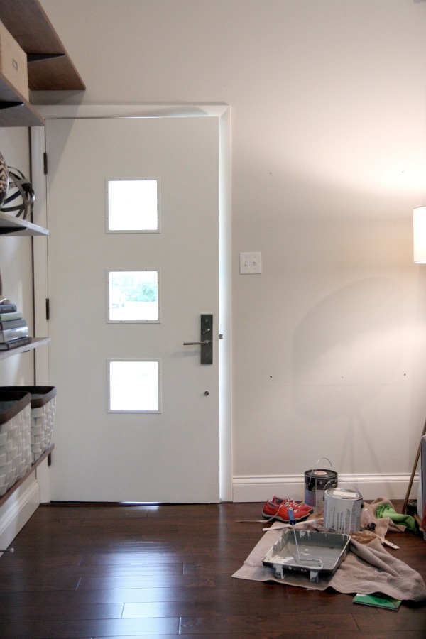
I knocked out the interior side of the door today. {It’s Benjamin Moore white dove mixed in Clark + Kensington primer + paint, semigloss…the same as these doors.} It was pure chaos and it took me all day to apply three coats of primer + paint. Remind me never to paint with kids in the house again.
First, our power went out and I had a hard time seeing what I was doing. Then the neighbor’s cat mistook the open front door as a welcome sign to come in and rub up on the wet {!} paint. He’s such a nice kitty. He was so confused. My tone of voice didn’t match my words at all. “Go on, kitty. No, kitty.” But I was using my nice “Here, kitty kitty…” voice. I couldn’t be mad at him. After all, I’m pretty sure he was the sole reason we didn’t have mice squeeze in through the gap at the bottom of the door last winter. The three coats went on very slowly. I decided I’m over painting doors. When I was finished and washing out my brush, Mabrey grabbed my wet roller and tried her hand at painting the entry rug in 0.2 seconds flat. While I was trying to rinse the paint off the rug, Mabrey stuck her hand in the wet paint on the drying door. Ugh, babygirl keeps me on my toes and makes my head spin!
So the interior side of the door is done. I’m halfway there.
I posted that picture on instagram this past weekend. I was trying out a paint sample for the door. The minute I saw it I knew it wasn’t the one. The majority of IG commenters agreed. It was too bright, too primary yellow. It was not the mustard I had in mind. So back to the paint store I went. I was looking for something with a bit more green and gold in it – a color that on its own might be considered “ugly.” I found it by way of Sherwin-Williams alchemy.
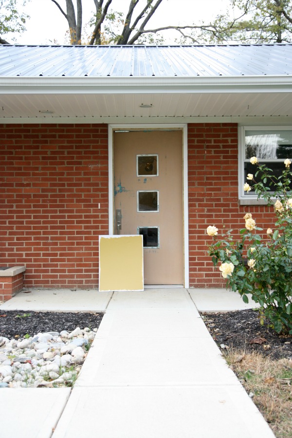
It’s a muddy gold that looks right at home with our midcentury ranch. I had my spicy mustard but was curious about a moodier blue-gray. I decided to paint the other side of my foam board in Behr’s evening hush, the same color I used on the french doors at the back of the house.
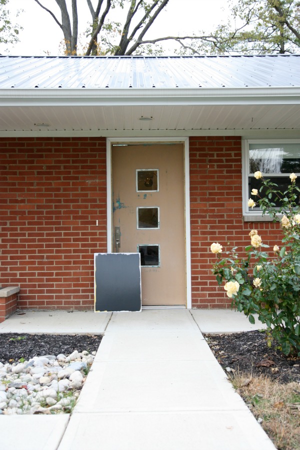
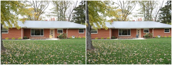
The darker hue is a nice contrast against the red brick and ties into the metal roof even though it isn’t an exact match. It also picks up on the composite slats we added to the planter from this post. My only hesitation is that the trio of square windows might get lost in the dark color from a distance. The windows read black and we plan on painting the narrow trim around them the same color as the rest of the door. {White trim around windows on painted exterior doors looks very “builder” to me.} Maybe peel-and-stick frosted window film would help accentuate the windows?
At any rate, HH and I are torn between the two colors. We love them each for different reasons.
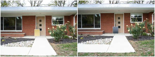
The gold feels welcoming and highlights the door and its design. It’s also a nod to some of the bright green-yellow shrubs and yellow roses in the landscaping. The gray feels like a safe, cohesive choice and probably represents our style better. It definitely gives the house a more masculine look from the road.
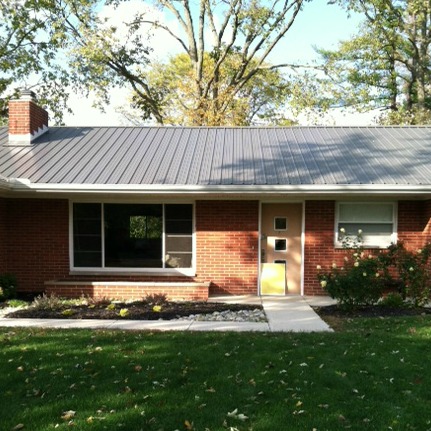
As is, the exterior of our house is very linear and one-dimensional. The gold breaks it up and wakes up the entrance. The gray is a bit more sophisticated, somber even.
I like when the color of a front door is a clue as to what is happening design-wise on the other side. Both colors hint at what we have going on indoors. There are traces of mustard and gold in our living room, dining room and bedroom. Dark moody walls make an appearance in the mudroom and nursery and I will always be a lover of high contrast.
Ah! I can’t decide. Which color would you pick and why? FYI – Painting the brick is not an option. Our inspector advised against it due to the construction and climate. The paint wouldn’t allow the brick to breathe and we would be at risk of developing mold and mildew. No, thank you, but I still love me some painted brick.
images: Dana Miller for House*Tweaking
My boys are back in school as of this week. Layne is in third grade and Everett goes to half-day kindergarten in the afternoon. When Mabrey takes her nap after lunch, I have two whole hours TO MYSELF. It is heavenly. I savor every minute but I always have something to do. Today, I took pictures of the boys’ room and I want to share them with you. Their room is really coming along! Just a few little things left to do but I’ll probably drag them out because as soon as I call a room “done”, I start thinking about changing it. It’s a disease.
So, the boys’ room…
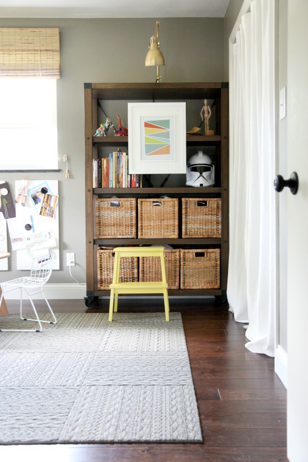
It’s a difficult room to photograph because of the room’s orientation, the furniture layout and the bright southern sunlight but let’s take a tour around, shall we? The bedroom is roughly 11’x14′. Not teeny tiny but not huge. My older kids {boys, ages 8 & 5} share this room. The room doubles as a playroom for all three of our kids. Above is the view from the hallway looking straight into the room. The bookcases are “styled” now – as much as you can style bookcases in a children’s room. To the right, is the closet. During renovation, we removed all the bedroom closet doors and opted for fabric panels in their place. They are less cumbersome, quieter and safer for the kids {no smashed or pinched fingers}. I have a few things to add to the closet wall and I’ll share those in another post soon!
This is another view from the hallway looking towards the far corner of the room. There is a second bookcase and a play table + chairs sits in between the bookcases, under the window. This is where you heard Mabrey playing blocks in the sensor switch video. I bought the table primarily for the boys’ use but Mabrey LOVES sitting at the table to stack blocks.

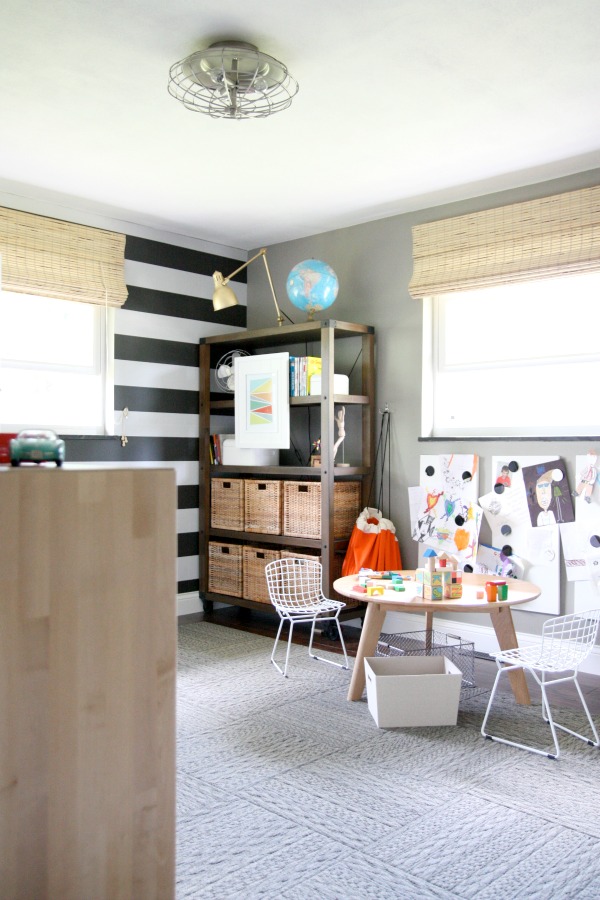
Walking into the room and turning to the left, you get a nice view of the striped accent wall. It’s actually peel-and-stick wallpaper! Everyone who visits our house comments on the wall and then proceeds to smooth it over with their hands. The wallpaper has more depth than painted stripes and it draws people in. I like that it makes the rectangular room feel wider. Typically, I don’t shove all furniture up against the walls in a room but, in this case, it’s kinda necessary to leave as much floor space open for play.
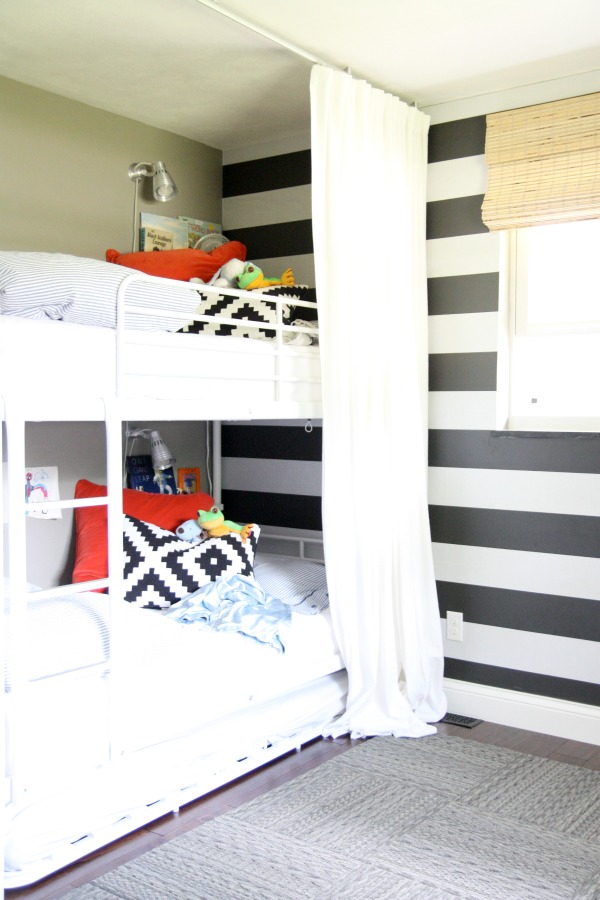
I let the boys pick out their bunk bed. It isn’t what I would have chosen myself but it was inexpensive and it gets the job done. The kids love it. I do like that it has a detached trundle for sleepovers and overnight guests. We’ve used it a ton already! And that’s another reason why the middle of this room is open – to pull out the trundle without having to move anything out of the way. I added floor-to-ceiling curtains to make the beds feel like a hideout per the boys’ request. Each boy has their own reading light and book ledge. We recently added a small clip-on fan to the top bunk’s book ledge. It can get pretty hot up there on warm nights.
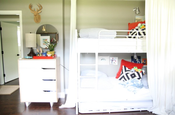
This is the view from the play table looking over to the beds, dresser and door. If you look closely, you’ll see that the bunk sits in a little bump out ~8″ deep. Placing the largest piece of furniture here helps keep it from crowding precious floor space.
That’s it! The boys’ room in a nutshell. With the kids back in school, I want to put together a room-by-room tour of this house. Right now, the only tour under the “see my house” tab is of our previous house. For those of you who want a video tour, it’ll come but I really want to finish up a few larger projects before I share that. I hope you will stick around to see it.
For more details on the styling of the boys’ bookcases and pictures of a certain babygirl playing in the room, you can read this post I wrote for Wayfair.
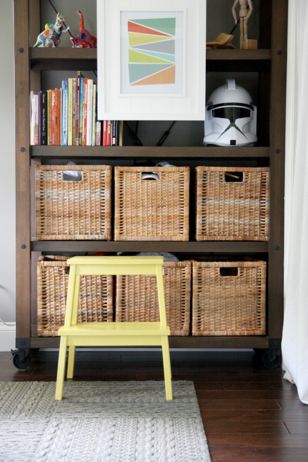
Bookcase sources: Warner bookshelf // work lamp spray painted with Rust-Oleum’s metallic gold // rattan baskets // colored slabs geometric art No.1 //colored slabs geometric art No.2 // step stool painted in Behr citrus zest, semi-gloss // sweater weather carpet tiles // Valspar dry riverbed on the walls
images: Dana Miller for House*Tweaking


budget decor, DIY, renovation